printing
you are here [x]: Scarlet Star Studios > the Scarlet Letters > printing
June 26, 2009
wiping the slate clean
by gl. at 6:15 pm
it's been a very long time since i've posted, and it looks to me like if i wait for the perfect time to give each item the post it deserves, i will never post again.
during the holidays, at the masarie curry party, marta said i changed her life: she attended a collage night once and makes one every day now. it's not often you get to hear something so dramatic or sincere!
but it's been hard because a bunch of awkward things happened at once. my focus has shifted to include arts organizations. i've been spending a surprising amount of time & energy supporting medical causes. my own art has re-embraced theatre. a lot of people have died (including lane, my mom & sven's grandfather). my primary art support group collapsed. my photo routine is broken. the economy shook us. in short, things are in flux.
since sven & i are about to go on a long summer trip, i'd like to tie up some loose ends so when i return, i can start with a clean slate: i'm still searching for the next surge of momentum but i can't move forward if i'm still looking back. so here are some things that have happened over the last year i'm not going to write much about but that are worth mentioning & recording:
events: shu-ju in the rare books room, gems of small press show, red bat & loaded hips show at iprc, white bird dance series, open studios (cirocco moody's raven), shawn demarest's shows, trillium holiday show, handmade nw, little things show, coraline premiere, a puppetlove show, apollo, how to disappear completely, hidden portland book launch, crazy enough, inviting desire w/ bridget, an afternoon on dayna's boat "rapture." plus, dayna went to italy & brought back treats: a fish placemat from volterra in in the cinque terre, yellow italian paper (used to wrap purchaes, in art, as placemats, etc.), a menu with cool image, favorite yogurt jar, a sugar packet, a piece of broken window from abandoned house in tuscany(!) wrapped in italian newspaper, red & white rocks from cinque terre, beach glass from the amalfi coast, a bookmark from assisi, and a metal botanical tag from flea market. then ann gave me a subscription to “where women create” magazine, which is like a “lifestyles of the rich & creative."
teaching: i had a great time teaching gocco at the iprc until the iprc could no longer offer them due to the shortage of supplies. (however, i still provide private gocco lessons, like the one i did with dot.) so i've been teaching creative business classes at the iprc, the library & trillium/scrap. that may come to an end soon, too. i've been re-offering workshops at the studio without being responsible for promotion & registration.
classes: when i first decided i wanted to dip my toe back into the theatre waters, i took a theatre/coaching class: it was a really rocky way to start because she did not believe in encouraging students. so i was both relieved & sad to leave. i had better luck at the 100th monkey's "ninja sewing" series (where i learned about threading, knotting, warp/weft, running stitch, gathering stitch, back stitch, buttons, hem stitch, blanket stitch, cross stitch, whipstitch, chain stitch, split stitch, french knots) and have been happy to be able to make and repair very simple things.
art: "where the sidewalk ends" photo series, "5 reasons" book, comparing down to earth "smoke rings" a year later, "writing our bellies full" reading, fidelio, last big gocco supply order, cast as an extra in TNT's "leverage" (so was trixie!), opsfest, dayna's art buddy invitational (my buddy, sven's buddy).
at the little things show, i picked up a prayer flag by jennifer mercedes because of its title: "a prayer for an inspiring future." yes, please. see you soon.
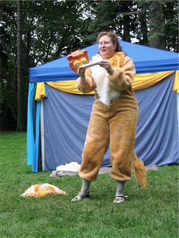
[gl. as The Lyon in A Midsommer Nights Dreame]
posted by gl. | permalink | categories: administrivia, classes & workshops, exhibits & events, miscellany, other art, printing, trixie, writing
January 25, 2008
simultaneous gocco project: winter solstice
by gl. at 5:54 pm
earlier this year shu-ju created the "simultaneous gocco project" for the gocco-printers list. even though i couldn't participate at that point it was so much fun to watch the others contribute that i thought it should be a seasonal event. shu-ju thought that was an excellent idea -- if i managed it. ;)
fortunately, teaching my first gocco class coincided with the next simultaneous gocco project in december, and since i had to create a demo for the class i had an easy way to get involved in the project.
i've always wanted to create cards based on the crest for my family's scottish clan, mckay. my family is very interested in that geneological branch, especially my dad. michael's dad made my dad a stained glass window with the crest a few years ago: it was a huge hit.
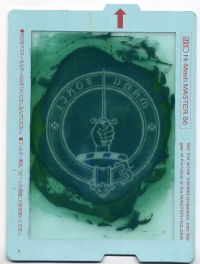
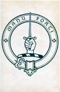
[gocco screen and finished card]
these are printed on a faintly patterned, thick card stock with a very light gloss that has not been folded, so they're more like note cards or postcards. in fact, this is from a batch of blank postcards i inheirited from chas when i got his letterpress.
so the only problem is that i had already sent my dad christmas presents by the time i made this and his birthday isn't till october, so i have a long time to wait until i can give these to him. :) still, i'm glad that's an idea that's now out of my head and onto the page.
the next simultaneous gocco print project will be in march. i have no idea what i'll be making yet...
posted by gl. | permalink | categories: printing
January 13, 2008
print gocco basics at the iprc
by gl. at 10:48 pm
it's been a busy time for gocco printing! gillian from half-empty press recommended me to teach print gocco basics at the iprc. i was a little nervous because i've printed a lot more on food than paper!
so after a bazillion questions and shu-ju's blessing, i taught gocco in december and january. fortunately, they both went well! the first class had wanted to do more fabric printing but the fabric kit had been misplaced, but even so i could tell i had some gocco converts. in the last class, the timing didn't feel as smooth as the first class, but i think it was still successful. ideally, some of the students from both classes will end up in shu-ju's advanced class later this month. :)
one of the things i'm really proud of is that i let everyone do their own project (most other iprc printing classes, including gocco, have them working in teams). i brought in my own gocco to keep the ratio of students/goccos low, because i think you learn things better and are more invested in the process when you get to work with your own art or on your own project. so i encouraged multitasking while waiting for the photocopier or the gocco, and it really seemed to work well.
there's always that wonderful moment when i pull the first print for my demo, holding my breath and hoping it does, in fact, print -- and when it does everyone gasps a little. truly! i love hearing that sound: the first time you see a print come off the gocco it's magic. :)
one of the interesting side effects for teaching is that i had to create projects to demonstrate the gocco. you'll be hearing more about those later...
posted by gl. | permalink | categories: printing
November 12, 2007
it's hip to be squared
by gl. at 2:11 pm
two weeks ago i attended shu-ju's "print with your food gocco class" at the iprc. some of you may remember what a fine time i had making poetry crepes at the edible book tea in march, so i'm always up to try more food printing! there was just one other person but i'm glad the iprc chose to run it anyway. the people who weren't in the class were simply astounded at what were were doing and kept taking pictures. :)
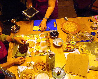
[trying lots of different printing surfaces (photo via shuju)]
we printed on fig newtons, mini pancakes, puff pastry, cookies, apple slices, and lunchmeat. i also brought homemade dessert crepes to print onto for sven's 36th birthday breakfast later in the week. crepes are a great printing surface, but i was really impressed with the clarity of printing on puff pasty! mini pancakes print well, too, and are very visually appealing objects (someday maybe i'll do one letter on each pancake. so cute!). shu-ju offered us a few different printing "inks": i was so happy with the peanut butter/chocolate syrup combination that i didn't try "shu-ju's secret sauce," a blend of nutella & balsamic vinegar (sweet & tangy!). the chocolate/peanut butter ink is easier to make and a better consistency than the one i created for the edible book tea, which was just chocolate syrup & powdered sugar.
this was my first time using our new laser printer to create a gocco screen! despite not blow-drying the print and forgetting to use the blue filter, the screen came out beautifully. that thrills me. however, i need to learn to put cardstock on the print bed when i'm flashing a screen, or the print bed pattern shows (fortunately, when printed, it's light enough that the ink spread just squooshes over it). to make the screens more durable and washable, we ripped the screens apart & taped them together. i wish i had thought about putting plastic wrap over the print bed for the edible book tea; it would have saved me a lot of cleanup!
btw, shu-ju wrote about the print with your food class a while back. :)
so i surprised sven with a "branded" birthday: i printed the 62 logo on breakfast, his present, the card & cake!

[crepes & puf pastry squared]

[reverse: crepes & puf pastry squared]

[apple squared]

[birthday breakfast squared]

[cake squared: no gocco, just icing]
posted by gl. | permalink | categories: classes & workshops, printing
November 4, 2007
pressing business
by gl. at 11:59 pm
october was a month o' letterpress! i got the chance to attend three letterpress classes in one week at the iprc:
how type is made
sven and i have had a crazy fantasy that between my love for letters and his developing metalworking skills, we might make our own type someday. after going to this workshop, i think we were cured of that notion. i was hoping for more explanation about what's involved in each of the steps of typemaking, but i now know difference between monotype & linotype, categories which were previously blurred for me. fascinating fact: the development of linotype apparently was what prompted the printer's union to accept women, who were frequently linotype operators.
introduction to letterpress
this is the class i've been trying to get into for months! i took this class a few years ago, before chas gave me his press, but i wanted a refresher because i knew there were things i was unclear on, notably in the lockup process.this class was very helpful in allowing me to solidify some of those concepts. i thought the point of lockup was to pack as much furniture into the chase as possible, so it became tedious and rather tetris-like. but the rule is furniture doesn't touch! you're looking for a pyramid effect, with the largest pieces out on the edges and the smallest pieces against the form. that will immensely simplify my lockup process (and hopefully give me better prints!).

["a sample of a most perfect lockup": click to see it larger]i am totally envious of this furniture storage case, as my furniture & reglets are in a giant jumbled shoebox:

[everything in its place]also, my little 3x5 kelsey doesn't use quoins, it uses metal plates (otherwise known as lockup slugs/lead). i had been using the long one, but not the short one! i hope that using both will immediately give me better prints, too. :)
i finally understood the difference between "packing" vs "make ready" in this class. i had entirely forgotten about the make ready process, in fact. print on a piece of tracing paper: this is your make ready. then puncture three dots through the make ready and the tympan to register it. put a tiny piece of tissue paper over the letters that aren't printing on the make ready, then realign it behind the tympan and print again. the tiny pieces of tissue should provide a tiny bit more pressure on those spots; it doesn't take much. check the results. if letters are still dropping, repeat the process.
miscellaneous: in addition, i was excited to learn about beaver engraving, a portland business who's willing to make magnesium plates from illustrator files for what i consider to be a reasonable fee.
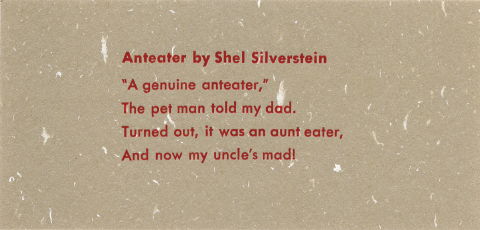
there aren't enough letterpresses for everyone, of course, so we ended up teaming up. because i've taken it before, i let my partner take the lead on most things. so this is her quote:
Anteater by Shel Silverstein
"A genuine anteater,"
The pet man told my dad.
Turned out, it was an aunt eater,
And now my uncle's mad!i "fixed" a grammatical issue (using "my" instead of the original "me") because i didn't know shel actually wrote it like that. oops. that extra comma after "turned out" drives me crazy, too, but that's original, as well.
i believe this is 10-point type but i have forgotten the face (darn!). 6 pt slugs on top & bottom, with at least an em quad on either side of the lines for stability and 4pt leading between lines (two 2pt leads). we used 5-to-the-em spacing because there was more of it in our point size than there were 4-to-the-em spaces.
care & maintenance of your tabletop press
this was a class i was very much looking forward to, and i was thrilled that they encouraged me to bring my own press in so i could work directly on it! i was determined to discover whether my press was defective in some way, so i'd finally know whether my unsuccessful printing attempts have been my fault or or the fault of the press. i don't mind if it's my fault, but i don't want to waste a lot of effort and frustration if it's something that could be easily fixed by noticing the press is missing a whoozits or by adjusting the whatzits.but it turns out my press is fine (yay!). all the pieces are there and are in good shape. i still need to clean it of the grime it accumulated after years of living through colorado seasons in a box under chas' porch. and i replaced the rollers before the workshop (from n.a. graphics in silverton!) just so that wouldn't be an issue. when i spoke with fritz, he said it was likely the pitting i had on the former composition rollers were actually little mice teethmarks! that's what hide glue gets you, i guess. i have rubber rollers now, thank you.
so because i brought my own tabletop press, it meant that everyone got their own press to examine, which i quite liked. i picked up some tips & vocabulary to help me talk about letterpress more clearly, like:
labeling & differentiating rollers, trucks & rails
locating the oil & oil holes in most presses (my tiny kelsey doesn't have any, though i'm welcome to oil the parts where metal meets metal. now i just have to find a tiny oilcan!)
labeling the platen/tympan bar (a "bale")
making sense of grippers (i had them on backwards and not tightened), though nobody has been able to tell me what the gripper bar spring does
discovering a whole pack of what i thought were dark postcards was in fact pressboard, meant to be used as packing
also: craftsman apparently makes good presses. kelseys are bottom of the barrel, but i don't care! also, i discovered that only 1/3 print area on any press is consistently usable, which on a 3x5 press is pretty substantial (gocco is like that, too: you get your clearest image transfer in the center).
finally, we adjusted the platen, a process i had done after consulting the manual, but that never seemed to have any effect. i found that it's probably because it's so sensitive: a quarter-turn of the screw can make a big difference.
i found this to be a fairly time-consuming & tedious process, in part because we had to set up a form to test it, and this made the class run about 1/2 hour longer than expected. but the process make a lot of sense:
set up four corners of a form with the letter "O," preferably in a larger type size. check to make sure all the type you're using isn't worn and is exactly type-high by using a type-high gauge (also handy for checking the depth of wood/linocuts). set the form something like this:
then you print (in this case, a dry print so we didn't have cleanup), see which Os are not printing, and then adjust the screw nearest the O a little bit at a time to see the effects. only adjust one screw at a time. repeat until all four Os are printing clearly. when you adjust the platen pressure, the standard is to set it for heavy stock, which is why you add packing for lighter stock. i wasn't having much luck with this part, and though we were running so far behind, the instructor still spared some time after everyone had left to make sure the platen screws on my press were properly adjusted. good thing you don't have to do that very often (once a year or less).
so i feel much more confident in my letterpress skills now. i really hope it makes a difference when i get a chance to print again!
posted by gl. | permalink | categories: classes & workshops, printing
October 20, 2007
artist's way guided intent (october) & misc book arts
by gl. at 8:38 pm
update 10.21.07: updated the planisphere link. thanks for catching that, sven!
two (!) tuesdays ago michaelmas & i went to the "vamp & tramp" trunk show at 23 sandy, which is a stunning collection of artist's books travelling around the country. michaelmas was impressed with "true to life" by julie chen. i loved a book called "read" whose pages were initially red but would turn white with exposure to heat, so while holding it and reading the primary story, another story would be revealed beneath it.
--*--
the next day, wednesday, was the october guided intent here at the studio. the rainy season prompts us to turn inward, which is a good excuse to literally try to "find yourself" by creating a lifemap. lifemaps are a way to visually explore relationships between the people, places and events that have been important to you.
in what i think is a studio first, bridget wrote about her lifemap on her blog! i've never known anyone to write about these events on their own sites when they leave, so this delighted me. it's good to know this stuff is actually happening and i'm not just making it all up, right? it's good to share the consensual hallucination. ;) plus, it's really lovely to see more insight about a piece develop over time. in addition to lifemaps, this month birch won a metallic marker to gild the edges of autumn leaves, and everyone went home with a wish token in their pocket.
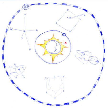
[planisphere: click to see more lifemaps!]
i was obviously hugely influenced by the most recent book i've been reading: dava sobel's the planets. i almost always love astronomy books, but this is beautiful, beautiful, beautiful. i found myself marking almost every page. it's poetry. it's what i want to be when i grow up.
so i created a little planisphere here: since the format is naturally meant to mark change over time, the "constellations" represent variously "ascending" art-parts of my life: theatre, poetry, computers, calligraphy & facilitation. in the center is my "solar system" at the studio. i very much like this concept; there's a lot more to explore here!
--*--
i still want to write about the open studio/collage night we hosted a couple of nights ago, but the next studio event is another guided intent: "possibility," where we'll use a variety of fortune-telling tricks as writing prompts. we'll create poetry using coins, cards, cookies & tea leaves!
then we'll host our first 2-day workshop: not just a pretty face. we hosted this as a 1-day workshop last time and decided there was so much to cover it would be better as a 2-day workshop, so you'll have plenty of time to study the masters and create rough drafts the first day, then come back refreshed and ready to dive into your final painting the next day!
posted by gl. | permalink | categories: artist's way, exhibits & events, printing
August 22, 2007
ocac: "pushing the gocco envelope"
by gl. at 3:28 pm
last week i assisted shu-ju wang, local gocco artisté extraordinare, with a 3-day class she taught at the oregon college of art & craft, "pushing the gocco envelope."
the class was pretty packed, so in addition to handling questions, i tried to be invisibly helpful: i brought in a bunch of supplies to share when we were running low, i took pictures for shu-ju, i staggered my work/lunch times so there was always someone available to answer questions, i took half a day to spend with people in the computer lab, i pulled an extra print for the person who let us use the computer lab, i cleaned the classroom even better than it was when we started. i tried not to ask too many questions myself, and i tried not to even wince when the students voted to come to class an hour earlier, even though i live on the opposite side of the planet as ocac which made for some long days.
it definitely felt different to assist a class than to facilitate one. i kind of liked it; i could be helpful without being the ultimate authority or having as much responsibility. just like at my art events, though, i was worried that i wouldn't actually be able to finish making the art! i started off slowly as people needed more help earlier on in the process, but fortunately i caught up on the last day.
i've owned "little miss gocco" for a couple of years now but have done regrettably little with it other than note cards and poetry crepes. so beyond the altruistic desire to assist a fellow artist, i was happy to get the chance to do more goccoing! unfortunately, my computer had a fatal hard drive crash on the first day of class, so i had to create something fairly simple quickly on sven's laptop.
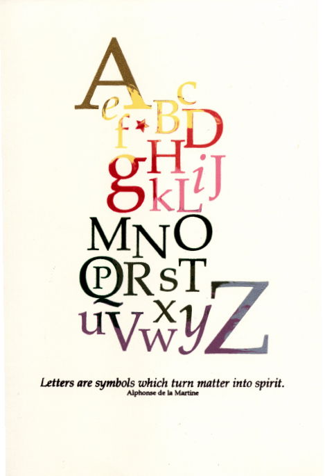
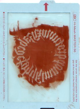
[letters are symbols which turn matter into spirit]
this print took two gocco screens (which was the point of the class, to create a piece bigger than the standard b6 print bed). the "a" is in gold, "the "z" is in silver. the darker parts in the middle are actually 3 different colors of green (the bottom is brown). if i was going to do it over again i'd reverse the color on the bottom screen (leaving brown as the base color).
i didn't pull any prints i thought were completely perfect, but it was good to do it with shu-ju around. for instance, i was surprised to find i wasn't using enough ink a great deal of the time, even when it felt like i had a lot. i also discovered i press too hard. i wasted several prints by not using the mylar registration technique (lesson learned!). but the marbling happened mostly the way i imagined, even if it took a lot of test prints to start the ink migration process.
at the end of the class we hosted an exchange, where we got a copy of everything everyone else made. whee! that's one of the best things about printmaking! there were some delicious prints, cute cards, and imaginative booklets.
posted by gl. | permalink | categories: classes & workshops, printing
June 17, 2007
here it comes again
by gl. at 10:52 pm
very exciting news! paper source will be carrying goccos again (as early as the end of the week)! i'm thrilled (and frankly, a little surprised) that it came back!
the paper source price sheet almost knocked me down, though: "little miss gocco" cost me about $250 a year and a half ago, including a stamp kit, extra screens & bulbs, and one of almost every ink imaginable. i don't think i would buy a b6 gocco alone for almost $400. still, i'm glad people have the choice to buy one now! i know the attachment is almost irrational. :)
[edit: ah, i see. it's for a fairly advanced pg-arts machine. which is pretty cool & all, though i'd like to see an option for the entry-level b6.]
posted by gl. | permalink | categories: printing
May 11, 2007
alpha particles
by gl. at 9:00 am
yes. this is why i love letterpress.
posted by gl. | permalink | categories: printing
March 31, 2007
the comeback kid
by gl. at 11:40 am
exciting news! gocco is likely to make a comeback this summer!
"march 29, 2007 i've spoken to a reliable source at the certain u.s. retail chain mentioned below, who has confirmed they have worked out a deal with riso japan to import b-6 or b-6 compatable machines and supplies to the u.s. for their own stores. some of the supplies have already arrived at their warehouse, and they hope to roll out the complete system, classes and a media campaign this summer. until everything is in place, they prefer not to be identified."
i'm amazed but exceptionally pleased; i was pretty sure this wouldn't happen. i just hope the retail chain realizes that those of us who bought a TON of supplies when we didn't think it was coming back probably won't be buying more for a while. so if sales start slow, i hope they hang in there!
posted by gl. | permalink | categories: printing
March 29, 2007
eating poetry: gocco printing with chocolate
by gl. at 11:40 pm
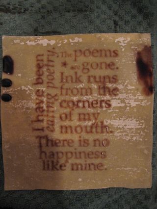
for the edible book tea, i had a lot of different ideas, but the one that gave me the most pleasure was doing some sort of interactive edible printing project. i wanted everyone to print their own or mark their own edible item. i was thinking of doing a "jello journalism" setup, like a hectograph. while researching that possibility, it suddenly occured to me that a gocco would be even better! and boy have i been looking for a good gocco project!
for those who can't wait for the punchline, the basic recipe for the chocolate gocco ink i used is hershey's syrup mixed with powdered sugar until it reaches a consistency similar to that of riso ink. it was perhaps a 1/4 cup of syrup to 5 or 6 heaping tablespoons of powdered sugar. i tried several different formulations & chocolates and that was the best one (and the most reproducible). the "ink" will thicken in the refrigerator; it's better fresh and at room temperature. but the other secret was crepes. wonton wrappers didn't work nearly as well for a good impression. i didn't try other mediums once i found crepes, so there may be other surfaces that work well. the sweet crepe recipe seems to have worked slightly better than the savoury crepe recipe.
the whole process took me about a week to nail down (roughly 15 hours). i could only work on it "after hours," when all my other work was done, which often meant i was testing after midnight. here's how it all went down:
day1: buy egg roll & spring roll wrappers at uwajimaya. pick poem, create poem layout in illustrator, photocopy poem, set up gocco, burn screen. make chocolate sauce from melted chocolate chips, test print on egg roll wrapper. the chocolate is much too thick, wash screen. test prints w/ hershey's chocolate syrup (3 different kinds!), but the syrup is too thin. the screen breaks apart under all that washing, so i burn a new screen. begin to wash screens much more carefully. test print w/ hershey's syrups most promising, but i think the type is too small. reset & adapt poem to configure for larger type, photocopy, burn new gocco screen. test print w/ hershey's syrup: words are forming, but i'm not thrilled. attempt to toast egg roll wrapper prior to printing & burn it. toast another egg roll wrapper. test print w/ a mix of chocolate syrup, cocoa powder & powered sugar. better print, but the toasted egg roll wrapper crumbles and gets all over the place. test another print on plain & toasted egg roll wrappers. test print on spring roll wrapper (blech!!). i care a lot that this is actually an edible book. take a short nap, clean up kitchen, fret. (end at 5 a.m.)


day2: think of using crepes! thanks, sven!
day3: make 2 savory crepes to test, realize i don't have enough syrups to do much more. when i try to mix the syrups with cocoa and thin with water, it squishes out the edges of the screen -- but it prints one good print on the darker side of the crepe! a true success! make 10 more crepes. make another batch of ink with the rest of the syrups & powdered sugar. 5 successful prints in a row! leave the rest for tomorrow's tests, clean up kitchen. feeling cheerful. (end at 3 a.m.)


day4: pick up an extra bottle of hershey's syrup & a jar of papa haydn's chocolate sauce after visiting michaelmas. i didn't even know papa haydn's sold its chocolate sauce in jars. while smooth and decadently delicious, the sauce doesn't print at all, even if thinned w/ milk. it did have the highest proportion of actual chocolate of all the sauces available on the shelf at zupan's: is particle size an issue? it also squishes and gets all over gocco press (though the syrup also gave me that problem). feeling frustrated. wondering what my plan b is. clean up kitchen. amazed the screen seems to still be holding. (end at 3:30 a.m.)

day5: make cherry pi for 3/14! (related only in that i had to wait till that was done to work on the "eating poetry" project.) after the total non-success of the premium chocolate sauce, am glad i bought the extra hershey's syrup. this was, happily, the easiest day yet: i created more ink from about a 1/4 cup of hershey's syrup and 5 or 6 heaping tablespoons of powdered sugar. i finally think to apply a very thin layer of sauce, which works like a dream! no squishing out the sides, but continues to have even coverage and am able to pull multiple prints. the crepe sticks to the screen and must be peeled off, pulling very thin strings of syrup from the letters. neat! use up rest of crepes: i now have enough pre-printed crepes for plan b, which simply involves picking a crepe & eating it rather than everyone printing their own -- but at least there's still poetry involved! write some of the process down. clean up kitchen & gocco. (end at 2:30 a.m.)

day6: cut waxed paper to cover print bed. set up studio for edible book tea. print poem & art onto paper so people can see the source (but then i leave them on the printer!). make blank crepes w/ the sweet crepe recipe instead of the savory crepe recipe. these turn out lighter in texture and may even make better surfaces (carmelization?). to make the printing side dark enough, i leave it in the pan for 1.5 minutes. am finishing the crepes minutes before the event is set to begin. at the event, i describe the project, pray, print... hooray! a beautiful print! when i let others print, the results aren't as good, but i can't tell what they're doing differently. they fill the printed crepes w/ strawberries & whipped cream, though, and it's so delicious it hardly matters. (end at 3 a.m.)


wrap up: i am pretty pleased with the way these turned out, though of course i'd like even better, more consistent coverage. maybe what i'm really looking for is a chocolate embossing technique. :) i printed about 25 of these crepes for the event without evidence of clogging, though i have no idea how many more i could have gotten out of it. as far as i can tell, the screen is still usable. thank you, gocco!
posted by gl. | permalink | categories: printing
February 9, 2007
more letterpress experiments
by gl. at 12:40 pm
so in the spirit of many small experiments, i had an inspiration about how to check if the rollers or ink was one of the problems in my last letterpress attempt: i took the form out, inked it with a stamp pad, and tried an impress. strangely, many of the letters were crisper and more detailed than they had been with rollers, but it didn't solve my basic problem, which is that half of the letters aren't really showing up at all.
so i tried tightening the screws on the platen and adding more paper under the tympan to no avail. i finally even pushed the offending letters out obscenely raised above the other letters, and it had no effect. how can that be?
posted by gl. | permalink | categories: printing
February 4, 2007
speed letterpress
by gl. at 11:59 pm
tonight i wanted to see if i could create a "speed letterpress" card in under an hour. i wanted to make a birthday card for a friend before we met her for dinner. this was an incredibly silly idea, considering i have yet to pull a good print from the press. but i thought it would be a noble attempt, and if it worked it would be a grand gift!
it didn't work, of course. it almost worked, but i couldn't get a good imprint: many of the letters on the right weren't printing well, and i didn't really have much time to adjust it before i had to go. the composition was easy & fun, but as usual, the arranging & locking of the form took most of the time. in this case, because it was an irregular block, it was exceptionally difficult to fit the furniture & reglets around the letters so that they would remain flush and firm in the chase. also, i was using one decorative cut that was slightly smaller than the letters.
oh, well. i'm still glad i tried instead of waiting for the next perfect 4-hour block of time, which looks like it won't happen till thursday. the good news is that even though i had to leave the press for about 8 hours with ink still on the plate & rollers, when i returned i was still able to wash it off w/o much fuss, even without citrisolve. it looks like simple green & a microfiber towel will do the trick!
(by the way, bad news: i only have 3 s's in this style, which means i can't actually spell "scarlet star studios"! but i have 9 r's for some inexplicable reason.)
posted by gl. | permalink | categories: printing
February 1, 2007
soiduts telracs
by gl. at 11:59 pm
first letterpress prints! alas, it was not as complete of a success as i would have hoped.
first i had to sort throught the typecase of the type i chose to resort everything into its appropriate cubby and discover what letters are missing. it looks like the largest quad i have is an em quad. not many coppers/brasses, either.
composition is easy and fun. the part i was dreading is, in fact, the part i like least: arranging and locking the form. the furniture is like playing evil tetris and it takes me two or three times as long to it as it would probably take anyone else. once i sorted it into similar sizes that helped a bit: i need a beter way of storing/sorting the furniture & reglets other than a jumbled box.
so finally, my first print:

what's wrong here? :) reversing the letters is such a classic mistake it was really funny.
let's rearrange the letters, shall we?

ah, that's better. sven got one of the mirrors i use for the blind-contour drawing exercises so i can always check the orientation, though i suspect i'll get better at this over time.

but this is the best print i could get out of dozens of tries. much more of them were like that second one, and even this one is lacking in clarity and detail. one of the big problems is that awesome star cut in the middle, i think. it's actually a cut nailed to a block of wood, not a solid chunk of lead like the others. so i think it's just the sliiigggghhhtest bit too tall. this means the letters to either side of the star aren't getting enough ink or impression, i think. even planing didn't help. this frustrated me so much i ended up adding enough underlays to the back that the chase finally fell out of the chase bed. i hope i can sand the wooden block down a bit. in the meantime, i'll try using the word "star" next time instead of a cut, but how can i resist this star?
i wasn't sure how cleaning would go, but i am pleased to discover the ink and the press is easily cleaned with liberal use of a weak simple green solution and judicious use of citrisolve, both of which i consider only mildly toxic at worst. (i use the simple green for cleaning gocco screens and the citrisolve for transfer prints.) the question of cleanup had been worrying me because i really wanted to avoid a pile of kerosene-soaked rags. with safety boy on my side, i didn't want to have to install another fume extractor. ;) sven's already already worried about the toxicity of lead type. also, i bought some lava soap which works great for taking the ink off my hands.
further review:
how do i know if it's the rollers? when will i know i need to replace them?
i was surprised to discover how easily the ink bled through to the other side. i thought this was reasonably good paper, but the star and some of the letters can frequently be seen on the reverse. is there something i should know about the paper & ink combo for letterpress? that was one of my least favorite issues w/ calligraphy.
i have no idea how old this letterpress is. it's an adorable kelsey excelsior 3x5 tabletop press, and a note i found in chas' things indicated it may have been made around 1945. how do i find out?
posted by gl. | permalink | categories: printing
January 27, 2007
quality time
by gl. at 11:56 pm
i spent today with the letterpress! i desperately wanted to take another workshop at the iprc, but the letterpress classes fill quickly, and by the time someone responded to the email i sent, they were already full. i had hoped the phone call that woke me up this morning was them calling to say a spot had opened up, but whoever called didn't leave a message.
so i decided to make today a letterpress day, anyway. it's been quietly sitting in the studio kitchen for months (*cough*years*cough*) and one of my new year's resolution is to spend more time with gocco and letterpress (and less time with calligraphy).
so much of the inertia around the letterpress is still not knowing exactly what i have and don't have. chas owned Artemesia Press when he was younger and was kind enough to donate the letterpress & accoutrements when i stopped by on a trip to colorado a couple of years ago. it had been stored for years in less-than-ideal conditions and just getting the stuff put away was a huge deal. but i still haven't found the time to sort through -- or identify -- all the pieces yet.
so i read through all the manuals & documents, matching what i was reading to what i was seeing on the press. i reseated the rollers and made sure everything moved like it seemed like it ought. i thought one of the grippers was missing but i found it later in a box of random metal bits and replaced it. i moved everything into new boxes and packaged like with like. i repackaged all the decorative cuts into one box with lots of little cups to group related cuts together. i found the furniture and the reglets. i found the chase and even managed to fit it on the chase bed. i tested all the inks, which are in remarkably good shape.
most importantly, i finally unpacked the four typecases which have been living in the studio oven, a task i had been dreading because they are dirty and heavy and have so many small bits floating around inside. i was delighted to discover that they are, by and large, in much better shape than i expected. three of the typecases were wrapped together: two of those are in excellent shape, the other is rickety but okay. but the fourth was exposed to elements and bugs and dust and it's really a mess; i don't know what to do to clean it. finally, i also have an egg carton that seems like it contains another set of type, and a small glass jar which has even more type; i don't know how i'll deal with those yet. and while i haven't thoroughly checked the type assortment, in general, the type seems relatively intact. lot of italics for some reason. :)
i could still use a planar and i suspect i'll need to order new rollers, after all; the replacement rollers are pitted and a little gummy. but at this point, i'm finally ready to assemble type and put it in the chase!
posted by gl. | permalink | categories: printing
June 21, 2006
addict
by gl. at 2:00 pm
man, carl totally knows how to reduce me to a little puddle of musty drool. he furled a link to bibliodyssey's zoomorphic calligraphy, which writes about arabic calligraphic forms:

this isn't much different than the tradition of elaborate spencerian animals, except they rarely contain words:
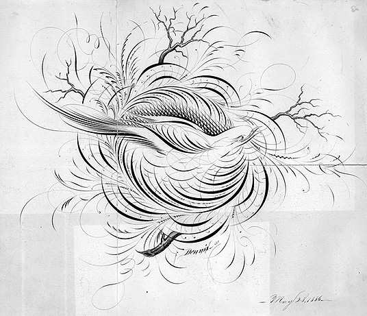
at any rate, the entire bibliodyssey site is worth adding to my accumulated rss feed; maybe if my book fetish is fed a little at a time i can stop binging. ;)
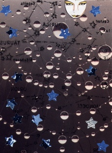
this reminds me that i've been meaning to write about the other rare-book sites that absorb me for weeks, rendering me unable to do actual work until i have seen all the images and put them in a safe place to use for later inspiration. the most amazing of these, if you love star maps as much as i do, is the us naval observatory rare books collection, which includes bayer's uranometria (1661) and the atlas celeste de flamsteed (1776), along with pix of the glass plates used to record the transit of venus in the late 1800s.
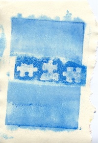
and the collection of anatomical plates at the university of toronto took me about a week to get through, but i recently made a gocco screen from one of its pieces...
posted by gl. | permalink | categories: calligraphy, links, printing
June 2, 2006
bloom
by gl. at 11:21 am
according to "websites as graphs," this is what an html dom analysis of this blog looks like:

[click to see a larger version]
What do the colors mean?
- blue: for links (the A tag)
- red: for tables (TABLE, TR and TD tags)
- green: for the DIV tag
- violet: for images (the IMG tag)
- yellow: for forms (FORM, INPUT, TEXTAREA, SELECT and OPTION tags)
- orange: for linebreaks and blockquotes (BR, P, and BLOCKQUOTE tags)
- black: the HTML tag, the root node
- gray: all other tags
pretty, eh? i'll have to make a transfer print of it at some point, i think. :) see more websitesasgraphs on flickr.
(via kyrie.)
posted by gl. | permalink | categories: links, printing
May 29, 2006
intermission
by gl. at 2:01 pm
let me quickly talk about two things:
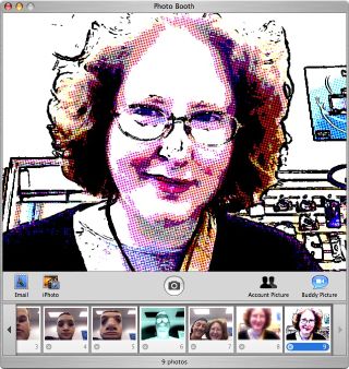
first, on saturday i went to a gocco "flash and swap meet" w/ shu-ju wang, the local gocco expert. she's got a riso sp-275 flash unit that doesn't require the cute little flash bulbs. i flashed some new screens, but i didn't actually print much: i should have asked if anyone needed something goccoed! one of the screens i flashed was this picture i took of myself via photobooth at the mac store just the day before:
it looks like the "flash & swap meet" might be a regular thing, so next time i want to remember to bring scissors, tape, treats, and um, paper to print on. :)
second, when i look at the logs, i often wonder who "weefeelfine.org" is. thanks to drawn, i now know: we feel fine gathers sentences from thousands of blogs to construct how the internet is feeling. you get to see the data in several ways:
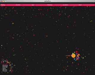
this is a format called "madness," with each point being a written feeling from someone -- or ocassionally, a picture. here's a picture with its blog text superimposed onto it:
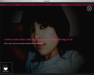
[i mean most days i feel fine im okay nothings wrong at all]
if the radiohead from "ok computer" and "kid a" wanted to make a website instead of an album, this is what they'd make. if i haven't made it sound interesting yet, then i'm obviously doing it wrong. go look!
posted by gl. | permalink | categories: links, printing
April 16, 2006
happy easter from scarlet star studios!
by gl. at 11:38 pm
we hardly ever refuse a reason to celebrate a holiday; we colored organic eggs and hid gifts inside little plastic ones. it gave me a chance to play w/ the little letter stamps sven got at harbor freight, thanks to a great tip from a woman on the se portland artwalk. this won't make sense to most people (it's based on a story of eggs who dream of being something else), but i find it charming, anyway, especially when it's emerging from a very small plastic egg:
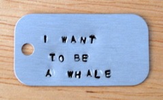
i used the 1/16" metal stamps on an aluminum dog tag, then rubbed the letters w/ black acrylic and wiped the excess away. does anyone know what jewellers use on letter-stamped bracelets?
posted by gl. | permalink | categories: miscellany, printing
March 11, 2006
won't go slow so's not to focus
by gl. at 11:09 pm
hey, look! a non-creata entry! instead, a day packed with art activities:
i was going to go see shu-ju's work in the most recent print arts northwest show, but when i went to check on the address i realized they were having a fundraiser & demonstration at barnes & noble, so went to pick up one! hundred! demons! and visual journaling: going deeper than words. which worked out well, because we got to talk to shu-ju who helped sven figure out how to build a larger registration plate for the gocco, and i found out laurie is still selling gocco supplies.
on our way to collage to take pix of the show, we dashed into foster & dobbs, a food store i've been wanting to check out w/ sven. we walked away with caramels, cheese crackers & a japanese-inspired chocolate bar w/ ginger, wasabi & black sesame seeds.
we finally got pix of the 4x4 show! the owner remembered me and asked me about the inquiry from the OCADSV, but alas, i haven't heard from them yet. i'll follow up w/ a phone call this week.

4x4 display
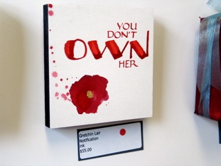
"notification"
i also submitted a piece to portland modern's "saturation" issue today. i sent one of the star-based printmaking pieces i made last month:
"atlas céleste," named after discovering some amazing rare books at the us naval observatory library collection sitewe stopped by the ace pearl hardware store (16th/glisan) because sven has been wanting to check it out and he was on the hunt for a tiny tap, anyway (4-40, for those for whom such details matter. making your own threaded holes is still magic to me). it looks to me like they have many of the same things as uptown hardware, which i adore, but it's closer to the creative job club so i may stop there more often.
then we had dinner at pizzicato w/ michaelmas, and then we all headed to...
nochnoi dozor (link in flash, sorry). i had very low expectations of this movie but found myself enjoying it immensely: excellent cinematography, intriguing mythos (i love the Gloom), artistic subtitles and room for replay. there was even a buffy reference (and you haven't lived until you hear buffy say "get out!" in russian).
also, on friday i checked out the ceramics show "about place: the signature of a kiln" because it was in the mt. hood community college art gallery which is right next to my calligraphy class. one of my artist's way independent study students is a ceramicist and is almost giddy at all the nceca activity this weekend.
i have two and a half more creata sessions to write about & need to prepare for my tax appointment monday. but tonight, now, sleep!
posted by gl. | permalink | categories: calligraphy, exhibits & events, printing
February 19, 2006
printmaking party
by gl. at 11:07 pm
last sunday i got invited to a printmaking party by a woman who attended a previous artist's way open studio, and other than gocco & letterpress i don't have a lot of experience with traditional printing techniques, so i was very much looking forward to it. i expected to use use the large shiny wheeled press more than i did, but really it was simple monotyping that i really enjoyed.
monotyping involves painting a piece of plexiglass with a design, then laying a piece of paper over it and using a rolling pin to apply pressure. using the "get through your first 50 failures as fast as you can" rule, these are the first two monotypes i created while everyone else was trying to create the perfect one:
 2.
2. 
we used Rives BFK for the first batches of prints (and random paper later as supplies began to dwindle), which has a high rag content and is a beautifully creamy, lightly textured, thick, soft paper. we soaked the sheets for 10 minutes because we were using water-based pigment (gouache & watercolor crayons) and it helped lift the print from the small sheets of plexiglass. also, soaking the paper allowed the plate to create a luxurious emboss on the print.
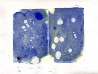
emboldened by the ease & speed of making monotypes, i tried more. i've been wanting to make more stellar-themed art, so i brought out a copy of a star map from 365 starry nights (which i cannot recommend highly enough as a way to learn the night sky, and it's the same map i used in "web"):
 4.
4. 
i love these. they didn't come out as expected, but i think they're beautiful. i'd lay the plexiglass over the part of the sky i'd want to print, paint blue first and swirl it around, the paint the stars in. except once the blue is on, it's very difficult to see the stars and monotyping is an imprecise process with a lot of spread. so these are more impressionist than print, but i'd like to think they have the same spirit as van gogh's starry night.
then i tried using two plates w/ the same technique:

6.
the second one is a ghostprint of the first, printing what was left on the plate after the first print. i like these, too; they have a flavour of those tinted images you see from nasa, or nighttime infrared images.
but i still couldn't identify constellations and chalked it up to the vagueries of the monotype process: i hadn't quite caught on that monoprints are a reverse printing process (that particular detail almost always eludes me because my 3d spatial ability is poor, and positive printing is one of the reasons i love gocco so). so when i made a G on the next piece, it came out backwards and i salvaged it by stamping letters over it.

yes, i know it looks like "kidneys" rather than "kind eyes." i was going for an awkward justification effect where the letters simply fill the space without spaces or punctuation, and it would have worked better if the upper lines were more consistent.
so i tried a backwards G on the plate but then painted over it with another water-based medium, which obliterated it. still, it made a nice texture, and the colour intrigued me enough to try a plant-based print with it:
 9.
9. 
i tried a couple of different plant-based prints i'm not showing here, actually: the others were too thick and i couldn't apply enough pressure to get them to print -- and when i used the large shiny press, i forgot to add my paper, and so printed onto newsprint! (and the print still didn't come out). however, another woman made a simply stunning print of a small pine branch, so i know it's possible.
i tried more dimensional objects, and the puzzle pieces below did the same thing: the wide swath of white in the middle is where the puzzle pieces didn't print. so i tried an overprint: i removed the puzzle pieces and printed the swath of paint still left on the plate. i didn't line it up very well, but i like the asymmetry of it. if i can find decent lowercase letter stamps (they're all uppercase or overly quirky stamps), i'd like to print "i want to know" on this piece.
 11.
11. 
at that point my brain was full, so my last piece was this pink & red checkerboard. check out that spread at the top! sheesh! also, you might notice how incredibly, um, off-kilter these pieces are becoming; it's a trend that begins early enough on that i ought to have corrected for it, but i didn't notice until it was too late and then couldn't figure out what i was doing wrong, so i want to be more careful on the next round.
i can't believe i walked out with almost a dozen prints! now my problem will be deciding what to sacrifice to attempt lettering on them...
posted by gl. | permalink | categories: exhibits & events, printing
December 17, 2005
don't go, gocco!
by gl. at 8:32 pm
 kyrie told me that gocco is "going out of print" as it were, and will cease production on machines & supplies. i really didn't want to believe it after just spending an abundant amount of money on a setup about a month ago, and having to project the expense of hoarding screens & bulbs for the forseeable years is making my eye twitch.
so i tried to contact the portland gocco rep but never heard back from her, so i tried shu-ju wang, whose energy & talent finally propelled me into getting my own -- and she confirmed the dreadful news.
there seems to be some hope that another manufacturer will pick up the patents or manufacture supplies. i have no idea how feasible that really is, but if i had any ideas on how to actually make that happen, i would be happy to try. in the meantime, i finally (!) joined the gocco-printers group and am participating in the "save gocco!" campaign. what else can i do?
posted by gl. | permalink | categories: links, printing
December 6, 2005
mhcc calligraphy: class 9
by gl. at 11:26 pm
when xmas & blogging collide: we create gilded versals at last week's mhcc class. guess who's getting a gilded versal for xmas? :D fortunately, i'm guessing michaelmas will find the information here interesting & worth "tarnishing" the surprise. the scanner doesn't show shine so well, though. ergh.
this is considered in draft status until i clean up the edges, reoutline it & burnish it. gilding looks easy, but of course it isn't. it's time-consuming & fussy & messy. even with fake gold leaf kits (as opposed to shell gold, which is more authentic and costs proportionally more), there are several laborious steps after you draw your versal:
- bulk up a layer of gesso
- let it dry
- add a layer of adhesive
- let it dry
- no, really. let it dry. or when you add gold leaf, it will come up, and you will have to lather, rinse, repeat.
- when tacky, gently float a thin sheet of gold leaf over your piece, trying to get as few wrinkles as possible
- place a piece of paper over it & burnish w/ a bone folder, trying to get the gold leaf to cover all the adhesive elements
- brush off the leaf excess with a softsoft brush
- scrape up the edges of ragged gold and excess adhesive w/ tinytiny xacto strokes to expose your versal lines
- brush away all the bits
- re-ink
- place a very soft cloth over the piece and use a burnisher (or a bone folder) to make the bits shine.
- keep burnishing
- keep burnishing
- pause
- keep burnishing
- tada! pretty, huh? breathe. try to focus anywhere further away than your nose.
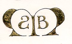
when i created this versal at mhcc, it was originally an asymetric design w/ just an M and a B in its right counter. but i drew it on a separate piece of paper because i don't feel confident enough to draw directly onto an original. i rarely do. then i did a basic graphite transfer -- which reversed the B and became the basis for the backwards S (michael's middle name is stuart). i loved the balance & playfulness this created. sweet, sweet serendipity!
also, i was inspired last week to create an artistic response to a political issue (alas, this is one case i could have done without inspiration, though):
this is also a draft, but i see a lot of potential in it. that's four different colors of red ink.
and we don't usually post links (why not?), but here are two i find totally worth mentioning:
keri smith posts a template for a "magic book," which is how marti has us make the abecedariums at the beginning of each term. i'm thrilled to have the instructions because i can just barely do it when marti's there to show us, and it is definitely a cool technique to know.
the gocco is definitely my kind of cute & convenient, but this "cheap screen printing tutorial" wins super mega bonus points for being clever, easy, cheap & equally non toxic.
posted by gl. | permalink | categories: calligraphy, classes & workshops, links, printing
November 15, 2005
go go gocco!
by gl. at 11:12 pm
i succumbed! the charming little gocco has won mon coeur and a spot in the studio's kitchen & printing shelf. i bought little miss gocco (or as sven calls her, "baby") at last night's portland society of calligraphy meeting, since the woman who owns letters and print (and who has been a calligrapher for years) was demonstrating them. i walked away with an embarassing number of inks & supplies, but i began printing tonight after artist's way!
i began with our logo and immediately hit a snag: though you can print multiple inks on one screen, it's a lot easier to do when your bits aren't so close together, like the stars next to the text and the streak behind the scarlet star. this is especially difficult when working with the logo at a reduced size, like one would want to print on the back of those cute blind contour cards i just created. :) i get about 10 out before the red or the silver really begins to creep into the wrong places. i bought some ink block, but i can't cut the foam finely enough to wedge between some of the spaces and instead just end up blocking bits of the screen.
in the blind contour drawing print, the migration of colors is part of its charm. the logo, though, suffers when silver stars become scarlet and vice versa. i suspect i will have to create two screens for the logo (one for silver & one for scarlet), which is a shame because it will require drying time between screens and careful attention to registration to print the logo on anything -- which likely means i'll be less inclined to do so. meh. this is, of course, my curse: to take something that is incredibly easy and immediately discover its limitations. :)
the good news is that creating the screen was super easy. none of it is difficult; in fact, it's amazing just how easy it is. and i still love the tiny explosion.
posted by gl. | permalink | categories: calligraphy, printing
November 14, 2005
pan: holiday gocco printing
by gl. at 4:04 pm
eeeeee! yesterday i finally got to take a gocco class w/ shu-ju wang, something i've been wanting to do since the portland open studio tour. she even recognized me, due also in part to my subscribing to her gocco print test lab, pudding. (mph, why do all the best things have "pudding" in them? maybe sven & i should rename ourselves "scarlet pudding studios.")
print arts northwest hosted the workshop and fortunately (for us) there were few enough students so that we each got our own gocco press. i took a gocco workshop at the iprc several months ago, and as much as I (heart) the iprc, shu-ju's class had a lot more hands-on time and i walked away with a more complete picture of the whole process (but then, it cost 4 times more, too).
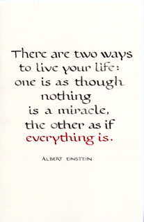
i totally missed that this was supposed to be for "holiday cards." i wanted to use the einstein piece to create cards, but its subtle tonal variations make lousy photocopies & therefore lousy gocco screens (i could play w/ the contrast in photoshop or iphoto, though, i think). so instead i used my blind contour self-portrait, leaving enough room beneath for a little calligraphy. when i used just black ink, it didn't look much different than a photocopy, but when i used three colors it was much better. (using different inks on the same screen is one of gocco's many advantages compared to traditional screenprinting.)
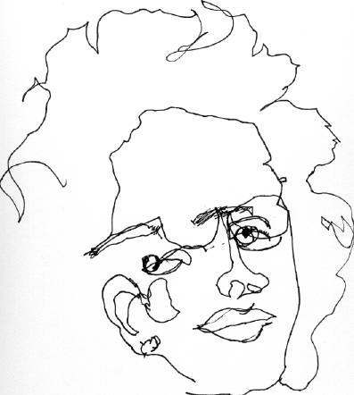 | 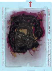 |  |
| [original] | [gocco screen] | [gocco print] |
so now i have 21 small cards in white & mustard (the gold ink disappears at the right angles on the mustard card, making most of my face disappear) and 12 small portrait-sized pieces i don't know what to do with yet. (though i suspect my parents will get one for xmas. good thing they don't read this, right? ;)
gocco competes with letterpress for my attention (and my limited $ for supplies): i adore handling type and the feel of letterpress pieces, but gocco is much quicker, easier, more versatile, and more importantly, a lot less toxic to use & clean up. i suspect gocco will win, at least in the short term.
posted by gl. | permalink | categories: classes & workshops, printing
August 28, 2005
renovations
by gl. at 9:06 pm
we consolidated a lot of art supplies in the kitchen, in part because our potential storage is underutilized, in part to help give sven some space in "the lab," and in part to share the often-duplicate supplies we have like glue, tape & markers. so some of the kitchen cabinet doors came off and the art we were storing in the bathroom came to live in the main house and the pantry was rearranged.
additional good news: sven hammered the letterpress arm that was bent enough for me to replace the rollers! i suspect these rollers aren't any good anymore because they're gummy, but i'm glad it's now a complete unit. i still don't have a good letterpress setup yet, but this is a huge step closer than i was in march. i am amused to note that the typecases for the letterpress fit perfectly in the oven; finding places for the letterpress supplies & the power tools gives us a lot more counter space.
things that still need to be solved:
- we only have one shelf left in the flat files that isn't designated for something
- my poetry & plays are still living in boxes, though we moved them to the bathroom
- the tools are lots better, but they really need a more permanent home
- we need a better system for cloth bits
- some of the kitchen cabinets are mysterious shapes that wait empty until we figure out what could possibly fit there
- non-shareable things for artist's way & open studio should be marked such or moved
- a better bed/couch system for guests or just hanging out
- i'd really like to see the main room painted
posted by gl. | permalink | categories: printing, studio space
May 27, 2005
1000 monkeys w/ 1000 typewriter ribbons just make a tangled mess
by gl. at 12:33 am
an exciting day here at scarlet star studios: with some spurious disassembling, sven has managed to replace the typewriter ribbon for the old remington noiseless i have! well, i'm excited. and just in time for the cacophony party, too, if i want to go. but it's great just to get clear, legible letters out of it, and i got a dual-color ribbon, so i can get black and red out of it. oooooooo!
posted by gl. | permalink | categories: printing
May 11, 2005
iprc: gocco printing
by gl. at 9:14 pm
tonight i went to iprc's gocco printing class. i've been interested in gocco printers since the summit scribes had a christmas card exchange and many of the fabulous ones had been printed with a gocco printer.
making a gocco print is like creating a cross between a silkscreen and a stamp, but also endearingly includes a tiny explosion: first you create a screen based on a photocopied image, then dab ink onto it, then squish the screen against the object of your desire. several times. you can get a heck of a lot of prints out of an inking. afterwards, it looks like this:
a used gocco screen
a gocco print: bronze ink on sage linen
i even saw someone do a photograph, and there were examples of printing directly onto a blank cd and paint swatches! so now i'm really intrigued and i'm glad to see dick blick carries them with a reasonable selection of accessory stuffs, as the workshop instructors said they were difficult to get and one had to be referred to "the gocco lady" to find one. think ink also looks like a good supplier, especially since they offer metallic inks, which i had fantastic results with. the fabric kit, which is really what makes the whole thing into a giant stamp, would be an essential add-on. of course, i'm looking at the b6 kits, not the huge b5 kits with the price tags to match. yikes.
one of the instructors was using the gocco to make flyers for her typewriter party may 29! god, i love portland. it will give me an incentive to get a new ribbon for the typewriter i got via freecycle....
[update may 12: that ribbon has been discontinued. i've just ordered this one. and i forgot to mention i left iprc a box of decorative border tape i got from chas when i picked up his letterpress. i can't imagine a better home for it.]
posted by gl. | permalink | categories: classes & workshops, printing
March 20, 2005
kelsey printing guide
by gl. at 6:11 pm
ooo! chas just sent me more letterpress materials he found lurking about his place, including the kelsey printing guide, which i saw online long before i thought i'd ever have one of my own!
still have to get that roller arm unbent, though....

posted by gl. | permalink | categories: printing
March 6, 2005
letterpress unbound!
by gl. at 11:03 pm
doing a workshop at the iprc probably prompted this, but i spent tonight finally unpacking the letterpress chas gave me over thanksgiving! three boxes later, and i have an almost-functional press and the use of one of my studio's kitchen counters again! i was thrilled to find two "new" rollers to replace the ones that had disintegrated, but dismayed to discover one of the "hook" arms to hold the rollers is bent in such a way that i can't pull it down far enough to add a new roller. i tried to bend it back, but this stuff is solid & old and made of iron or steel and isn't budging. i can't imagine what made it bend to begin with. so i'm stuck for a bit.
looks like i still need a brayer & a planer, too, but these aren't big deals at all.
getting rid of a lot of the letterpress clutter in the kitchen makes me feel less intimidated by the press (it's so cute!) and about the kitchen space. in general, we don't use the appliances very well in the studio, so they take up a lot of room i'd rather be using for storage. i'm considering storing the typecases in the oven. :)
posted by gl. | permalink | categories: printing, studio space