calligraphy
you are here [x]: Scarlet Star Studios > the Scarlet Letters > calligraphy
November 10, 2007
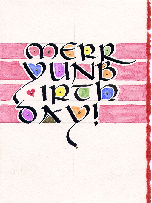
aocc 2007: the 4x4 exhibit
by gl. at 11:24 pm
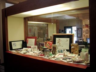
sven wrote about the portable art gallery he made for the 4x4 exhibit i was curating for the all oregon calligraphers conference this year. here's what it became!
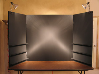
[before]

[after]
two major goals i had for this exhibit were:
find a non-destructive way to attach the art to the board: last time some of them were stapled, which made me wince. so i was planning to use photocorners, but sven had an even better idea: photocorners on squares of card stock, so that i could move them around more easily, especially when i put them in blocks of 4.
include a statement: last time the display didn't have a sign or any context/mission about the exhibit, and i definitely felt its absence.

[4x4 exhibit: a call for unintimidating art]
The full text of the statement (or view the PDF layout):
As calligraphers, we toil over grand works. In pursuit of perfection, our labour is often pleasurable: delicately handling calf skin, breathing gently on gold leaf, sometimes even grinding our own pigments to achieve something truly magnificent and fine.
Frankly, it’s a little overwhelming. Even the most spontaneous works happen after immense preparation. There’s no “undo” for calligraphers: the pressure to get it “right” leaves less room for error and risk, essential components for making progress and exploring our own styles. And our time is so precious we hate to waste it on creative experiments.
But limitations often inspire creativity, and working in a small 4"x4" square is a prime example. We all have some small scraps of paper to use up, some leftover inks from previous projects, or some technique we’ve always wanted to try. With this exhibit, we’re encouraging play, risk and reward. The format is meant to be unintimidating and approachable — both for artists to create and viewers to appreciate. At heart, art is meant to be fun!
With special thanks to Sven Bonnichsen for making the display panel, Susan Cole for coordinating the previous exhibit, and everyone who makes AOCC happen!
i don't know if anyone read it, but i was glad to have it there. :)
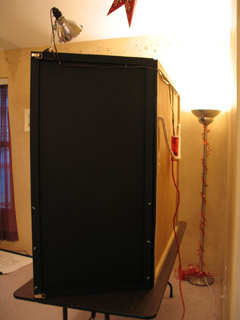
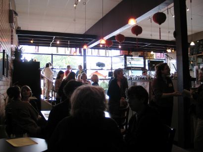
besides creating this elegant place for art, sven also came w/ me to aocc to help set it up. we were up so early, we saw venus blaze in in the heart of leo. i was heartbroken to discover this fabulous display doesn't fit in trixie, so we had tro use the svan instead (thank god it fit in there!). sven's help turned out to be not just a kindness, but a huge blessing: we had 33 small pieces, many of which i got the day of the exhibit. which was a shame in part because the exhibit seemed to be a pretty popular destination, & i needed to keep popping in to add another piece of art or rearrange the art in front of them. depending on the configuration, this exhibit could have held over 100 pieces.

[look at all the pretty pieces]
the shelves came in extremely handy for items too thick to use photocorners, but someone brought in a framed piece and it fit perfectly when we removed a shelf. it's lovely to have that flexibility. it might make sense to make another row of shelves, but it was immensely gratifying for them to work out so well.
one of my favorite pieces from the exhibit wasn't on the display, but lying in front of it: this "gravel alphabet" by marilyn new has gorgeous letters sandblasted onto tiny pieces of gravel she gathered at the beach.

[ittybittyalphabeta]
the whole alphabet would fit in half the size of your palm, but she has an even tinier set which was also on display. amazing craftsmanship and a very unique piece. so imagine my dismay when i came back to the exhibit after the afternoon classes to find the gravel alphabet missing! when marilyn came to pick up her other pieces, i apologized profusely -- and fortunately, it turned out she had sold them. what a huge relief! everyone wins! well, except for me: i really wanted those stones for myself! :D
so overall, i was quite pleased with this year's exhibit; it met the major goals i wanted to accomplish this year. too bad aocc will travel to salem next year! sven built the exhibit with love and it belongs to us, not The Society. (but having said that, if you need to borrow/rent a portable art gallery, the terms are very reasonable. ;)
posted by gl. | permalink | categories: calligraphy
October 26, 2007
the portable art gallery
by sven at 3:19 pm
Gretchin is curating a "4x4" show at the All Oregon Calligraphers Conference this Saturday. I volunteered to construct a display for her for the art pieces.
I tend to like short-term intensive projects... Our main design meeting was on Friday night, I went shopping for materials Saturday, did carpentry on Sunday and Monday, painted on Tuesday, and put the finishing bits of hardware on Wednesday afternoon.
The main "wall" is 4'x4'; two hinged panels fold out, each 2' wide. We want to give the art -- all of which is 4"x4" -- lots of breathing room... So I assumed 8"x8" for each piece: 1" of "whitespace" above, 3" below, 2" on each side. That's room for 72 pieces of art, potentially.
The walls are made of .25" thick hardboard (AKA masonite). The hardboard has framing braces behind it made from .75"x1.5" pieces of poplar. Pine would have been cheaper -- but I wanted something of better quality, with fewer knots and less warping.
Looking at the calligraphy that's been submitted so far, some of it is on paper and some of it is on small canvases. Thus, it was important to have some shelves for the dimensional pieces. The shelves are .25"x2.5"x2' pieces of poplar, supported by .5"x.5"x2' rails, which attach to the frame using long screws and wing nuts (2 per shelf)
A word of advice: If you ever build a portable display that needs nuts and bolts, use wing nuts! They are sooo much easier to deal with when you're on site!
Everything that was .25" thick got assembled using 5/8" #16 wire nails. The frame was assembled with some massive wood screws for strength.
I used "black black" matte latex house paint, applied with a roller. Before this, I tried black gesso -- but felt that it smudged too much. The finish I got is very good... But I'm still wondering if enamel paint would have been more durable. The toxicity of that stuff is higher, though -- which made me loath to work with it.
The love, though, is really in the details.
People are going to walk up from the sides, so I made sure to paint the backsides of the fold-out panels as well as the frontsides that are going to display art. It looks like we're going to use clip-on lamps for lighting -- so I put hooks in back to help route the cords. Distracting light would come through the cracks where the hinges are -- so I added black canvas there as a shield (painted with acrylics for extra opaqueness).
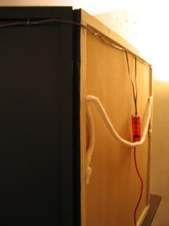
Transporting the display is going to be a bit awkward no matter what -- but I've tried to make it as easy as possible. There's a shoulder strap in back -- not rope, but this crazy cotton ribbing (I don't know the proper word for it) that gets sewn into furniture. You put that strap over your shoulder -- and then there are side loops to grip onto for extra control. The front "doors" latch shut using the sort of latches you find on a trunk.
All told, I'm pretty darned happy with how this thing turned out. Can't wait to see it in action!
posted by sven | permalink | categories: calligraphy, exhibits & events, studio space
September 5, 2007
numerology
by gl. at 12:34 pm
last sunday the portland society for calligraphy was asked to write numbers on the participants of the first portland triathlon, which meant we had to be there at dark o'clock. many triathletes said they were really grateful to have beautiful numbers to wear for the next few days: the number they wear is like a badge of honor, but usually they get something scrawled with a sharpie. even the athletes who were wearing full-length body suits wanted numbers!
[smiling in the dark: click to see the other pix from this event]
and even more impressive is that lorinda moholt wrote a poem afterwards, while the rest of us had gone back to bed or were drowning in coffee!
Triathlete Numbers
(more fun than vellum)
5:30 am, dark, no coffee
(do they ever eat donuts),
tall, short, thin, almost-thin
hairy and smooth, they stop
for us to write numbers on
strong, tense bodies.544, 837, 20l, 683, 219;
on thigh below the shorts line,
then upper arm, always the left
side, age on calf. Calm and
cheerful or focused and silent,
they leave our stations with
right sides anonymous.20-something, 40-plus, 68,
calligraphers in the still
dark morning tell each
competitor "I only write
winning numbers." Some
say thanks, then walk to
the cold Willamette.
as alesia says, vellum "is old-school calligraphy material: goat-, sheep - or calf-skin to write on. AKA unoccupied skin, unlike what we did this morning!"
posted by gl. | permalink | categories: calligraphy, exhibits & events, writing
June 30, 2007
muse talk art reception review
by gl. at 11:59 pm
the muse talk art reception last week went really well! there were about 50 people there, which i think is pretty respectable for a coffeehouse show. i was especially pleased (and surprised!) to see so many people i knew: special thanks to kristen & todd; jennifer, julie & evan; toni & matt; mary knight & her friend; and seamus & his family. in addition, sven & michaelmas were there, and leeann was visiting from california! i very much appreciated the support! (alas, kim was sick, serena was at the vet, and anna was at a bridal shower. but i appreciated your good thoughts, too.)
[part of the crowd]
one of the great things about this show is that we had an opportunity for perfomances in addition to visual art. so i read the "birthday poetry" series i began when i was 25 and still in colorado. i try to write a poem every year as the first thing i do when i wake up on the morning of my birthday. sometimes the date slips a little, but this ritual turned out to be very important when i was languishing in california, or i wouldn't have written anything at all.
i was afraid it might be too much: 9 poems over 8 years, 3 states and 2 countries: all in 15 minutes! i wrote the transitions out beforehand because i knew i didn't have time to ramble. but i was very pleased (and relieved!) with how well it went: i heard audience responses in all the right places and several people came to talk to me afterwards times to recall similar situations & emotions.
[reading 25, 26, 27, 28, 29, 30, 31, 32 & 33]
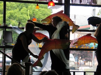
and then, as if that wasn't enough, i volunteered to be "water" in the "salmon dance"! who can resist the swirly scarves? i certainly couldn't. a tribute to the lifecycle of the salmon, alisa created the dance a few years ago with a much larger group, so this was a much smaller reprise. still, her handmade salmon sculptures are amazing, and the large windows were great to illuminate them (though they also produced terribly backlit pix, as you may have noticed).
[wandering water]
oh, and i also have a couple of pieces in the visual arts show. :) the art show will remain up until july 24, so stop by to see these two pieces, which are tucked in the back by the big comfy couch. and feel free to buy the work of one of the other artists! *nudge*
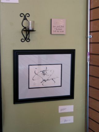
["advice" and "a grace it had, devouring"]
this was fat straw's first art show, and throughout the planning process we could tell the owner was pretty dubious and wasn't willing to help or answer many questions. his tune began to change when the newspapers we sent press releases to began to call, and on the day of the show fat straw was very busy serving drinks & snacks. he was very intently watching the performances and afterwards he said he was impressed with the all the arts & the work we did to set up the show. hooray!
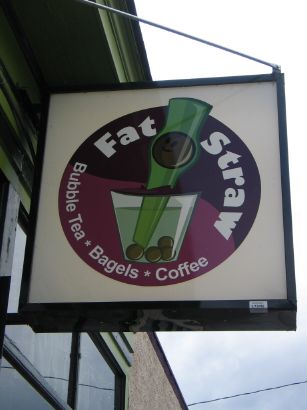
[fat straw sign]
posted by gl. | permalink | categories: calligraphy, exhibits & events, other art, writing
January 23, 2007
read it and weep
by gl. at 9:01 pm
just in time for national handwriting day (today!), chas has sent us a link to the palaeography tutorial at the uk national archives. palaeography is the study of old handwriting, and the tutorial is especially focused on the typically illegible (but fascinating) documents between 1500 and 1800. it contains tips on reading and transcribing documents, a reference page, a tutorial with 10 levels of difficulty, a ducking stool drill game ("i'm not a witch!") and documents for further practice. it also includes the ability to download all the reference materials as high-resolution pdfs. thanks, chas!
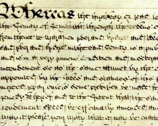
[An Act of Parliament for amending and widening the road from Falmouth to Marazion, Cornwall, 1760. Click the image to see the full tutorial.]
posted by gl. | permalink | categories: calligraphy, links
December 23, 2006
more advice
by gl. at 11:15 pm
i just completed a housewarming gift for the kindest, most patient client ever. jane saw the "advice" piece i made for shaedra, who was inspired by a piece she saw at jane's house. it's practically a mobius of inspiration, and so jane wanted me to make one for her daughter, who just built a house at lake tahoe.
jane orginally comissioned this piece in june, but she fell off the face of the planet for a while, and then i did, and i finally decided it had to be ready for christmas (and it helped i had a final project due for the mhcc class i've been sporadically attending this term).
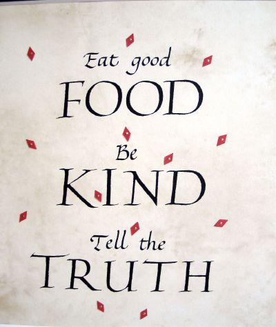
[click the image to see detail]
calligraphic exif: about 15 hours; random older paper with a parchment-like texture; speedball C2 & C3 nibs w/ a lot of help from an exacto, repositionable glue stick and a photocopier; sumi ink; basic italic & roman caps; red paper & gold paint-pen.
yep, that's right. a photocopier. words with multiple o's in proximity to each other spell Trouble-with-a-capital-T. "good" was bad enough in italics, but "food" in roman caps right below it was simply dreadful. it's impossible for me to create 4 o's that are reliably consistent. after trying for an hour, and having trouble with some of the other roman caps, i decided to try the photocopy technique again, this time writing each letter till i got one i liked, then adding each individual letter into a coherent composition and photocopying it onto the paper. it took a while, but was much less frustrating than doing & redoing 20,000 pieces. the italics could be done as full words, but each capital is done separately.
another reason for photocopying was because this paper didn't want to accept ink without spreading (argh!). i even tried gum sandarac, the way denis brown taught us. the red diamonds were meant to be ink but couldn't keep sharp edges, so after i tried several different things, sven cut diamonds from a piece of red sparkle paper & then i dotted them in the middle with my favorite gold paint pen. that worked out i think: the paper diamonds give more dimensionality to the piece and and i had more options for trying several different placements.
earlier, i spent over an hour hour trying to work out the right proportions & spacing of the elements, which means a lot of very tedious lining & relining of the page. i finally went back to the house, created three slightly different layouts via adobe illustrator, and put them on the awesome light table we got from freecycle. i used the layouts as guides for my own lettering, which worked great! the fonts are obviously not the same as handwritten calligraphy, but the layout offers good visual parameters for centering, proportion & spacing. it was a trick i picked up for a piece i made for sven's parents years ago.
i hardly ever frame a piece for a client, but this one was so late i didn't want to give her another step before giving it to her daughter, and having the frame really helped me limit the color palette & size. why is the square format so appealing, anyway?
this may be the last calligraphy piece i create for a while. after this i decided i probably wouldn't do any new pieces next year, choosing to spend the year getting the gocco & letterpress (and wordwear) going instead. right after making that decision, i remembered i had signed up for a calligraphy birthday card exhange, and maybe something i cannot refuse will come up, but otherwise, i have no calligraphy commitments next year.
posted by gl. | permalink | categories: calligraphy
October 27, 2006
denis brown: get rhythm!
by gl. at 10:48 pm
my last denis brown workshop was wednesday! my brain felt full, so i left early. you'd think i'd want to stay for the "gestural movements to music" segment at the end, since it sounds so similar to exercises i do with artist's way, but i was afraid that adding anything more new to my head would simply cause it to leak out my eyes.
during the course of two days, of course he said more than this, but this is what stuck:
if 4-6 items are on this list, then the hand is probably an italic variant:
- slant
- lateral compression
- branching
- "cursive" (economy of strokes)
- rhythm
- speed
i have always considered the "o" to define the hand (though in typography you can often identify the font via the "g"), but for denis, the hand is very dependent on the "n": every letter will change if you change the n.
"any italic can have a clear verbal description in addition to a visual one". is it high-branched, asymmetrical and pointed? if you can describe your variant "n," you can learn to apply those elements to all the other letters.
edward johnston vs hermann zapf: johnston knew what the pen was capable of & approached lettering from the natural abilities of the pen; whereas hermann zapf knew what he wanted the letters to look like and would find a way to wrestle the pen to make those shapes.
"your eye will learn quicker than your hand." the first day, especially, was all about "target practice." i re-learned an old lesson from when i owned a motorcyle: look where you want to end up and you'll go there. the same is true of the pen: as i trained myself to look where i wanted to begin the downstroke, i was able to more consistently end the connector at the right spot.
"i'm trying to get you to forget about the alphabet and remember the basic structural relationships."
i made an interesting self discovery while warming up in my car over lunch one day: i don't think i want to be a calligraphy artisté. i want to be a casual calligrapher: i want to get to the point where calligraphy feels like an easy, natural extension of my handwriting, without a lot of fuss or guidelines or setup/cleanup. i want to be able to dash off calligraphy on nametags & lunchbags. i want to make ordinary things extraordinary with personalization & customization, but i don't need to make large-format framed works of art. some of this comes from my inherent love for ephemera, so you can think of this as "ephemeral embellisment."
having said all that, i got a lot out of this workshop, tried a lot of new things. despite resisting it for years, i became more familiar with using gouache & a loading brush; i tried several sizes of brause nibs, which i still find pretty stiff, but i think i'm beginning to get the hang of them (overloading really does seem to help); marti's fox river pad worked like a charm; i became an advocate for guardsheets (though thin cotten gloves wouldn't be too bad, either); i learned how to use ground pumice stone.
you can especially tell what a difference two days make in the pix below. i'm always rough when i begin a class: stuggling with a new nib (brause), new paper, new space, new ink or whatnot.

[begin]
[end]
i can always find fault w/ my own writing, but on the whole by the end i was vastly more consistent & elegant than the first early attempts.
posted by gl. | permalink | categories: calligraphy
October 24, 2006
denis brown: flourishing
by gl. at 11:59 pm
on sunday i attended denis brown's flourishing workshop. i sat next to one of the david douglas high school calligraphy instructors, maria, who seems very sweet.
in many ways, this was the "dangerous lines" content, not the speech at aocc the day before. denis exhorted us to think of flourishing like "spilling the ink onto the page into the shape of a flourish rathering than drawing a little twiddly bits." he wants us to pour ink from the pen like cream from a jug. he also crusades against the holy 45-degree standard pen angle recommended for most italics: because our eyes are steroscopic, they read horizontal lines thicker than vertical ones. so lines made at 45 degrees are geometrically equal, but visually, the horizontal lines look too thick. italic is a major monorhythmic hand and needs the vertical lines to be its strongest feature, so he recommends bringing the pen angle to 40 degrees, or even less depending on the context.
he noted that if a flourish isn't flourishing, you should check...
is the ink diluted enough? to the shock and amazement of all, denis would often double the water in an ink bottle to get it thin enough to flourish at high speeds and yet remain opaque & black.
is there enough ink? denis would load his reservoir so full it would blot immediately upon bringing it vertical. he'd counter that by bringing it onto its tip, which allowed the ink to come out at one controlled point.
is there enough pressure? this was my foggiest point, because if i used more pressure my hairlines would go thick, but with less pressure the pen just skipped.
later in the afternoon denis performed casual surgery on my poor black zig marker because it was so dull. using only a scalpel and his iron will, he shaved off the edges of the marker until they were suitable writing instruments again. i tried not to panic.
unfortunately, denis subscribes to the "if you can't flourish, don't prove it" school of thought, which, as a creative advocate, i always find enormously discouraging. lots of blocked artists have heard something similar to "if you can't dance/paint/write, don't prove it," which keeps them from doing anything at all. i subscribe to the "if you fail faster, you will succeed sooner" newsletter. if you can't flourish, then flourish something! in fact, flourish lots of somethings! that's the only way you'll get better.
the one suggestion i have for denis as a teacher is that he needs to watch people actually write, not just analyze the letterforms and demonstrate them. he told us several times to tip the pen onto its edge for the flicks, but after he had come around a couple of times and noted i wasn't flicking right, i asked him to watch me, and it was immediately clear to him how i was holding the pen wrong for the flicks. when he showed me how to hold the pen, ink came out exactly as it was supposed to! knowing that earlier in the day would have been great.
posted by gl. | permalink | categories: calligraphy
October 22, 2006
aocc 2006 review
by gl. at 11:25 pm
yesterday i attended the all oregon calligrapher's conference. we packed a lot into 8 hours, so this will be a long post. :)
aocc general
i had a good time, especially because sven, kristen, colleen & rick also came. but it was too short! alas, we were up an hour early to volunteer and there was surprisingly little for us to do: i ran interference on arrivals to direct them past the harried 4x4 exhibitors, added a couple of signs here & there, did some random errands. i was also surprised to discover the vendors weren't sellilng anything i couldn't live without, though i was oft tempted. (there was a beautiful green box with a stone and a feather, though, that i regret not getting.)
aocc exhibits
the most disappointing thing about aocc was the 4x4 and "show & share" exhibits. it was probably so disappointing because i had been looking forward to it, but there were no signs, no statement or context, and many pieces had been stapled to the backing! *wince* (and not very carefully, either. thank god my piece was already mounted!) some nice pieces, and i do so love the small format, but the presentation was appalling.
denis brown keynote: dangerous lines
after introductions and welcomes and applause, denis spoke about calligraphy. with a topic like "dangerous lines" i had hoped for more rebellion and maybe even a call to action, like the lecture michael & i attended by charles pearce. still, he said many things worth noting:
"all calligraphy is digital, as it's made by the hand." manual's root is "hand" in latin and digital's root is "finger," so how did they become such disparate concepts?
calligraphy is "recording in ink a performance of movements. if you're hesitant when you write, it shows. if you're miserable, it shows."
the difference between an educator and an instructor: educe=draw out of, instruct=put into. this reminds me of when i used to work w/ faculty: my default blanket term when writing documentation was "instructor" because it was the least offensive. every other term had a status associated with it and was guaranteed to make somebody mad.
he made an interesting parallel between art & video game evolution: pac man included a 2d grid, knots, dots & little monsters, just like early illumination; now we have 3d virtual reality rendered games, which are sort of like the renaissance discovery of perspective & reality.
he recommends mitchells at tiny sizes
slunk vellum: the smoother vellum of a stillborn calf, "a calf that died before it was born. a real trajedy. the most innocent thing."
to get oil paints onto paper, write in ink first, then seal w/ pva; layer oil paints over it and then scraffito over the lettering to reveal it.
"the way painting has been liberated by photography," calligraphy can be liberated by printing, allowing it to be more complex, illegible, or expressive.
polyrhythmic calligraphy vs monorhythmic calligraphy: most western writing is monorhythmic, relying on strong downstrokes and repetitive combinations. monorhythmic is techno: a strong, driving, easy beat. in contrast, polyrhythmic is jazz, classical, west african drums: more complex, multiple beats, simultaneous threads. different letters can look different depending on their context, with a desire to create counterrhythms & reverse directions.
he is inspired by bar codes, a rhythmic pattern like italic. "what the bar code lacks is a sense of spirituality."
the interplay between traditional & expressive calligraphy is my favorite. rathering than favouring one over the other, i prefer a combination. he compared a 6th century gospel of st. john that had an elaborate system of abbreviations to sms text messaging.
"you don't want to hear that someone is 'working' the violin. you want to hear them play with it."
this didn't happen during his keynote, but i noticed while he was there that the prints denis has for sale are remarkably fine. i'm fairly critical of self-printed calligraphy, which tends to be grainy, and even some commercial giclee prints are disappointing. but i was impressed: even under a magnifying glass i couldn't discern a dot pattern & the colors seemed true. if i ever start printing my own work, i want to use this system, so according to his website, he uses "an Epson 2100 using Epson’s 7-colour UltraChrome ink system at 2880 x 1440 dpi on Epson acid free watercolour paper, a combination to ensure long lasting quality. Wilhelm Imaging Research (www.wilhelm-research.com), suggest prints using this combination of ink and media will last for over 90 years without appreciable fading , based on indoor display framed under glass. Dark Storage Stability Rating at 73°F/50%RH is indicated to last over 200 years. The detail is super fine at this resolution, being almost 10 times finer than normal commercial printing."
lunch
the lunches were fairly tasty for salads. sven got pushed into line by the irrepressible marti dawkins, who told him they were "merging." the psc meetings are held waaaay over in beaverton, but a guy sitting at my table wanted to start an east-side group, and sven & i nudged him into it. i grabbed meri and we asked her to make an announcement before he could lose his nerve. a small flood of gresham calligraphers immediately signed up. the last i saw he was happily chatting up the teachers at the david douglas school district. :) the creative advocates strikes again!
jaki svaren: concentric italic
kristen thought jaki had a gentle energy. alas, we didn't have much time to actually do italic because we were busy breathing, stretching and meditating. "sipping on a cup of green tea, i stop the war." a very interesting thing i am glad to know is that 5 degrees, the usual italic slant, is the slant of a diagonal line drawn between the inner and outer edge of a broad-edged line. she gave us homemade visors with our names on them to keep out the glare of the fluorescent lighting. as she reminded us of the small miracles of breathing and sound, a white horse walked past our windows.
denis brown: book of kells
ah, michaelmas, you would have really liked this session! first we actually looked at the cathach, the book of darrow, and the lindisfarne gospels before getting to the book of kells.
looking at manuscripts almost always makes you feel better about your own calligraphy: they are beautiful, but the slant, spacing & sizes are often inconsistent, and monks would often forget letters or words and tack them on in unusual or weird ways. also, "the book of kells is like the mona lisa of its time, but it's also the simpsons," he said, pointing out the illuminations containing drunk monks & men pulling on each other's beards.
interesting random fact: he says the cathach was the first copyright case ruling. in 7th century AD: "to every cow its calf, to every book its copy." st. columkille apparently borrowed a book from anothe monk (finnean), then copied it for himself. after the ruling he was forced to return the book to finnean AND its copy.
posted by gl. | permalink | categories: calligraphy
October 20, 2006
denis brown: sharpness in writing
by gl. at 11:41 pm
thus begins the calligraphy marathon: a week of calligraphy classes related to the all oregon calligraphers conference. this year it features denis brown, my favorite calligrapher in the world. he's been brilliant since he was 15, and how can i resist anyone with an irish accent?
he's been in town for a couple of days now; i attended my first session yesterday. i was half an hour late even though i had left myself a 15 minute buffer; the traffic and weather were horrible! i seriously thought about turning around because i hate it when i'm so late, and i think it's disrespectful to the teacher. fortunately (well, or not, depending on how you look at it), other people had the same issue. i wasn't even the last one in.
but before we even got to lettering, he spent a long time talking about the basic components: tools, materials, technique. i picked up some notes worth keeping:
you want rag paper, which is cotton, because the fibers are longer -- but more importantly, because cotton doesn't contain acid. even a lot of "acid-free" paper is simply acid-buffered -- or the surface might be acid-free, but the core is normal acidic paper.
press paper distinctions: hot press=smoother; cold-press=rougher; "not pressed"=cold pressed, "rough"=not pressed at all. got that? light-weight paper is automatically smoother than heavier-weight paper.
denis recommends bk rives (rives heavyweight if possible), arches text wove & saunders waterford hot press (though i personally found bk rives to thoroughly suck in any ink -- but i guess i should try w/ sandarac now).
sizing comes in three flavours: waterleaf, internal & external. waterleaf has no additives, internal is sometimes called "soft sizing" and is often used in printmaking. sizing is often simply gelatin: you can make your own sizing from boiling clear jello and brushing it onto the page. i guess this means most papers aren't vegetarian. ironic, isn't it?
the sounds paper makes when you wobble it is called the "crack" and is affected by the type of sizing it contains.
one of the kindest things you can do for yourself as a calligrapher is have a cushion of (cheap!) paper beneath your piece, at least 10-20 sheets. if your tool is hard, it should be used against something soft (and vice versa: that's why you'll use brushes on metal & wood).
he doesn't use ink anymore, he uses winsor/newton lampblack gouache (or sometimes ivory black, but never jet black, which he says feels greasy). he says shminke & holbein are also good gouaches.
gum arabic & gum sandarac are technically edible!
if you write quickly, use thinner ink. if you write slowly, you can use thicker ink.
he called pollock "jack the dripper."
"some people think calligraphy is about copying shapes, but i think it's about allowing a movement."
upon gazing at freshly drawn letter with a pool of ink still glistening in the arch of a flourish: "the only word for that is sexy." and "it is a luxury of ink."
then he walked around and gave feedback on the sharpness and on letterforms. i was intimidated and anxious, no doubt exacerbated by my late arrival, but also because i was using unfamiliar nibs (brause) and ink (black gouache, and the tubes i brought were unfortunately dry so i had to borrow a dab from my neighbor). i am an intermediate calligrapher at best, but most people at an event like this are much, much better than i am. see? i have my issues, too. :)
after lunch he showed us how to use gum sandarac, which was great. gum sandarac is something i've often heard of but had no idea how much trouble it might be to use or what a difference it would make. it turns out gum sandarac repels water: a drop of water on a pile of gum sandarac forms into a little ball, as malleable and adorable as quicksilver. thus, it keeps ink from spreading when brushed on the page. easy peasy!
he also showed us writing on black w/ white ink (more sandarac & the "flooding in" technique; permanent white=opaque, zinc white=lightfast). he also showed us sharpening a nib on an arkansas stone, though he himself has stopped sharpening nibs, prefering his own technique (namely, speed) to create his ethereal hairlines (so fine that apparently herman zapf himself wrote denis a letter asking about his technique).
posted by gl. | permalink | categories: calligraphy
September 29, 2006
mhcc calligraphy: class 1
by gl. at 10:45 pm
i'm back at mhcc on fridays to take the afternoon calligraphy class. this is my fourth time: each class focuses on a different style of lettering, and at this point i've taken the whole series, so i'm beginning again w/ boookhand. which is a shame: i'd rather be working on italic since denis brown will be here next month. but any calligraphy at this point is good calligraphy. the only real issue is that bookhand isn't written at a 5-degree slant like italic, so i spent most of today trying to train myself out of that. :)
marti's calligraphy classes are very casual. it took me a while to get over that. if you can work independently, you're welcome to, so i've migrated to the back. this term there are lots more students than usual for this class, but only warren & i are returning students. (warren is a 70-year-old, left-handed calligrapher, so he ends up doing his pieces upside down!)
marti did something unusual this time: she asked us to review calligraphy books & magazines to look for layouts & lettering we liked, rather than jumping straight into practicing. i was surprised to discover how nice this was, to begin with inspiration first. i took a whole page of notes and felt more connected to my creative process. later, i realized this is what i ask my artist's way groups to do with the "intuitive collage" activity, and what happens when i ask my artist's way independent support clients to bring things that inspire them to our first session. begin with inspiration. fill the well. it makes a lot of sense, but i don't think i've ever seen it in a class before.
i may try something different this term. because the class is so casual, there are ocassional points where a piece is due, but there are no requirements for the piece, so i spend a lot of time each week wondering what i should create. instead, what i may try to do this term is generate a list of potential ideas & techniques and assign one to each week myself. that way i can spend more time wondering how i'll create something rather than worrying about what i should create. this would also be useful to plan a little further ahead for birthdays or xmas presents. the process is similar to how i run artist's way creative clusters: i have a basic list of my planned weekly art explorations with an eye for the seasons and external events, but it's flexible if someone is gone or if a better idea comes up. having the initial list saves me a lot of mental energy each week wondering what we'll be doing.
posted by gl. | permalink | categories: calligraphy
September 16, 2006
warning
by gl. at 11:36 pm
i bought a recent calligraphy piece from psc member angelina cox, who's just hopped across the pond to roehampton university for the last year they offer their calligraphy program. she was raising funds and i donated to her newsletter, but when i saw this piece i knew i had to have it:
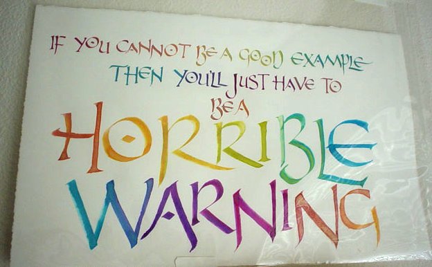
["if you cannot be a good example, then you'll just have to be a horrible warning"]
hee! and in other news, i registered for the mhcc calligraphy course again. it was nice to have a quarter off, but i didn't make very much (um, any?) calligraphy without it.
posted by gl. | permalink | categories: calligraphy
September 3, 2006
running as fast as i can
by gl. at 8:11 pm
several items of interest, including a new exhibit, the state fair, aocc and the state of october:
i'll be exhibiting two pieces at the portland society for calligraphy annual open show in the west linn library. there will be an artist's reception september 10 from 2-4 p.m. i had hoped to show at least one new piece, but i have been hobbled by traveling and artist's way promotion and a cold, so i'll be showing two previous pieces. if you haven't had a chance to see them in person, you should go to the reception, where there will be many other fine calligraphers to see.

["born": part of a poem i wrote for a birth]

["tongue far from heart": from shakespeare's measure for measure]
last week i went to the state fair, in part to view the calligraphy exhibit. i was foolish and didn't bring a camera or even anything to write with. but i was quite taken w/ angelina's "alphabet" piece, which included deeply embossed ancient alphabets with a simply-lettered but elegant quote. in the student category, i was charmed by a well-done representation of mr. tumnus' arrest warrant. and sven & i have often talked about writing black on black, so it was a pleasure to discover "lightning," a piece written on black with walnut ink. the warmth of the walnut ink allows the letters to be read with the right light and the right angle while still preserving the mystique. in addition, the piece had a large lightning bolt etched into the glass.
i registered for the all oregon calligraphers conference, and the only unfortunate part is that it means i won't be able to attend the open studio tour this year. which is sad because sven and i have gone every year i've lived here. i love the open studio tour. i get to meet interesting new artists and explore interesting new studios.
but aocc is the priority this year because one of my favorite calligraphers in the world will be coming! denis brown is also probably one of the youngest high-profile calligraphers, too, inducted into the international society for calligraphy at age 15. as a native of ireland, i'm very much looking forward to his lecture about the book of kells in addition to his keynote. plus, in conjunction with aocc, he'll be offering workshops through my calligraphy guild, so i signed up for three of those. i'm a little intimidated, but when am i ever going to get this chance again?
october will be a very full month. sacrificing the open studio tour was necessary because we're also going to the hp lovecraft film festival, the oregon shakespeare festival in ashland and the hood river heirloom apple days. and of course there's halloween and sven's birthday is the day afterwards. add to this a family visit and the general roster of studio events, and we'll see what happens when we make it to the other side.
posted by gl. | permalink | categories: calligraphy, exhibits & events
July 31, 2006
a toast to the happy couple
by gl. at 3:47 am
(this is the last post before we go to canada for a couple of weeks...)
i just finished a commission for a marriage certificate! i very much enjoy creating things for joyous ocassions:
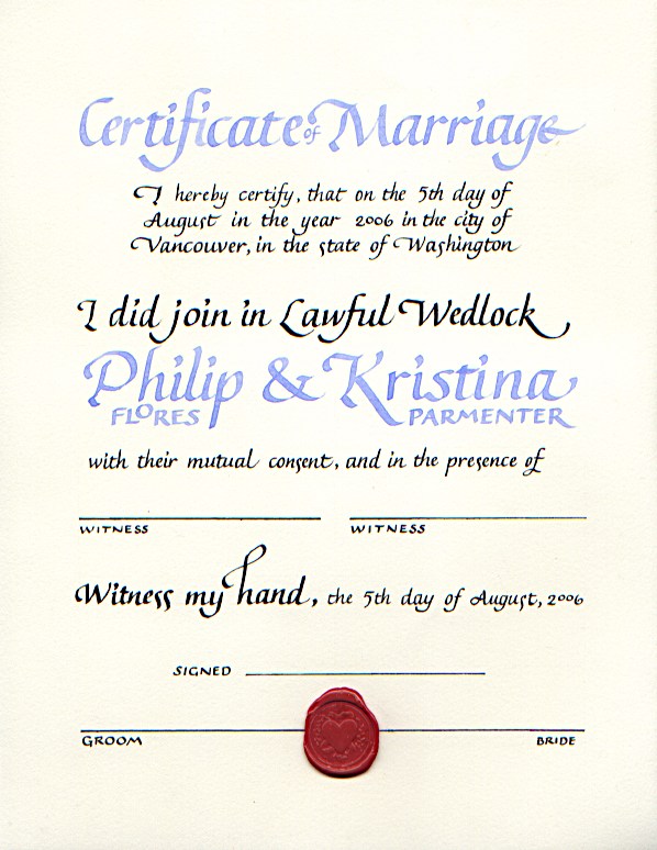
[click the image to see it larger]
exif: about 20 hours; arches text wove; tape .5, 1 & 2 nibs w/ some help from a .03 pen meri gave me to create the lines; sumi ink for black and custom acrylic mix for the periwinkle; basic italic/chancery; wax seal
believe it or not, there's no shiny on this piece! the wax seal was difficult, though: i had to create several emergency ones at the last minute when the one i put on as the last and final step before delivering it broke! aieeee! melting the wax creates noxious fumes and if safety boy had been there he probably would have handed me a mask. i hate using those candle-like wax sticks; they mix soot in the wax and by the time you've dripped enough wax to create a seal, it's already begun to harden. instead, i crushed the wax stick w/ a hammer, melted the fragments in a little spoon and pooled it onto the paper all at once.
the ink is always my nemesis. their wedding color was periwinkle, and i mixed up a great one using a pearlescent purple ink, a couple of drops of random blue ink & a fair amount of higgins eternal white. but when i tried to use it, the ink would separate, leaving the letters outlined in shocking turquoise with streaks of darker purple in the stems. so i thinned a pretty, pale blue-violet acrylic, but by the time it was thin enough to (barely) write with, its color had become far more ice-pale blue than periwinkle. i ended up adding some purple ink to it & a little silver pearlescent, but it was still a struggle to write with.
when the nib is at its smallest size (.5), it takes more effort to keep the nib from skipping over paper fibers & whatnot, so i find my writing in smaller sizes isn't as fluid or consistent as it is at larger sizes.
when i create calligraphy, the layout comes to me in fragments: i knew how i wanted to do their names first, and then i had to go through about 20 versions of the rest of the text before i could begin working on good paper. i had initially thought it was going to be a horizontal layout because the "certificate of marriage" and the names could be so much bigger than they can in this format, but the line length for the smaller text and the signatures was simply too long and i couldn't get a good balance between all the elements.
and now off we go into the wild blue yonders of canada. oh, canada!
posted by gl. | permalink | categories: calligraphy
June 21, 2006
addict
by gl. at 2:00 pm
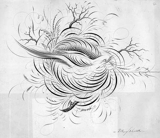
man, carl totally knows how to reduce me to a little puddle of musty drool. he furled a link to bibliodyssey's zoomorphic calligraphy, which writes about arabic calligraphic forms:

this isn't much different than the tradition of elaborate spencerian animals, except they rarely contain words:
at any rate, the entire bibliodyssey site is worth adding to my accumulated rss feed; maybe if my book fetish is fed a little at a time i can stop binging. ;)
this reminds me that i've been meaning to write about the other rare-book sites that absorb me for weeks, rendering me unable to do actual work until i have seen all the images and put them in a safe place to use for later inspiration. the most amazing of these, if you love star maps as much as i do, is the us naval observatory rare books collection, which includes bayer's uranometria (1661) and the atlas celeste de flamsteed (1776), along with pix of the glass plates used to record the transit of venus in the late 1800s.
and the collection of anatomical plates at the university of toronto took me about a week to get through, but i recently made a gocco screen from one of its pieces...
posted by gl. | permalink | categories: calligraphy, links, printing
May 20, 2006
mhcc visual arts student show reception
by gl. at 10:03 am
the reception for the mhcc visual arts student show was thursday. we hadn't gotten in the door very far before marti saw us and took us to what i call the "calligraphy ghetto" for unmounted pieces. most of my pieces were there because she ask me to participate at the very last minute, so i hadn't managed to frame any of the pieces. but very few of any of the calligraphy pieces were framed this year, and so most of the submissions were in this glass case. fortunately, born was already framed thanks to sven's amazing foamcore & copper wire creation, which marti loved and was showing off to everyone. (ooo, and worth mentioning: i sold "born" even before the show began! yeah!)
[the "calligraphy ghetto" for unmounted pieces]
last year the calligraphy pieces were more integrated into the rest of the show, which is a mix of all the different arts mhcc has to offer: sculpture, design, pottery (the pottery studio has a ton of wood stacked in front of it for the wood-fired kiln this weekend), drawing, painting, metalworking & jewelry. marti has almost convinced sven to take a metal-working class, in fact, as she led us away from the reception and down to the studio to show its array of delicious tools & enamels. will he resist the temptation? kim graham's sculpting class is most important right now, but maybe next year... ;)
posted by gl. | permalink | categories: calligraphy, exhibits & events, other art
May 9, 2006
mhcc visual arts student show
by gl. at 6:12 pm
i was asked with extremely short notice to participate in another art show! so if you're in the far reaches of gresham for some reason in the next couple of weeks, stop by the mhcc visual arts student show, which runs may10 (tomorrow!) though may26. the gallery is open monday-friday 9 a.m.-4 p.m. the reception is may 18 noon-2 p.m., but since it's such an odd hour, i don't expect anyone to go.
but if you get a chance to see the show, you'll see the originals of several pieces i've shown on the blog:
the original study for "notification," the piece I sold at the 4x4 show:
"born," an excerpt from an original poem i exhibited at gresham city hall last year:
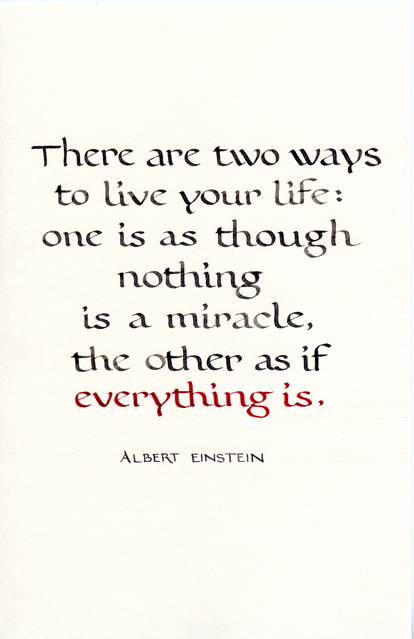
"miracle," a simple but elegant einstein quote (and the only thing that's for sale):
a couple of cards I made for sven:

and a weathergram with an original poem on it:
i hope someone manages to see the show even though i probably won't see you at the oddly-timed reception. if you do, drop me a line, eh?
posted by gl. | permalink | categories: calligraphy, exhibits & events
March 24, 2006
mhcc calligraphy: class 10 (final project)
by gl. at 6:25 pm
today was the last calligraphy class at mount hood community college, which is the show & tell for final projects. i was worried because i got hit with a miserable cold this week that kept me on the couch for three days.
so when i finally roused myself into the studio last night after a trip to salem for a workshop i have yet to write about, i scrapped the amazingly dynamic nietzsche quote i had been planning on using and instead used a quote shaedra mentioned seeing at a friend's house. (at the time, she said, "oh, YOU could do that!" and my artist's way voice was, "no, YOU can do that!" because hey, who says you can't? :) but i thought this would be a neat little suprise when next we see her so i sure hope she's not reading this!).
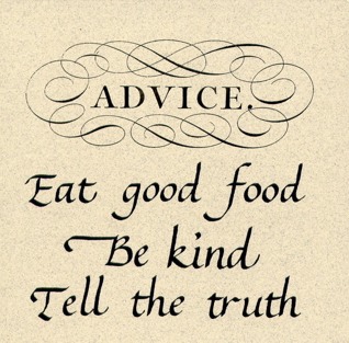
["advice": what you don't see is the amazing shine on the "advice" & its swirls, nor the sparkles in the paper.]
because i was already feeling like i had to do something incredibly simple, i wanted to try a new technique (which isn't new to professional calligraphers or the newpaper person i was in a former life): a paste-up version, where i don't try to create a perfect original, but instead write the elements a bajillion times, pick the best ones, paste the elements together & photocopy it. this allowed me some flexibility in layout and control of the elements & the ability to add graphics.
even so, after doing originals for so long it's hard not to think of it as cheating, especially when, influenced by the amazing "hall of best knowledge" series, i decided to stretch it even further by adding the "advice" element taken from the universal penman (the original of which i got to see at the getty and its original, official title is outrageously long: The universal penman: or, The art of writing made useful to the gentleman and scholar, as well as the man of business. Exemplified in all the useful and ornamental branches of modern penmanship; with some necessary observations on the excellency of the pen, and a large number of select sentences in prose and verse; various forms of business, relating to merchandize and trade; letters on several occasions; accurate specimens of the oriental languages, and alphabets in all the hands now practis'd / written, with the friendly assistance of several of the most eminent masters, and engrav'd by Geo. Bickham. The whole embelish'd with beautiful decorations for the amusement of the curious.)
ahem. anyway. calligraphic exif: tape 2 nib w/ sumi on a fox river tablet, reduced 20% on brown sparkly paper, graphic element reduced 50%, then (and this is the part that wowed 'em in class) a layer of gold laser foil (that i bought from paper direct probably over 10 years ago) was applied over "advice" to make it look like a foil stamp (man, i wish the scanner would pick up shiny. i like shiny! i am such a magpie.).
sven worked his magic again and painted the edges of a 4x4 tile black (except all his recent metalworking also dusted the black with minute brass filings, adding to the sparkly effect), added a sawtooth hanger to the back and mounted the finished piece this morning while i was still unconscious on the couch, overcome with the effects of sleep deprivation and flu. thanks, sven!
the next round of mhcc calligraphy is uncial/blackletter/spanish round gothic, which i've already done, so i think i'll be taking a break for a while. i'm pleased to have done a whole year of study, but i slacked on this last class more than i should have (as you can probably tell from the lack of posts). i might get back into a PCC class in fall or take a PSC lettering workshop. either way, i should brush up on some skills before the October AOCC with denis brown! *sighs dreamily*
posted by gl. | permalink | categories: calligraphy, classes & workshops
March 21, 2006
art updates
by gl. at 11:52 pm
i've added art to several of the CREATA workshop entries:
- communicating through visual symbols
- self-care for therapists
- dreams, active imagination & creativity
- exploring creative arts therapies modalities
- children's graphic development
- intro to art therapy
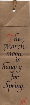
also, another weathergram:
now me & my sick self will toddle off to bed. today at creative job club we developed a major paradigm shift for artist's way promotional activities, but it'll be a few months before it becomes something tangible...
posted by gl. | permalink | categories: administrivia, calligraphy, classes & workshops
March 15, 2006
unitarian artist's way: week 8
by gl. at 11:40 pm
i can't believe i haven't checked in about the unitarian artist's way lately, and tonight was our last night. we were to share some of the art we've been doing, so someone brought a guitar, someone brought a banjo, someone brought a bright fabric-patterned cloth, someone brought a chapter from a novel, someone brought a book she'd made for her grandmother & some sculptural driftwood pieces. someone even brought us gifts: stones she had painted with the word "zhong dao" (balance) and a chop which represents longevity.
i brought a weathergram i made at psc monday night and the printmaking pieces i made last month:
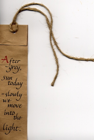
(these look so much better in trees, but we don't have any! harumph.)
posted by gl. | permalink | categories: artist's way, calligraphy
March 11, 2006
won't go slow so's not to focus
by gl. at 11:09 pm
hey, look! a non-creata entry! instead, a day packed with art activities:
i was going to go see shu-ju's work in the most recent print arts northwest show, but when i went to check on the address i realized they were having a fundraiser & demonstration at barnes & noble, so went to pick up one! hundred! demons! and visual journaling: going deeper than words. which worked out well, because we got to talk to shu-ju who helped sven figure out how to build a larger registration plate for the gocco, and i found out laurie is still selling gocco supplies.
on our way to collage to take pix of the show, we dashed into foster & dobbs, a food store i've been wanting to check out w/ sven. we walked away with caramels, cheese crackers & a japanese-inspired chocolate bar w/ ginger, wasabi & black sesame seeds.
we finally got pix of the 4x4 show! the owner remembered me and asked me about the inquiry from the OCADSV, but alas, i haven't heard from them yet. i'll follow up w/ a phone call this week.

4x4 display
"notification"
i also submitted a piece to portland modern's "saturation" issue today. i sent one of the star-based printmaking pieces i made last month:
"atlas céleste," named after discovering some amazing rare books at the us naval observatory library collection sitewe stopped by the ace pearl hardware store (16th/glisan) because sven has been wanting to check it out and he was on the hunt for a tiny tap, anyway (4-40, for those for whom such details matter. making your own threaded holes is still magic to me). it looks to me like they have many of the same things as uptown hardware, which i adore, but it's closer to the creative job club so i may stop there more often.
then we had dinner at pizzicato w/ michaelmas, and then we all headed to...
nochnoi dozor (link in flash, sorry). i had very low expectations of this movie but found myself enjoying it immensely: excellent cinematography, intriguing mythos (i love the Gloom), artistic subtitles and room for replay. there was even a buffy reference (and you haven't lived until you hear buffy say "get out!" in russian).
also, on friday i checked out the ceramics show "about place: the signature of a kiln" because it was in the mt. hood community college art gallery which is right next to my calligraphy class. one of my artist's way independent study students is a ceramicist and is almost giddy at all the nceca activity this weekend.
i have two and a half more creata sessions to write about & need to prepare for my tax appointment monday. but tonight, now, sleep!
posted by gl. | permalink | categories: calligraphy, exhibits & events, printing
February 28, 2006
old tech, meet new tech
by gl. at 11:10 pm
hooray! the portland society for calligraphy now has a webpage! it still needs a little more work, but mostly just tweaking the menu & adding beautiful works of art. the current chairperson of the society has been really great to work for, but even given the opportunity to work w/ good people & an ideal topic, i just don't enjoy web development the way i used to. i am glad to have the chance to give them a website, though, something they've been needing for years. now when people search for the portland society for calligraphy, people will hopefully find themselves there instead of here! :)
posted by gl. | permalink | categories: calligraphy, links, miscellany
February 23, 2006
4x4 art show a success!
by gl. at 11:21 pm
wow, what a crowd! collage was packed with people! and i am extremely pleased to announce my piece has already been sold! (thanks, colleen!)
i want to thank everyone who came: your support means a LOT to me. artists need other artists and friends who both encourage and support their endeavors (well, and who doesn't, really?). so when i say "thank you" here, i am full of gratitude & appreciation. many thanks to sven, michaelmas, susan, dian, jessica, leigh & her sister, kristen, colleen and amanda for coming by to say hi! thanks also to mph & linda sawaya, who both sent kind emails.
of course, this was just the reception and there's still plenty of time to see the show: it's up till march 27 at collage (1639 ne alberta). so if you find yourself in the area or with a hankering for small, accessible art, you should totally stop by. and because there won't be a big crowd like there was tonight, you'll have all the time you want to look at the 80-odd pieces. :)
sven bought a piece from linda womack tonight. he's been loving encaustics and we recently saw her work at an outside interactive installation. as a fellow dinnergrrl she's on my radar for a while, so i'm glad to have had an opportunity to influence an art purchase! afterwards, sven treated kristen & i to north pix, where i celebrated with a chocolate pear rosemary tart. :) thanks, sven!
posted by gl. | permalink | categories: calligraphy, exhibits & events
February 16, 2006
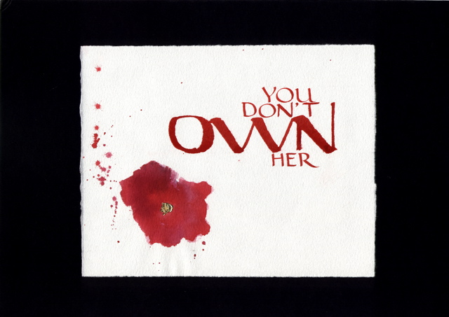
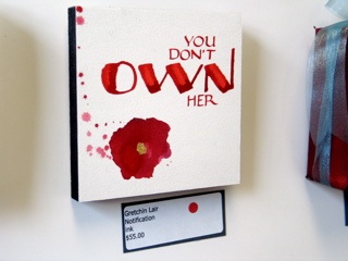
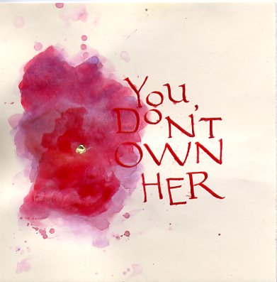
4x4 art show
by gl. at 1:16 am
ee! i've been accepted to the 4x4 show! i recreated "notification" (formerly known as "you don't own her") to fit in a 4" square because i like it so much and am thrilled it will be seen in public. the art reception is 6-9 p.m. february 23 (next week!) during last thursday on alberta. collage is located at 1639 ne alberta and the show runs till march 27. come say hi! w/ more than 65 other artists, there will be lots to see. :)
[original version: i forgot to take pix of the one in the show!]
sven got a wooden craft tile at craft warehouse, painted its z-dimension edges with black acrylic and added a sawtooth hanger on the back. he also mounted the piece for me this afternoon when i was afraid to breathe on it lest it do what the last one did. thank you, sven!
tech notes:
again, this piece uses ink & gold leaf; the stain uses four different colours of red. i tried using watercolor paper and arches text wove, and i am surprised to find the arches text wove worked better for this piece (and a little disturbed, since i gave all mine away).
but the most surprising discovery was that despite the recent investment in several types of folded pens, nothing compares to my favorite calligraphic tool in the whole wide world, the soda pop pen (a writing implement made from an aluminum soda can & a chopstick -- someday i should post the instructions).
see, i struggled to create a decent O with the firefly and the folded pen, even after consulting the calligrapher's bible (the only lettering book i know with not just one but three ruling pen hands) -- the edges are just too stiff, i think. but the soda pop pen is so flexible and effortless it's simply joyful. its only lettering deficiency is a tendency to scrape the inside of the letter, which causes the middles of strokes to be slightly lighter than the edges. but i had strayed from soda pop pens because i wanted more durable, easier-to-clean pens i didn't have to make myself. well, then. guess i'd better learn to cut my own quills next...
posted by gl. | permalink | categories: calligraphy, exhibits & events
January 28, 2006
mhcc calligraphy: class 3 (and artist's way prep)
by gl. at 12:18 am
shhhhh! i skipped calligraphy class today! i was on the way there and turned around about stark and came back home. well, actually i stopped at fred meyer first for some curtain rods for the curtains i bought at craft warehouse that i want to hang in the studio -- except it turns out that i just bought giant fabric, not curtains at all. heh.
i have the first artist's way independent study student of the new year coming over tomorrow, which means the studio had to get a shakedown today. we do pretty well keeping the studio clean when we run classes and host events, but if it sits too long between guests we pile things up and don't dust, so when classes begin again i have to mop & wipe the counters & clean the sinks (ink in sinks!) & dust, etc. etc. earlier in the week sven rented a steam cleaner so all the carpets are clean.
each time i run the artist's way creative clusters or host an event, we tend to make improvements to the studio. for instance, for the first cluster in this studio sven made the flat files and hung the star lamps in the living room. for the fall clusters we added a scarlet star lamp on the porch and a small red cd player, along with clearly labeled, consolidated & organized art supplies in the kitchen. this time the spring clusters will get pretty, colorful pots on the steps and a "scarlet star studios" sign below the window, as well as a large "pocket" curtain holding an array of small treasures & delights. the kitchen now holds colorful glasses, mugs, plates & special tea.
posted by gl. | permalink | categories: artist's way, calligraphy, studio space
January 20, 2006
mhcc calligraphy: class 2
by gl. at 11:46 pm
i had a little epiphany about italic today: many of the letters are just one stroke! in most calligraphic hands, each letter is composed of multiple strokes: for instance, the "a" is three strokes, the "g" is four strokes. but in italic, the "a" can be done in one stoke and the "g" in two! doing them with reduced strokes not only makes them vastly quicker to write, but it immediately affects the counters & spacing and automagically produces sweeter, thinner upstrokes. it's completely counterintuitive, though, because ordinarily you're taught only to pull a stoke, never to push it (except maybe in copperplate).
i've been using zig markers because they're a lot easier to travel with, but i really miss the crisp flow of ink, so i think i'm going to try a fountain pen next week.
i was feeling restless today and left a bit early because i've already created the magic book twice and still have leftover bubble paper from last time. turning right instead of left puts you on the historic columbia highway, which i took all the way past horsetail falls. thanks to the all the recent rain, that whole network of waterfalls is particularly stunning and new ones are tumbling from the rocks in abundance.
posted by gl. | permalink | categories: calligraphy, classes & workshops
January 18, 2006
mhcc calligraphy: class 1
by gl. at 11:11 pm
i'm taking the third class in the three-round cycle of mt. hood community college calligraphy classes, this time in italic. i've never actually taken an italic class before and after years of trying to train myself out of a slant, i need to become familiar with the 5-degree slant that makes italic both quick & elegant.
below is a monoline italic, which means i'm not doing it w/ a chiseled nib to give it the appropriate thicks & thins, but a blue sparkly gel pen instead. i'm surprised & relieved to find italic's basic letterforms are easier than expected:
and in fact, if i were using a copperplate nib instead of a gel pen, the letterforms aren't really that much different.
i know the gashlycrumb tinies so well that i often use it for calligraphy practice, but i think i'm going to begin learning gorey's "utter zoo alphabet" as an additional abecedarium.
posted by gl. | permalink | categories: calligraphy, classes & workshops
December 21, 2005
scary solstice from scarlet star studios!
by gl. at 12:30 am

3 things to know about these photos:
that cool scarlet star at the top of our artfully blurry tree is new this year: it showed up the day after we thought it would be cool to find one (thank you, serendipity!). what you don't see is that it's also decorated with the amazing tin stars sven made for my 31st birthday, when he built a scale replica of the burning man in our driveway and set it on fire. the stars fell out as the man burned.
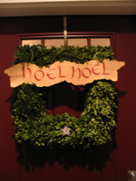
i've never made christmas cookies before. what better place to start than with scarlet(ish) gingerbread stars? this is the second batch, where i got fancy with icing and jiggering w/ the timing & thickness so they'd remain soft.
this is our first square wreath, decorated with another tin star and a "noel noel" banner i've had since i was just beginning calligraphy as a member of the summit scribes in colorado springs. man, that was probably about 7 years ago.
a scary solstice to all! and to all a good night.
posted by gl. | permalink | categories: calligraphy, miscellany
December 16, 2005
mhcc calligraphy: class 10
by gl. at 10:08 pm
i'm so tired my tongue feels thick and my hands disembodied. but finally, the final project is finished! i showed you the draft, but the final piece is done with a tape 1 nib and a "firefly" pen, which is the manufactured form of my favorite tool, the soda pop pen. the roman caps are lettered w/ calli scarlet on arches text wove (i know! after i disavowed it! but this ink surprisingly works fine w/ this fickle paper); the red stain is four different flavours of red inks with surprisingly different hues & gold leaf in its center.
[it looks so small surrounded by black. click for the larger version.]
even though i began this project earlier in the week, i finished the last of 21 attempts at 5:30 this morning. as i was detailing & packing the piece to take to class this afternoon, everything went wrong. while erasing the lines, one tiny dot smudged. i stopped and scraped it away w/ an exacto. while blowing some loose fibers away from the scraped spot, the gold leaf blew right off the red stain and off the table. i got up, got some glue and gently wiggled another piece of gold leaf in place. as i was leaving the studio, i dropped my sturdy cardboard portfolio and managed to gouge a ragged chunk from the "N" in "own" -- fortunately, not in a way that really distorted the letterform, as the gouge occured in the middle of the leftmost downstroke and the folded pen uses a lot of ink.
i don't normally do this, but i've actually used a little photoshop to edit some of the obvious blemishes because it was so heartbreaking to have it fall apart on me like this. will i make another? i don't know. probably not. i think the smarter thing to do is follow the "notes on making art" model and just create another: quality through quantity. still, it would be nice to use it for a portfolio piece....
it was difficult to share this in class because it is so obviously a "statement" and most calligraphers scribe innocuous song lyrics or bible verses. i've invoked him before, but i keep having to remind myself of charles pearce: calligraphers should write in their own words; calligraphers should develop their unique & possibly even political voice. afterwards i had one positive response from a woman i've been talking to over the term, but everyone else obviously didn't know what to say and a couple of people looked like they were afraid to look at it directly lest it infect them.
and now to sleep, perchance to dream...
posted by gl. | permalink | categories: calligraphy, classes & workshops
December 12, 2005
psc monthly meeting
by gl. at 10:03 pm
we introduced each other again because there were some new people and we had to mention what our favorite christmas song was. what if you don't celebrate christmas? i thought. calligraphers love songs like "silent night" and the "holly & the ivy" with the occasional rebel enjoying "jingle bell rock." but of course, when my turn came, i had to admit that when december rolls around, i break out the very scary solstice cd.
met a lovely new person who has a lot of energy and is eager to meet people and learn more. i think she'd have a lot to offer to and gain from a creative cluster, so i gave her a couple of cards for the portland artist's way creative clusters.
and i can't believe it, but i've volunteered to help create the website! it'll probably happen in january. the president, who feels responsible for creating the site on top of resurrecting a formerly dead calligraphy society, has already done a lot of the hard work like picking a host & getting a domain name & working out much of the layout/copy; i don't mind putting it online and maintaining it. and i so want them to have a website, as i was frustrated to be unable to find any info about them before i became a member.
and apropos of nothing: today i got red shoes! let's go dancing. :)
posted by gl. | permalink | categories: calligraphy, miscellany
December 11, 2005
keep the little flame flickring
by gl. at 9:47 pm
wow! as a letter junkie, how could i not fall in love with spell with flikr? :D


(found via arteliance, who linked to "notes on making art." thanks!)
posted by gl. | permalink | categories: calligraphy, links
December 6, 2005
mhcc calligraphy: class 9
by gl. at 11:26 pm
when xmas & blogging collide: we create gilded versals at last week's mhcc class. guess who's getting a gilded versal for xmas? :D fortunately, i'm guessing michaelmas will find the information here interesting & worth "tarnishing" the surprise. the scanner doesn't show shine so well, though. ergh.
this is considered in draft status until i clean up the edges, reoutline it & burnish it. gilding looks easy, but of course it isn't. it's time-consuming & fussy & messy. even with fake gold leaf kits (as opposed to shell gold, which is more authentic and costs proportionally more), there are several laborious steps after you draw your versal:
- bulk up a layer of gesso
- let it dry
- add a layer of adhesive
- let it dry
- no, really. let it dry. or when you add gold leaf, it will come up, and you will have to lather, rinse, repeat.
- when tacky, gently float a thin sheet of gold leaf over your piece, trying to get as few wrinkles as possible
- place a piece of paper over it & burnish w/ a bone folder, trying to get the gold leaf to cover all the adhesive elements
- brush off the leaf excess with a softsoft brush
- scrape up the edges of ragged gold and excess adhesive w/ tinytiny xacto strokes to expose your versal lines
- brush away all the bits
- re-ink
- place a very soft cloth over the piece and use a burnisher (or a bone folder) to make the bits shine.
- keep burnishing
- keep burnishing
- pause
- keep burnishing
- tada! pretty, huh? breathe. try to focus anywhere further away than your nose.
when i created this versal at mhcc, it was originally an asymetric design w/ just an M and a B in its right counter. but i drew it on a separate piece of paper because i don't feel confident enough to draw directly onto an original. i rarely do. then i did a basic graphite transfer -- which reversed the B and became the basis for the backwards S (michael's middle name is stuart). i loved the balance & playfulness this created. sweet, sweet serendipity!
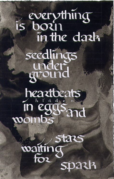
also, i was inspired last week to create an artistic response to a political issue (alas, this is one case i could have done without inspiration, though):
this is also a draft, but i see a lot of potential in it. that's four different colors of red ink.
and we don't usually post links (why not?), but here are two i find totally worth mentioning:
keri smith posts a template for a "magic book," which is how marti has us make the abecedariums at the beginning of each term. i'm thrilled to have the instructions because i can just barely do it when marti's there to show us, and it is definitely a cool technique to know.
the gocco is definitely my kind of cute & convenient, but this "cheap screen printing tutorial" wins super mega bonus points for being clever, easy, cheap & equally non toxic.
posted by gl. | permalink | categories: calligraphy, classes & workshops, links, printing
November 25, 2005
thanks
by gl. at 7:16 pm
no notable calligraphy projects this week (though i have to figure out my final project for mhcc soon...), but i dashed off some placecards for thanksgiving dinner yesterday:
just some simple bookhand w/ three gold dots on either side of the name. i used a harvest-orange french ink i've had for a while that's in a cool wax-sealed bottle and little cards already cut to size that i inheirited from chas' letterpress.
with or without placecards, we had a pleasant meal. but i was glad i actually took the chance to run over to the studio to do these; ordinarily i would think about it but not actually do it.
posted by gl. | permalink | categories: calligraphy
November 22, 2005
mhcc calligraphy: class 8
by gl. at 10:07 pm
we did some versals in this session, but i was much more interested in seeing how the pastepaper we made in the last session turned out.
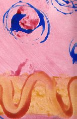
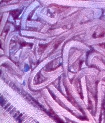
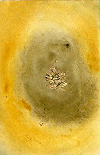
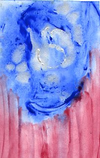
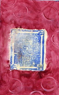
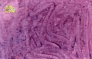
pastepaper is just acrylic paint mixed into cellulose-based art paste and applied to paper: in this case, arches text wove, which i find frustrating for calligraphy but excellent for pastepaper. pastepaper is often designed to be used in bits & pieces, but i find i am fondest of the ones that seem to be complete pieces in and of themselves.
it turns out i made 16 pieces. i can't scan three of the blue ones because i made the mistake of adding a copious amount of glitter to them, which makes them sparkle like a frosty winter twilight (the intended effect), but also gets on the other pieces and the scanner and the floor and the table and my clothes (the unintended effect). in fact, the pieces you see here all had some glitter shed on them, and since it was large salt-flake sized glitter, often it would pool, creating tiny dark rings and light spots where i wouldn't want them. and then they'd flake off and i would have to dust the scanner between each piece.
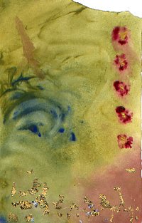
none of these were planned compositions; i just mixed colors and put them on the paper to see what happened.
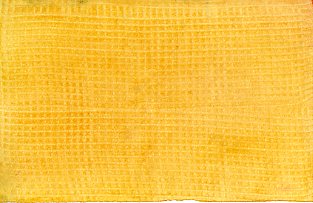
yellow wave (excerpt): this was the first piece i made and the paper is probably 4-8 times bigger than this. interesting note: all the pieces below were done with the same red, blue & yellow you see here.
purple noodle (excerpt): this is another excerpt before i began tearing the paper into smaller pieces to be able to experiment faster. ("get through your first 50 failures as quickly as possible."). the pattern is just fingerpainting with some plastic fork happening in the lower left corner.
greengold center: that's gold leaf in the middle. i was surprised to discover it stayed on remarkably well with just water & art paste.
red flowers: i wasn't tearing the paper especially carefully. :) if i could make changes to this one i would remove the odd brown streak angling from the blue swirls, because otherwise i'm quite fond of the composition. another experiment in gold leaf at the bottom, though the red spots have gold paint centers.
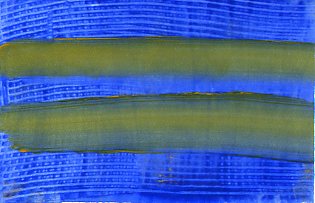
flag: i brought some silver ink and wanted to see what it would do.
fish stamp: marti brought some stamps so i played with them. i used something called "colorblock" on top of the fish, hoping it would let me paint on top of it and later peel off like frisket. alas, that didn't work, and when we used the hot press to flatten the pieces, it melted and stuck to the press padding. so what's colorblock good for? i have no idea.
secret: more playing w/ stamps, this time a letter block i used -after- put color down, trying to achieve a subtle tone-on-tone effect. then i tried writing a word in it, then i tried drawing a heart and adding gold leaf to it. none of these effects worked as planned, and it was especially embarassing to discover i had drawn the heart upside down.
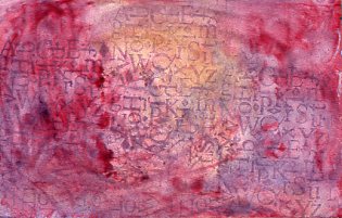
noise: undaunted, i tried laying the alphabet stamp block down first (using leftover paintpaste from "secret"). much better. there's a subtle gold wash in the center.
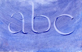
abc: i wanted to try writing in the paste again. much better. this is bookhand, btw. i know the "b" is a little wide & the bowl is sloppy.
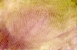
soundwaves: i decided to try a traditional pastepaper tool: a notched comb with squared teeth. i don't usually like the texture it makes, but in this case i'm quite fond of the overlapping ripples.
yellow weave: another "traditional" pastepaper approach, i was charmed by its sunny simplicity. somebody set their dark blue piece to dry too close to mine, so it has some bluegreen edges.
yellow stripes: one last try with the comb. eh.
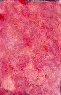
raspberry swirl: nothing special here: i think i used a plastic fork for the swirls but it wasn't as pretty as i'd hoped.
of course, now i have to use all this somehow; i still have three pieces of pastepaper from when i first made pastepaper in san diego. i'm hoping that because i made much more this time, i won't feel each piece is as precious and i'll be able to find interesting ways to use it.
posted by gl. | permalink | categories: calligraphy, classes & workshops, other art
November 15, 2005
go go gocco!
by gl. at 11:12 pm
i succumbed! the charming little gocco has won mon coeur and a spot in the studio's kitchen & printing shelf. i bought little miss gocco (or as sven calls her, "baby") at last night's portland society of calligraphy meeting, since the woman who owns letters and print (and who has been a calligrapher for years) was demonstrating them. i walked away with an embarassing number of inks & supplies, but i began printing tonight after artist's way!
i began with our logo and immediately hit a snag: though you can print multiple inks on one screen, it's a lot easier to do when your bits aren't so close together, like the stars next to the text and the streak behind the scarlet star. this is especially difficult when working with the logo at a reduced size, like one would want to print on the back of those cute blind contour cards i just created. :) i get about 10 out before the red or the silver really begins to creep into the wrong places. i bought some ink block, but i can't cut the foam finely enough to wedge between some of the spaces and instead just end up blocking bits of the screen.
in the blind contour drawing print, the migration of colors is part of its charm. the logo, though, suffers when silver stars become scarlet and vice versa. i suspect i will have to create two screens for the logo (one for silver & one for scarlet), which is a shame because it will require drying time between screens and careful attention to registration to print the logo on anything -- which likely means i'll be less inclined to do so. meh. this is, of course, my curse: to take something that is incredibly easy and immediately discover its limitations. :)
the good news is that creating the screen was super easy. none of it is difficult; in fact, it's amazing just how easy it is. and i still love the tiny explosion.
posted by gl. | permalink | categories: calligraphy, printing
November 5, 2005
mhcc calligraphy: class 6
by gl. at 1:19 pm
below is a bookhand layout using color for emphasis. the ink is actually much greyer than the scan makes it look: i watered down sumi fairly heavily to make the red stand out more. (and i like the whole grey/red thing. can you tell? ;)

[click for a larger verion]
my least favorite thing about calligraphy is struggling with materials. and i hate doing projects for classes which aren't actually functional -- why put in all that work if i can't actually display it or give it away as a gift or sell it? that's why the artist's way open studios have been working well for me, because at the end of the night i have created not just art, but a card i could give to someone.
i struggled w/ "two ways" because my typical card stock proved to be troublesome with the size of nib i had to use (a tape 1). the nib skipped and shook and wavered more than a nib even a half size larger. even turning the card inside out to use the hot press side didn't help. so the time i'd rather be spending tweaking layout and lettering got swallowed by debugging instead, making a 4-hour process 8 hours long.
so i frantically scrambled through all my papers for a smoother grain. what i should be using because i bought it specifically for this purpose is arches text wove, which i bought because the amazing teri martin recommended it during the sdfc coloring books workshop. i think teri uses gouache & acrylic, though: every single ink i've tried to use on arches text wove has feathered & spread: even sumi spreads a little. it's part of the trouble i was having with joanne's wedding comission earlier this year. i have about $75 worth of arches text wove in the flatfiles but if i can't use it, what's the point? i ended up using cheap paper from a strathmore drawing pad.
the sdfc did a paper sample workshop which was really interesting, but at this point, though i still have the samples, i don't what they are anymore (though i have some sort of vague memory that i was impressed w/ fabriano). and really, all i want is a good off-white text weight and cardstock/envelopes that work w/ inks & a variety of pen sizes. i got recommendations from the advanced calligraphers in the backof the class (aquarius 2 & fox hill), and i think i may be due for a paper & ink or daniel smith shopping trip.
we won't be meeting next week or the week of thanksgiving, though we may be doing a pastepaper workshop on saturday.
posted by gl. | permalink | categories: calligraphy, classes & workshops
October 29, 2005
mhcc calligraphy: class 5
by gl. at 5:06 pm
we must be about halfway through now, though we won't be meeting for two weeks in november. as promised, a layout w/ bookhand & roman caps:
[click the image for a much larger version]
after weeks of using zig markers for practice, i was happy to discover that tape nibs give me lovely hairlines when using sumi. here i've used higgins white and it very much sucks, immediately absorbing into the black card stock. in this case, i liked the ghostly & faded historical metaphor effect (which is actually sort of mitigated in the scan), so i kept it. the lettering required three different nibs: tape 2, tape 1 & a random pointed pen. the fireflies are three different colored pencil and you probably can't tell, even on the larger version, that the fireflies have tiny gilded centers. i like using gold dots on things, but they never scan well. i embossed the background lines this time so they are even more invisible than the pencil lines i used in "born": great for ink, but not for colored pencils, which explains why the fireflies look like they have black lines through them. oops.
if anyone reading this also reads dooce, yes, it's that heather armstrong. when i read that line on one of her posts, i knew i wanted to use it in a piece somehow.
next week: a layout using color as emphasis.
posted by gl. | permalink | categories: calligraphy, classes & workshops
October 10, 2005
psc monthly meeting
by gl. at 9:58 pm
i brought pens & little handmade books to the portland society of calligraphy calligraphic recycle sale, and walked away with two books, one of which is an art journal book i plan on referencing in artist's way. i had my eye on another art journal but the fluid dynamics in the tiny room were odd and someone else walked away with it just inches before i could.
later, they briefly talked about artist trading cards, mainly via cyberscribes, which i realize i ought to probably join again. (i set myself to "no mail" after burning man last year and never changed my subscription.) the speaker knew there was a group in town, but it was small and she dismissed it.
this meeting was attended by a lot more people (26 instead of 10). still, i'm a little disappointed because the room isn't set up for anything other than sitting around in a circle, talking to people you know. it's a much less educational environment than my experience w/ other calligraphy guilds, and the only way to change that would be to changes spaces, i think.
aocc, which i missed this year because i stayed home sick, will be hosted in portland in october 2006. that'll be nice. :)
posted by gl. | permalink | categories: calligraphy
September 15, 2005
psc monthly meeting
by gl. at 5:06 pm
i went to my first portland society of calligraphy meeting monday and was surprised to find only nine people there, including myself and the presenter, who was the president of the group. nine people at the first meeting of the year is not a good indicator of group health, especially when you have about 120 members. sdfc had 89 members, but about half of them were active and came to the meetings, which were a mix of business, lecture & hands-on activities. the summit scribes also had a very vibrant meeting culture.
so we all talked about our summer vacation & then the president showed cool photos of the projects developed & displayed at the legacies conference. portland calligraphers are striking in the way they feel compelled to mention how many degrees of separation they are from lloyd reynolds (who began a calligraphic renaissance at reed) and jacque svaren (one of his students who wrote the orange lettering book that every proper calligrapher must own). the president, who seems both talented & kind, was credited for resurrecting the group from the dead, so i want to give her some credit for rolling the stone up the hill. but if this had been my first group meeting ever, i probably wouldn't return.
i'm hoping next month, which includes a calligraphic supply exchange, is better. plus between now & then, i'll be attending the aocc. and i am hopinghopinghoping that there's enough interest to bring denis brown, one of the calligraphers i simply swoon over, to teach a class.
posted by gl. | permalink | categories: calligraphy
August 20, 2005
on word and art word: show ends
by gl. at 9:54 pm
btw, the on word & art word show ended thursday and i went to pick up my pieces yesterday. as we arrived, we saw the curator taking pieces into city hall, a different building than the visual arts gallery, and when we got inside, they were already setting up another show. aiee! so we ran back to the other building and found my pieces in the office of one of gresham's city administrators. it turns out the curator had decided to leave early so he could do a kiln firing.
posted by gl. | permalink | categories: calligraphy, exhibits & events
July 26, 2005
mhcc fall calligraphy registration
by gl. at 9:47 pm
after what i consider to be the smashing success of the spring mhcc class (i worked on calligraphy regularly, learned a new hand i like, created a beautiful finished piece, and got to be in an art show), i went ahead and registered for the fall course, which is bookhand and roman caps. it starts & ends about the same time as artist's way, so it looks like my fall will be busy again.
posted by gl. | permalink | categories: calligraphy
July 20, 2005
on word and art word: reception
by gl. at 3:58 pm
it was a fairly good reception, as receptions go. certainly i've said before that i am missing the mingling gene that powers most receptions, but enough people i knew came to keep me busy. colleen was there when sven & i got there, even wearing the labyrinth gift calligraphy! then a current mac student stopped by. rob & kyrie got there just a couple of minutes before the reception ended and the gresham city hall meeting began. michaelmas was late; we had to slip in and whisper and point. alas, my calligraphy instructor was apparently hit w/ a golf ball and had to stay home.
btw, i've already had to reprint both batches of artist's way flyers! that's a milestone i didn't hit for the spring classes. being out & about in gresham yesterday allowed me to hit a couple of places there and give flyers to people who stopped by the art show (thanks, colleen, rob & michaelmas!).
posted by gl. | permalink | categories: artist's way, calligraphy, exhibits & events
July 1, 2005
on word and art word: artwork delivered!
by gl. at 6:38 pm
i dropped my four pieces off at the show today & got a handful of postcards featuring two of my works verso! ee! i've never had that before. i am painfully aware that the "a grace it had, devouring" picture is the wrong resolution, but "born" sure looks good. :D
details:
the show's mistaken official title is "onwards & artwards."
the real title is "on word & art word." 'cuz it's a calligraphy show, get it? apparently all the publicity people didn't.
the exhibit runs july 5-august 18 at the gresham city hall visual arts gallery (fair warning: the page looks, um, awkward in safari).
open monday-friday 8 a.m.-5 p.m. and the first and third tuesdays of the month from 8 a.m.-7 p.m.
the reception is july 19 (i'll be there! come visit!): 5-6:30 p.m.
posted by gl. | permalink | categories: calligraphy, exhibits & events
June 19, 2005
on word and art word: paperwork
by gl. at 10:21 pm
so i got my paperwork in for the "on words and up words" calligraphy show at gresham city hall next month. tonight the curator called and asked for some print-ready pix so that they could go on the promotional postcard. whee! the only problem being that i don't have any; i only have web versions. so off i go to the studio when i thought i was going to bed.
posted by gl. | permalink | categories: calligraphy, exhibits & events
June 10, 2005
mhcc calligraphy: class 10
by gl. at 7:46 pm
all we did today was display & briefly discuss our final projects. my project was the first few lines of the poem i wrote for maya's birth on the sink marbled-paper. it's rotunda primarily using a tape 2 nib and accented w/ a tape .5 nib w/ j. herbin grey pearlescent ink on arches text wove. (see? even calligraphers have their version of exif geekiness. ;)

[click on the image for a larger version]
after the wedding commission, it was a relief to have all the materials cooperate this time, and i'm really pleased w/ the result, especially since sven created a terrific dimensional frame made entirely of black foam core and copper wire. the only issues were that i discovered i couldn't erase the pencil marks without also lifting the black from the background, and the pencil lines were very difficult to see in the grey/black contrast. this turned out to be a project that took about 15-20 hours of my time, but i don't mind working hard on something if there's hope at the end of it. most of lettering for me is finding the right line spacing, especially as i tend to design calligraphy as if it were typography. but between the wedding commission and this project, my right hand is actually swollen; i've never had that happen before, not even when i stayed up all night making christmas cards while michaelmas talked to me over the phone.
throughout this project i kept thinking of the time michaelmas & i went to an sdfc meeting when charles pearce was lecturing, and he talked about how, if you're going to do a piece, it ought to be a piece based on your own words, in part because calligraphers are almost always copying the words of others (especially in the form of quotations). he talked about it in terms of having a unique and potentially political voice, but having just spent so much time with just 4 lines of my poem, it had better be words i want to be heard.
posted by gl. | permalink | categories: calligraphy, classes & workshops
June 8, 2005
you win some, you destroy some
by gl. at 11:53 pm
there's very little that can compare to the horror of giving your calligraphy to the patron and hearing her say it's beautiful -- and then hearing her say, in slow motion, "but his name is Dubbs, not Tubbs."
i felt my heart sink. i felt awful. she's leaving the day after tomorrow at early o'clock, so i immediately went home and tested more paper and nibs and ink and finally got three more done, which we'll arrange to view tomorrow. it just felt like a complete insult to spend all this time & energy on this piece for it to have gone so horribly wrong.
the good, vaguely related news: the final project for mhcc is going to be great. i'm thrilled with what i'm doing, and the sink marbling couldn't have come at a better time. when it works, it works! the hand i've chosen, the paper, the ink is all coming together to create something very fine indeed.
posted by gl. | permalink | categories: calligraphy
June 5, 2005
you win some, you lose some
by gl. at 11:05 pm
[warning: big pix post. click on the images to see them larger.]
so i'm finished w/ the wedding commission even though i'm still unhappy w/ it. gouache worked better, but at the consistency i needed to get it to come out of the pen, the letters were still not as sharp as i would have prefered. i tried using three more different types of nibs to see what effect that would have, which was none. a couple of months ago i began ranking my paper based on bleed factor, so i started looking through the 3-star paper to see if that would help. and it did, a little. i had 5 sheets of a 3-star paper the right size, so i used all of it attempting to make the lettering work, and then, with my hand cramping, i finally called it a night. two full days working on a 3-line piece is just too much. all told i must have done over 30 versions of this piece and i'll give joanne a choice of four of them, none of which i would consider to be perfect. man. after all this, it makes me nervous to tackle my mhcc final project on friday.

(so why do i want to write about these difficulties when potential clients could read this blog? because i don't think art should be mysterious, in the domain of a few special people who make it look easy. and people undervalue art when it looks effortless, especially calligraphy. art isn't always a struggle, but divine inspiration is rare and we cheat ourselves and others if we pretend we don't work at it.)
although speaking of divine inspiration, i did make a lovely, if late, discovery tonight. several months ago i discovered a faux marbling technique while washing out a container of sumi ink in the studio sink. unfortunately, i grabbed the first paper that came to hand, plain 8.5x11 printer paper, and so made these fascinating swirly grey prints on pretty crappy paper. i've been meaning to try again on better paper, and while cleaning up after the wedding piece, i realized i had leftover green gouache, gold ink, and a half-full black ink i had intended to throw away after i broke my nib the other day.
so i tore up some arches text wove and threw the gouache in the sink and laid the paper over it. not as good as before: i got some bland green smudges, but nothing noteworthy. i figured when it dried i would try laying the green papers on the gold ink, but in the meantime i would see what i'd get out of the black ink. muuuucccch better! i had enough in the bottle to do almost 20 sink-marbled pieces, and i had to keep tearing up more arches text wove to print on.

and because i'm printing in my sink, after the 6th or 7th one i placed one over the drain in such a way that when i pulled it up i thought, "oh, that's pretty. it sort of looks like the moon." and then i did it again with more marbling and i thought, "ooooo! moonprint!" and that's how the moonprint series began. because i was still experimenting w/ the printing technique, i couldn't consistently get a moonprint, but i'm starting to get the science of it now: the fluid dynamics, the way the waterproof sumi must have some hydrophobic bits which repel the water to make it float, the way the paper soaks up the ink and the water to limit the pieces to monoprints.

first moonprint

second moonprint
so some of the marbled prints are subtle, some of them are stunning, and some look as if they're old and damaged gelatin prints of a magic moon. what will i do with all this black and grey paper? i still want to see if i can add another layer of marbled gold to some of the pieces, but tomorrow i start artist's way at the mac. eek!
posted by gl. | permalink | categories: calligraphy
June 4, 2005
wedding gift commission
by gl. at 11:53 pm
argh! i spent all day working on the layout & ink selection for a wedding gift commission, even going so far as to blend my own gold from a combination of other golds, only to find that all my green inks bleed on the final paper i'm going to use. it makes the letters fuzzier than they ought to be.
i'm going to try gouache for the first time tomorrow, but i'm not hopeful.
posted by gl. | permalink | categories: calligraphy
mhcc calligraphy: class 9
by gl. at 11:43 pm
created a pangram book, gold leaf. the next class is the last one.
i broke a nib in frustration while trying to get ink to come out before i decided to check the ink. lesson learned: this blend of cast-off inks will finally be tossed.
posted by gl. | permalink | categories: calligraphy, classes & workshops
May 27, 2005
on word and art word
by gl. at 11:29 pm
oo! i'm going to exhibit four pieces in the "on word and art word" exhibit at gresham city hall in july! my calligraphy teacher introduced me to the guy who's hanging the show and he said yes! the pieces will be the four i still have framed: "aliya's tree," "blue fish," "tongue far from heart" and "a grace it had, devouring." of these, only "tongue far from heart" will not be for sale. not that i expect them to sell, but "tongue far from heart" is the first piece i executed from a late-night calligraphic epiphany, and it was my first insight into how the artist's way was finally working for me, so i consider it irreplaceable.
posted by gl. | permalink | categories: artist's way, calligraphy, exhibits & events
mhcc calligraphy: class 8
by gl. at 11:20 pm
more on blackletter. i still really like it, but it seems too formal for most of the projects i want to make, like something for maya or the commission i'm currently doing for joanne. we also did some dry embossing (stars for me, of course!) & i got samples of silver & copper foil that i missed when i was sick.
posted by gl. | permalink | categories: calligraphy, classes & workshops
May 21, 2005
mhcc calligraphy: class 7
by gl. at 2:51 pm
it rained so hard we got leaks yesterday. combine that with the monotonous strokes of blackletter, and it's like chinese water torture. :) actually, i like blackletter; it comes out of my fingers really easily and in a rhythm unmatched by any other hand.
it also turns out we were not doing spanish round gothic last time (though the handout said we were); instead, we were doing "rotunda," and this week we did spanish round gothic. the ironic part is that spanish round gothic is a "rounder" hand than rotunda.
during the last half of the class we carved stamps, the neat part of which was coloring them w/ crayola markers instead of using a stamp pad. in this case, it turns out the second impression is much more detailed and beautiful than the first one.
there's a calligraphy show july in gresham. the instructor has asked me to bring in some of my stuff next week to possibly submit. ee!
posted by gl. | permalink | categories: calligraphy, classes & workshops, exhibits & events
May 17, 2005
mhcc calligraphy: class 6
by gl. at 4:59 pm
eep! almost forgot to write about the last calligraphy class! we covered versals, which i always love, (especially roman capital versals), and i smiled a little at the juxtaposition of using fluorescent gel pens to create ancient letterforms. we also began spanish round gothic, which also has a wide pen manipulation (from 30-90 degrees), but it's not as schizophrenic as rustics and really has a flow and density that's similar to uncials. i've been jonesing to practice it for the last few days.
we also got to go to the student art show. some very nice calligraphy books and pieces, but the work that really got me was a boxy installation covered with pine boughs, and the inside was red and lit and as huge as a giant's heart. two doorways were flanked with maroon velvet curtains and inside were golden buckets filled with inky blackness and a crack in the ceiling had text i don't remember peeking out.
posted by gl. | permalink | categories: calligraphy, classes & workshops, exhibits & events
May 9, 2005
portland society of calligraphy: first meeting
by gl. at 10:33 pm
alas, the weather was bad and i was sad to have made the almost 2-hour round trip to watch a 1-hour long lloyd reynolds video. a youth group kept interrupting and giggling and running up the stairs and playing their thumpa-thumpa music below us (god, i'm old!). i'll become a member, but i'll wait to attend until there's a slightly more interesting program.
there were about 9 or 10 of us in the room. i met linda, who was attending her first meeting in 10 years. she was an active calligrapher and teacher and wants to get back into it now that her children are in college. the president seemed nice and she said she'd send me an application form; i got the impression things were in disarray when i called the first time and they're trying to smooth out the rough spots.
posted by gl. | permalink | categories: calligraphy
May 6, 2005
mhcc calligraphy: class 5
by gl. at 10:42 pm
i was sick! i didn't agonize over it too much because i have no interest in rustics, anyway, but it means i missed my chance to contribute to the student art show. meh.
posted by gl. | permalink | categories: calligraphy, classes & workshops
May 1, 2005
mhcc calligraphy: class 4
by gl. at 4:26 pm
we're beginning rustic letters, and i -hate- them. hate hate hate. they don't like me much, either. they're 7.5 penwidths tall and as awkward as a fawn learning to walk but not nearly as cute. it's got a steep angle and there's major pen manipulation involved, which in my opinion is an advanced topic.
however, i used sven's unbirthday card as my uncial project due last friday. the instructor liked it so much she asked me to participate in the student art show next month. she also spoke a little disparagingly about calligraphers who deliberately write illegibly. my most recent work w/ the soda pop pen falls into that category, so i wonder if she'll accept "tongue far from heart" or "a grace it had, devouring"?
posted by gl. | permalink | categories: calligraphy, classes & workshops
a very merry unbirthday
by gl. at 4:13 pm
it's sven's unbirthday today, so i made a card for him:

(click the image for a larger version)
technical details: this is modern uncial done w/ a speedball c2 nib on a strathmore card. the counters were filled w/ watercolor pencil and a gold paint pen left the shiny raised dots this picture doesn't do justice. i left the pencil lines because sven finds them charming and i adore ephemera like that.
posted by gl. | permalink | categories: calligraphy
April 17, 2005
mhcc calligraphy: class 3
by gl. at 4:21 pm
more uncial, a wonky revised syllabus, & bubble paper. happier w/ my "n"s and "w"s, though i still need more practice in making things vertical instead of slanted to the left. next week i have a finished layout to present. yeep!
posted by gl. | permalink | categories: calligraphy, classes & workshops
April 1, 2005
mhcc calligraphy: class 1
by gl. at 10:11 pm
gosh, the mhcc cottage studios are neat. huge skylights providing even, soft natural lighting. lovely large tables that tilted at any angle, with good stools and solid footrests. it's making me rethink the table setup i have now. the teacher, who is in her late 60s or mid 70s, says she's a friend of jacqueline svaren (who i gather may still teach at pcc!) and that they were both students of reed's own calligraphic demigod lloyd reynolds. we were taught about calligraphy materials & how to line a page using pen-widths instead of standards units, both things i already knew about, but next week we start uncials! yum. i don't have a regular practice time yet, but knowing myself as i do, it would behoove me to front-load some practice in case i slack later.
all of the other students are enrolled in more than one mhcc class, and most are in a degree program. about 10 other people, 3 of which are boys, which is a pretty good ratio, though one of them left on break and never came back. i met a girl who does pottery and poetry and has always been interested in calligraphy -- she is interested in combining psychology and art, so we talked a fair amount about art therapy and i'm trying to put her in contact with some of the people i met at the creata workshops.
a huge hail storm on the way, there, though! even so, i got there about 20 minutes early and so went looking for rob in the library. afterwards i took stark all the way to the historic columbia river highway (crossed the stark street bridge!) and head to springdale, then turned around and followed it to halsey and took halsey home.
posted by gl. | permalink | categories: calligraphy, classes & workshops
March 11, 2005
portland society of calligraphy
by gl. at 10:09 am
so it turns out the portland society for calligraphy meets on the second monday of every month! (the same nights as artist's way.) so i can't go till their may meeting, which will be the last one of the year (they'll pick up again in september, just like sdfc used to).
i just finished arranging my schedule for fall and if i really like them, i'll be sad to miss them till spring 2006. otoh, if i don't like them, i'll be mad i rearranged my artist's way schedule for them. i think i'm going for the "become a member & do extracurricular activities" strategy till spring. i can't believe i have to plan this far ahead in march. :)
their membership fee is lower than sdfc, but they seem less interesting, too. they meet in a church waaaaaayyy out in beaverton (ugh), the woman who spoke to me asked me nothing at all and volunteered very little information (and got back to me more than a week later), said she couldn't send me a newsletter or a membership form, and the next three meetings will be "reviewing the lloyd reynolds videos." who, admittedly, was a reedie, but hmmmmm. surely there's something more to the society than this. i miss the sdfc.
posted by gl. | permalink | categories: calligraphy
February 14, 2005
the pretty scroll paper
by gl. at 1:08 pm
it's valentine's day. welcome to the new scarlet star studios blog!
i received an email today: "Hi there. Are you the person who writes sentiments on the pretty scroll paper with the calligraphy writing? I would like something made. Please write back."
why yes! i am the person who writes sentiments on the pretty scroll paper! i should add that to my business card:
Gretchin Lair
Writes sentiments on the pretty scroll paper
Artist's Way facilitator
whee! :)
posted by gl. | permalink | categories: administrivia, calligraphy