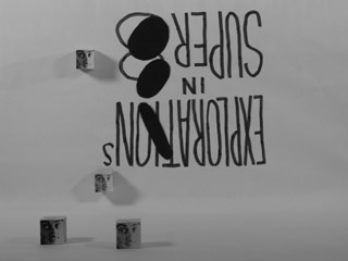
movies
you are here [x]: Scarlet Star Studios > the Scarlet Letters > movies
October 8, 2011
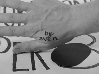
sambuka black @ wordstock
by sven at 1:35 pm

Congratulations to Dielle and Jeff, whose newly self-published book Sambuka Black debuts at Wordstock this weekend!
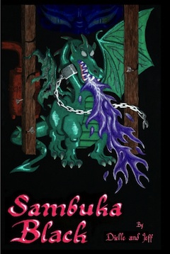
Dielle and Jeff are master animators dating back to the hey day of Will Vinton studios, and also worked Coraline. Dragons, a cyclops, a faun, giant wasps—it's a really fun fantasy novel... Packed full of references that will make stopmoes giggle with delight.
And all of the books are painstakingly made by hand!
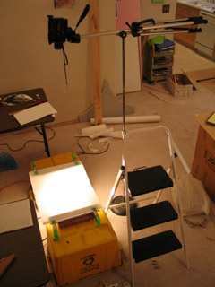
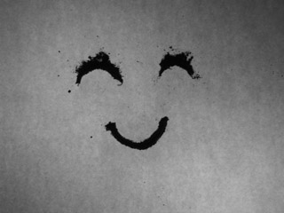
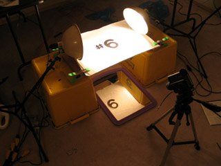
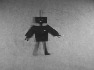
I've been doing some experiments with a down shooter in my (cough) copious spare time. I thought you might like to see the source animation, before I messed with it in AfterEffects.
The drawings were done on gridded paper that I created using incompetech.com. Small equals fast. And it's really nice to be able to work from left to right, just as one would for normal handwriting.
...Congrats and good luck with the book, Dielle and Jeff!
posted by sven | permalink | categories: exhibits & events, movies
July 20, 2011
animation walk
by sven at 5:30 pm
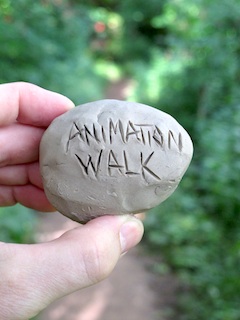
Experimental stop-motion animation driven by six principles:
- An animator animates.
- You can animate anywhere.
- Get out and walk.
- Every artist needs a sketchbook.
- Clay is your pencil — the photo is your page.
- Watch your mind evolve one frame at a time.
...It's been such a busy year, I had to find some way to squeeze in actual filmmaking!
P.S. As usual, the soundtrack won't be much good unless you've got decent woofers in your audio system.
posted by sven | permalink | categories: movies, stopmo
July 13, 2011
"mutate" in da vinci days film fest - july 16, 17
by sven at 1:46 pm

My short film Mutate will playing at the da Vinci Days Film Festival this weekend in Corvallis.
It's playing twice, so Gretchin and I will be taking a little vacation to check out the whole affair. It's part of the Animation Block, which will show on Saturday (July 16) at 3:45pm at the Darkside Cinema and Sunday (July 17) at 2:30pm at the Majestic Theatre.
I'm often amused by how festivals re-write my film description. Here's the da Vinci version:
Like an Animal Planet documentary from another dimension, MUTATE reveals the bizarre life-cycles of various alien creatures as they meld, merge, dissolve and evolve in surprising and frequently hilarious fashion.
Not bad. :)

posted by sven | permalink | categories: exhibits & events, movies, stopmo
January 26, 2011
"mutate" in openlens festival - jan 29
by sven at 11:39 am

My stopmo short Mutate will be showing this weekend in Eugene, Oregon, at the OpenLens Festival.
The date of my film's screening falls between two days when I'm emceeing for PDX Playwrights shows at the Fertile Ground fest. Playwright and animator... It's kinda mind-bending to switch between these identities in such quick succession!
Screening: OpenLens Short Film and Video Competition
Time: 8:00 PM
Location: UO Baker Downtown Center at 325 E. 10th
Admission: $8. Includes screening, awards ceremony, and reception with filmmakers and audience. Refreshments provided by DAVIS Restaurant.A screening of jury selected films for DIVA's OpenLens Festival Short Film and Video Competition will be followed by an awards ceremony and reception at which you can join filmmakers and others in celebrating the evening's showcase of exciting short films. Awards: $500 - Best Of Festival Jury Award. $200 - Honorable Mention Jury Award, and a $100 - Audience Choice Award. A membership in the Mid-Oregon Production Arts Network (MOPAN) organization will be awarded the Best Of The Festival film director.
OpenLens 2011 is a statewide event that provides an opportunity for Oregon short film artists to showcase their work in a competitive event. It is a small festival dedicated to the showcasing of new work while providing the opportunity for artists and audiences to meet and network.
This year’s festival features work from around the state as well as that of local artists. Of the 36 entries submitted, the festival Jury has picked a number of excellent films for the evening program. This year's juried films, trailers, and descriptions are available online.
Update: "Mutate" won Honorable Mention!
posted by sven | permalink | categories: exhibits & events, movies, stopmo
October 14, 2010
the whisperer in darkness - trailer 2
by sven at 7:00 am
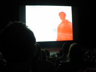
click image to see trailer on YouTube The H.P.Lovecraft Historical Society has just released a new trailer for their feature film, The Whisperer in Darkness! ...Big reveals!
Many of you will recall that I spent nearly a year laboring on this project as an armaturist. In the end, my work wasn't used as we'd originally imagined -- but it did ultimately play an important role in the production. (More on that at a later date.)
I got to see this trailer when it premiered at Portland's H.P.Lovecraft Film Festival on Oct 2. Very proud. Even prouder when the HPLHS guys received the Howie Award for their contributions to "the genre of cosmic horror, weird tales, and the promotion of Lovecraft and his work in particular."
[What, YouTube got nuked from space? Click here to watch an archived copy of the trailer (3:23min - 45.3 MB).]
posted by sven | permalink | categories: movies
October 12, 2010
"mutate" in film festivals
by sven at 5:16 pm
In the next few days, my film Mutate will be playing at three different film festivals...
Astoria International Film Festival
Saturday, Oct 16
1:00pm
Liberty Theater
1203 Commercial Street
Astoria, OR 97103
(503) 325-5922"In this brief but highly creative abstract clay animation, we witness the whimsical and even sometimes intriguingly edgy musings of a sculptor/animator with a sense of humor. The zany sound track mirrors the outré visuals. Like most art, Mutate defies concrete analysis; just relax and enjoy the quirky fun!"
-- Michael Fendel, Astoria International Film Festival
Salem Film Festival
Saturday, Oct 16
3:00pm - Northwest Emerging Artists Shorts Package
The Grand Theater
191 High Street NE
Salem, OR 97301
(503) 990-0150"Strange clay creatures revolve, dissolve and evolve in this delightfully quirky stop-motion animation."
-- SFF website
Video Gong Show - Final Round
Thursday, Oct 21
8:00pm ???
4122 N.E. Sandy Blvd
Portland, OR 97212
(503) 281-4215"3 competitive rounds of screenings have been scheduled & each is to take place in a different Portland quadrant throughout the summer. Top 5 films from each round will advance to the Finals at the Hollywood Theatre in October. Contestants compete for a $100 cash prize and a grand prize package from Picture This worth $1000. Just as with the classic show, the film's run time could be cut short by the sound of a GONG! The competition is meant to be fun (not cruel). Come support Portland's Indie filmmakers, while sipping a beer and having a laugh."
-- Film Action Oregon website
Why, yes -- AIFF and SFF do happen on the exact same day. Sigh. I'll be at the Salem screening if you want to see me in person.
Slim hopes of winning the Video Gong Show... In round 1, I was a runner up. I only moved on to the finals after someone else's film got disqualified.
Even so: Very exciting to be taking my filmmaking to the next level -- getting out there, getting seen!
posted by sven | permalink | categories: exhibits & events, movies, stopmo
July 10, 2010
the beginning
by sven at 11:25 am
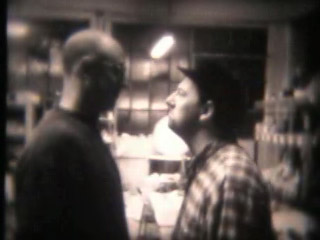
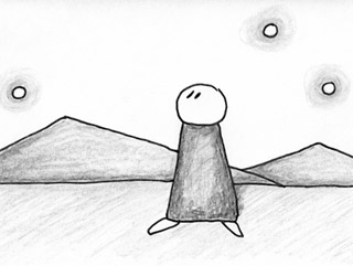
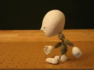
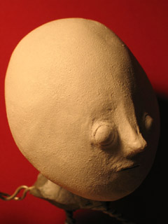
click on image to play film (40sec - 1.9 MB) A new film!
The point of this was to do proof-of-concept for the new replacement face kit. It could have just been a test clip — but adding title/credits material let me do more with the idea and atmosphere.
I'm considering doing some longer films like this using the same face... So please let me know what you think of the look, eh?
(I'd also love to hear some feedback from folks with lipsync experience.)
posted by sven | permalink | categories: movies, stopmo
May 20, 2009
working on "the whisperer in darkness"
by sven at 10:40 pm
click image to visit teaser download site Big news! Very exciting! Abrupt change of plans!
I'm going to be making several armatures for the feature film, The Whisperer in Darkness.
TWiD is being produced by the H.P. Lovecraft Historical Society -- the folks who created the definitive film version of The Call of Cthulhu. Like Cthulhu, TWiD will be filmed in luscious black and white -- but this time it's going to be a "talkie."
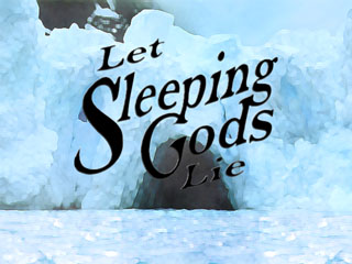
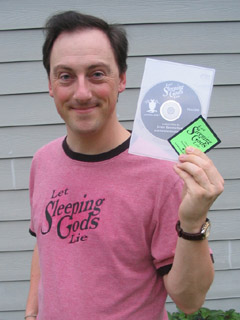
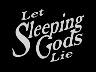
The opportunity to work on the project was too good to pass up. My own Lovecraftian film, Let Sleeping Gods Lie, will be on hold until further notice. Due to a non-disclosure agreement, I won't be able to share much about the particulars of the project… But expect to be seeing more posts about metal working and joint fabrication.
For those who want to delve deeper, the story that the film is based on is available online in its entirety at several sites, including Mythos Tomes.
posted by sven | permalink | categories: movies
October 4, 2007
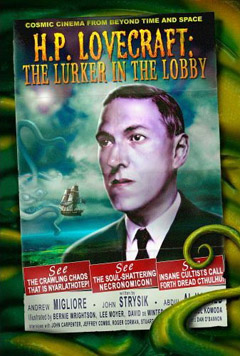
"lurker in the lobby" book mentions me
by sven at 10:00 am
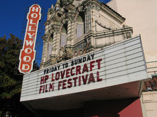
I've been meaning to write about this for ages... And since I'm trying to encourage people to come to the H.P. Lovecraft Film Festival tomorrow, now seems an apt moment.
Lurker In The Lobby: A guide to the cinema of H.P. Lovecraft is a recent book written by Andrew Migliore (founder of the filmfest) and John Strysik. If you're a fan of the genre, then this is a book that you cannot do without. It reviews essentially every Lovecraftian feature film, TV show, and short that has ever been created.
A page is devoted to Edward Martin III's Dream-Quest of Unknown Kadath, which I had a microscopic role in animating.
The book also mentions Madness from the Sea -- my very first short film, which premiered at the Lovecraft Filmfest back in 2002. The synopsis:
Planets come into alignment, a storm erupts, and Cthulhu appears.Well said! Accurate, and more succinct than I've ever been. ;-)
If you're interested in purchasing Lurker in the Lobby, I recommend buying it from Migliore directly, at the Arkham Bazaar. The book is also available via Amazon.com and bookstores such as Powell's (here).
posted by sven | permalink | categories: movies
July 2, 2007
animated installations at PLATFORM
by sven at 3:30 pm
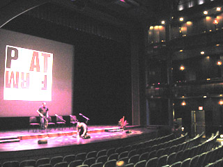
Pika Pika: the lightning doodle project I confess, when I heard that the PLATFORM animation festival was going to include animated installations, I felt dubious. I imagined it would just be films being projected onto gallery walls, nothing special. Boy, was I in for a surprise! The installation show turned out to be the most mind-blowing aspect of the entire fest!
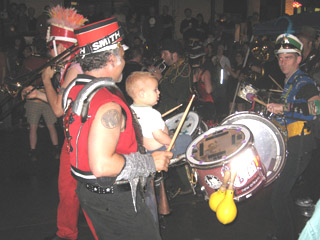
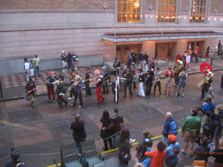
the March Fourth marching band Thursday night, as Competition Program 5 was ending, the "voice of god" announced that we should follow the marching band outside to the Walking Tour of Animated Installations. ...And as we streamed out of the Portland Center for the Performing Arts, there it was: the March Fourth marching band, already playing their raucous tunes. A joyous crowd followed the stiltwalkers, drums, and brass for at least 10-15 blocks. What a brilliant way to help lead a crowd from point A to point B!
Ritz & Tochka from Pika Pika As we arrived at the PNCA (the Pacific Northwest College of Art), Pika Pika started up their performance. What this group does is live animation...
A camera takes a photo of the performers using about a 30 second exposure. The performers draw shapes in the air using multi-colored flashlights. The lights' trails show up as glowing lines on the film. After taking a series of maybe 30 still frames like this, they use a computer to play back the images they've created, thus making an animation.
The animation is very rough, but personally I found it stunning. When a film of Pika Pika's animation showed earlier, during one of the competition programs, the phrase that went through my mind was "paralyzing beauty." It literally took my breath away.
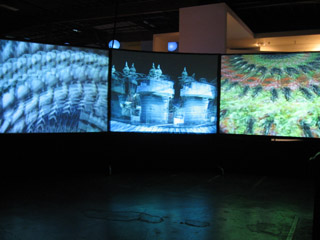
"Copenhagen Cycles" cinetrope - by Eric Dyer When I went into the PNCA building, the first installation that grabbed me was "Copenhagen Cycles." There were three large spinning disks with paper cut-outs attached to them being filmed by video cameras. The principle is similar to that of a zoetrope -- but the images were actually three-dimensional, and the animation was accomplished by matching the disk's rpm to the camera's fps.
"Copenhagen Cycles" screens When I discovered the spinning disks, I could only see the animation by looking into the little 2" square viewscreens of the video cameras. I thought this was really cool... Then I walked around the partitioning wall and discovered that the images were actually being projected onto three ten-foot-tall screens! Wow!
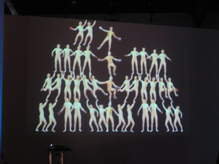
"Balance" - by Ondrej Rudavsky The animation titled "Balance" was being projected on a 2-story-tall wall nearby. It was a fairly static piece... It created the illusion of 38 acrobats standing in a human pyramid. The detail that really made this piece work for me was that the uppermost acrobats appeared to be holding onto the railing of the second story balcony in order to keep their balance. A pretty amusing illusion, I thought.
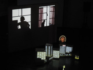
"Dream of Lucidly Living" - by Miwa Matreyek "Dream of Lucidly Living" was a performance art piece by Miwa Matreyek, a student from Cal Arts. Animated images were projected onto a flat screen -- both from in front and from behind. Matreyek would sometimes walk behind the screen, and her silhouette would become incorporated in the images. For instance, her shadow seemed to pet an animated cat; and, at another point, a beating heart was projected onto her shadow's chest -- so it was as if we were seeing an X-ray. At other points, she was in front of the screen arranging white boxes, which were transformed into skyscrapers by front-projection.
The music for "Dream of Lucidly Living" was by a band which Matreyek is a part of; she herself was the singer in the recording.
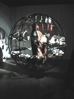
"No Never Alone" - by Gregory Barsamian The most stunning installation of all was "No Never Alone" by Gregory Barsamian. As you entered a darkened room, you saw before you a living sculpture.
It was a seven-foot-tall spherical cage. In the center of the cage was a life-sized human figure, motionless, covered by a shroud. Around the figure, there were two rings of hands. The upper ring was (I'd guess) 24 pairs of hands, each crumpling and uncrumpling eye charts. A lower ring of 48 hands was opening and closing books which showed pictures of hands clapping. At the top of the cage, carrots swung gently back and fourth.
Everyone who walked into the room was transfixed. It was hypnotic, and you just stood there wondering how this living sculpture could possibly exist...
The trick: The spherical cage was actually rotating at about 15 miles per hour. A strobe light was flashing at the precise rhythm required to make the sets of hands seem to exist in stationary positions. I overheard someone refer to this as a "strobascope." Fantastic!
...
In all, there were 18 installations in the show. By necessity, of course, I'm only sharing my favorites. I think one more is worth mentioning, though.
During the installation show, there was a car that was driving around the neighborhood. As it was in motion, it was projecting images of a running tiger onto the sides of the buildings it passed -- creating the illusion of a tiger actually running through the neighborhood. Sadly, I never actually got to see this one in person.
posted by sven | permalink | categories: exhibits & events, movies
impressions from the PLATFORM festival
by sven at 8:00 am
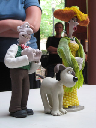
Wallace and Gromit puppets on display After going to my last screening on Saturday, I walked out into the Performing Arts Center lobby. I just stood there for a moment and looked around the room.
There was Henry Selick having a conversation with Peter Lord. Behind them was Joan Gratz talking with some friends. "Spike," from the Spike & Mike festival, walked by. And just outside I could see Will Vinton sitting at a table.
That moment was emblematic of the festival for me.
the "Attack of the Blog" panel What films did I go see at the festival?
- all seven of the primary Competition Programs (which included the "TV for Children" and "Adults Only" blocks)
- two Student Showcase programs
- the Internet Competition - short films that were made for the internet
- the two "Best of Pictoplasma" programs
- "World Animation for Kids"
- "Films By Kids For Kids"
- Tekkon Kinkreet - a gorgeous feature-length anime
- "Creature Comforts" - an unaired episode from the cancelled U.S. version
- "Sita Sings the Blues" - a work-in-progress by Nina Paley
- "Hey, Check Out My Pes Collection" - a Pes retrospective
- "Portland Animation Showcase" - films by Portlanders
- the last 20 minutes of "Princess Iron Fan"
- one of the two Open Screenings (the one that my films were in!)
I prioritized going to screenings of films rather than going to presentations. Nonetheless, I also made it to the following presentations:
- "Attack Of The Blog: Meet The Bloggers" - a panel discussion
- "Aardman Animation: Genesis to Revelations" - by David Sproxton
- "Aardman: Soft Clay, Hard Work, & Lucky Breaks" - by Peter Lord
- "An Afternoon With Henry Selick"
Profoundly exhausting!
The first showing of the day was often at 9:30am, so I'd be getting up at 7:30 in order to eat, shower, drive across town, and find parking. The last showing would often run til 1:00am -- so by the time I'd driven home, caught my breath, and gotten to bed, it was usually heading toward 2:30 or 3:00am.
Everyone was similarly tired. I managed to stay awake... But I did have to give a friend a little nudge at one point, when he'd nodded off.
There reaches a point where the exhaustion just makes you stop caring. You know that what you're seeing is amazing animation -- but you're just too tired and numb to feel anything.
In addition to the sleep dep, sitting still for six days is also a bit of a marathon. It's physically demanding to have to stay still that long -- it's like taking a cross-country flight every day. There were screenings where every-other-film I'd have to switch which cheek I was sitting on.
myself and fellow stopmo blogger Karl Sigler There were fewer films that had characters and a beginning, middle, and end than I would have expected. Often if a film had humans in it, they didn't speak, and were somewhat inscrutable. I'm not sure if this was numerically the case, but it felt like a majority of films weren't story-based at all... I was surprised by my own reaction: it felt like the films that did have story had an inherent advantage, that they were able to engage me and draw me into their world in a way that artsier stuff just couldn't.
For the competition programs, audience members were given ballots as they entered the theater. After each short, the lights would come up and an announcer (the "voice of god," I quipped) would say the name of the next film and what category it was in. Filmmakers were encouraged to stand up and be recognized during these pauses.
I had the impression that these pauses are something that happens at other festivals -- an etiquette that PLATFORM's organizers have chosen to emulate. It never felt like the audience (and filmmakers) really got comfortable with it. For the first program, I don't think any filmmakers stood up -- which just left the audience futilely craning their necks, searching the room.
One of the categories that the "voice of god" would announce was "Best Film Over $50,000." I think, to an extent, we were expected to feel impressed -- like we were in the presence of celebrity... But every time "Best Film Over $50,000" was mentioned, what I perceived was uncomfortable, mildly embarrassed chuckles and shuffling in the audience.
During the awards ceremony, legendary animator Marv Newland was one of the presenters. At one point he appeared to "break from script" and commented on the money-based categories... Saying that they were somewhat ridiculous, that the finances for independent films are always rather muddy, and that he had "literally" stolen the money to make one of his films. ...It was a surprising moment of on-stage criticism.
people painting designer vinyl toys at the UniPo table The award ceremony was really a curious beast.
Bill Plympton was the emcee. He was great -- he really had the gravitas to do the role justice.
There was an on-stage band, Portland's own "3 Leg Torso" -- which was also an excellent choice. An accordion, cello, violin, xylophone, and percussion... A sophisticated mix of klezmer, tango, and chamber music.
Children all dressed in white (under age 12, I'd guess) were in charge of handing the awards to the competition winners. (Personally, I rather liked this choice. Much better than using supposedly sexxxy women, imho.)
The award itself was a designer vinyl toy called "the god of animation." It's a hot pink, six-armed, three-eyed cartoonish character. Me, I think I'd feel more honored with something made out of bronze or glass... But I gotta hand it to the festival organizers: it's a unique and daring design.
the PLATFORM awards ceremony There were at least three big TV cameras, presumably for Cartoon Network. There was a sense that this event was maybe supposed to be a black-tie gala...
But animators don't glitter.
Most of the animators who got up on stage were in jeans; some in T-shirts. They were awkward and self-effacing. Animators aren't celebrities. They get up on stage and remain... Geeks.
The makers of "I Met The Walrus" won the award for Best Sound. A little baffled, as they accepted the award they pointed out that there actually wasn't any sound design in the film -- it used a tape of John Lennon being interviewed by a high school kid who snuck into his hotel.
Don Hertzfeldt won the "Best Film Under $5000" award for "Everything Will Be OK." When he got up on stage, he talked bout how strange this was... How he'd just been asleep, and literally only woke up minutes before! He said he was able to make his film so cheaply because a friend of his had won at several international festivals that award Kodak film stock. But the friend is a computer animator! ...So he simply gave the film stock to Don.
The anecdote about receiving a useless gift symbolized for me a disconnect between money/status-driven festivals and animators. Animators are so often scrounging to get by, and are used to being in a poorly understood/disrespected profession. After years of slaving away like this, a moment in the gilded spotlight seems kinda bittersweet. There's a tinge of... Not exactly resentment... But perhaps a sense of the facade?
It's hard to explain the vibe at the awards ceremony without it sounding like I'm putting down PLATFORM. Let me be clear: PLATFORM was wonderful! What I want to convey is the disconnect between animators and the trappings of celebrity.
Gregory Barsamian, who created the astonishing and transfixing installation piece "No Never Alone," as he was accepting his Grand Prix/Installation award made a lovely comment on who we are as animators... He referenced the film, "Freaks," and its famous line "one of us." The animators filling the auditorium: freaks. Wonderful freaks.
At the very end of this (at times oddly awkward) awards ceremony, PLATFORM festival director Irene Kotlarz was brought to center stage and given a huge bouquet of roses. (They never see it coming!) The audience gave her a standing ovation -- the first and only standing ovation of the festival, I believe. After three years of bringing the event to life, she wept at the recognition.
It sounds so predictable... But the moment was authentic. It made my eyes tear up. The man standing beside me teared up, too.
posted by sven | permalink | categories: exhibits & events, movies
July 1, 2007
praise for the PLATFORM International Animation Festival
by sven at 11:59 pm
The first PLATFORM International Animation Festival was a triumph.
Understand, this was the premiere of the ONLY major animation festival in the U.S. -- an event of historic importance.
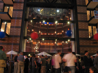
inside the Newmark theater, the largest screen The organizers did a simply phenomenal job...
The scope of the festival was visionary. It included not only traditional short films, but also animation designed for emerging platforms (hence the festival's name) such as the internet and cell phones. It made a bridge to the broader world of art by including an exhibit of animated installation artworks. And, while looking to the future, there was also honor for animation's history -- embodied by the showing of Snow White (with guest speaker Marge Champion, who was Snow White's movement model) and the earliest feature-length animated film produced in Asia ("Princess Iron Fan", 1941).
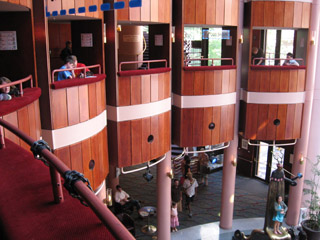
people watching cell phone animations, 2nd floor rotunda The orchestration of the event itself was excellent. The Portland Center for the Performing Arts -- the main venue for the festival -- was beautiful, and well laid-out to accommodate several films running at the same time. Each day's program of screenings (from an attendee's perspective) ran extremely smoothly.
the March Fourth marching band One organizational choice that I think was particularly brilliant: It's maybe a ten block walk from where the film screenings are to the Pacific Northwest College of Art, where the installation pieces are set up. How do you get everyone from point A to point B? Get the March Fourth marching band to lead everyone there!
street party in front of PCPA Cartoon Network was the financial force behind PLATFORM -- but the company was remarkably reserved about making its presence felt.
This was a "no logo" event. With the exception of the organizers verbally thanking Cartoon Network for its support, you could easily have missed that the company had anything to do with the festival at all. It was a very classy choice on CN's part. Supporting the animation community without shoving a lot of self-promotion down our throats engendered a lot of good will toward the company. (At least among those who attended.)
Let's hope that all involved see this festival as a triumph, and that it becomes an annual institution. ...I eagerly look forward to attending again next year.
posted by sven | permalink | categories: exhibits & events, movies
March 9, 2007
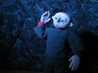
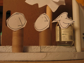
elder thing puppet test
by sven at 4:40 pm
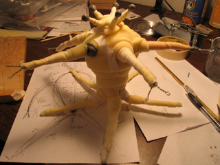
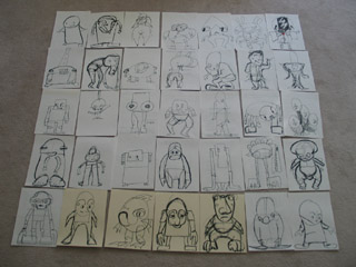
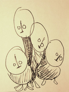
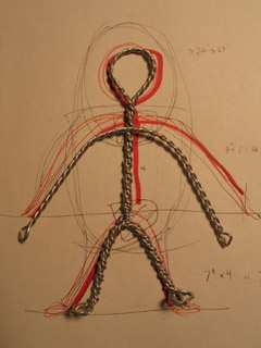
Yesterday I was a busy boy. I built a new puppet and tried out animating it.
new elder thing puppet While I was driving to Tucson, I thought through some changes in the script for Let Sleeping Gods Lie. I've been really unhappy for some time with the "joke ending" I'd originally planned. I've come up with a story now that is much more dramatic -- while still using my basic elements.
But changes? Oh dear...
I'm loath to ask my actors to come back for yet another shooting session. I still might be able to avoid it... I've decided that my storytelling style has generally been too linear; I want to switch my approach to "hitting the high points." By using a style that's similar in pacing to a movie trailer, I may be able to get away with using only what I've already got in the can. ...And then if there are a few vital pick-up shots, I may try using myself as a stunt-double.
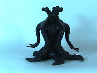
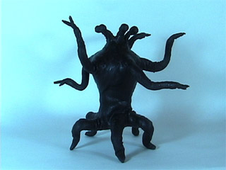
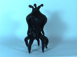
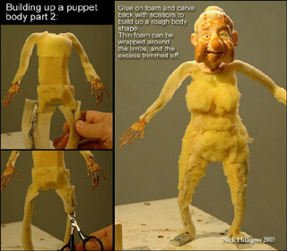
starting the armature An important development: I'm adding a whole new section to the film. I'm calling it the "deep history segment." Because it's a sort of flashback, I think it's appropriate for this segment to have a different visual style. I'd been contemplating animating something viscous -- like black molasses, or a mixture of ink + hair gel on glass. But then yesterday it struck me: why would I not use puppets?!?
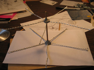
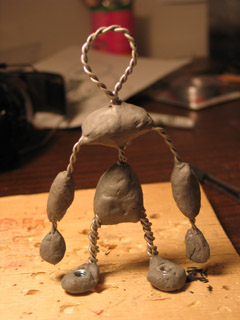
So I set out to build a "quick and dirty" elder thing puppet -- just for proof of concept.
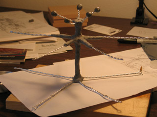
armature progresses The limbs are made from 1/16" aluminum armature wire: two strands for the arms and eyestalks, three for the legs. The arm and leg wires are 6" long.
The spine is a piece of wooden dowel, and the limbs are attached with plumber's epoxy putty. After fixing the limbs onto the dowel, I added an additional layer of epoxy -- just to make absolutely sure everything holds together.
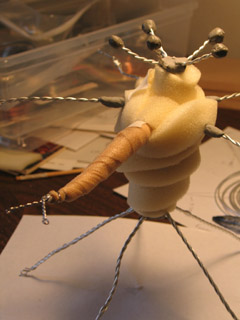
beginning foam wrapping I've got 1/4" and 3/8"-thick sheets of cushion foam on hand, which I cut into long strips and wrapped around the armature to bulk it out. Most of the time I chose the 1/4" foam. It allows greater control -- but does take quite a while to layer.
The foam strips are held onto the armature with athletic tape.
adding a rigging point It's a little hard to see in this photo, but I remembered to add a rigging point for this puppet. In one of its "armpits" I epoxy-puttied a 1/2"-long piece of 7/32" K&S.
[Notice that underneath the puppet you can see the rough blueprint that I drew for scale before starting construction.]
foam wrapping done There, the foam-wrapping stage looks about complete!
refining form with underwrap Next, I refined the form of the Elder with althletic underwrap. This is an extremely thin non-adhesive foam tape.
testing cloth tape on leg I had the thought that maybe I ought to use the athletic tape -- which is flexible -- as the final form-shaping layer. I tried this idea out on a leg tentacle... And found that I didn't like the way it crumples when the tentacle bends.
However, for the torso -- which is not meant to bend -- the tape worked out very nicely. It's sort of like applying papier mache -- but with cloth Band-Aids. The tape did a nice job of refining the form; it also accepts paint better than the porous foam does.
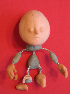
ready for painting Here's the pup, all ready to be painted.
painted with latex and acrylics mix I mixed mold-building latex with black acrylic paint for the paint job.
My latex has the consistency of thick mayonnaise. I would rather have used a more liquid variety -- but didn't have any on hand.
Why use latex? I was hoping to smooth over the texture. And I wanted something that would help hold the underwrap all together. And I've read about this technique -- but hadn't tried it yet -- so I wanted to try something new.
Nick Hilligoss describes puppets that have been painted with liquid latex as bending "like a rubber boot." Yep -- that's what it's like!
I don't really like how the latex turned out... How it crumples when you bend it. How it wants to stick to itself. [I know I could apply talc -- but it's important that this pup be as black as possible.] ...Still, it's good enough for a test puppet.
Almost forgot: I also added a little bit more epoxy to the eyeballs, just to make them bigger.
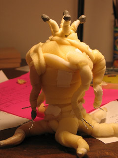
whipping leg test: click on image to play movie (33 KB) On to animating! The first test was a very simple "whipping" motion with one of the legs.
I've got some new photo lights. This was their first outing. Turns out their light is extremely blue. Not too happy about it.
walking test: click on image to play movie (76 KB) One of the big mysteries with the Elders is: How the heck do they walk?
I haven't really figured it out yet, but I've begun to get a better sense for how weight shifts from one leg to the next.
...This is one of the HUGE benefits of making an elder thing puppet: I don't know how I'd ever be able to figure out how they move if I was just positioning pixels with a CG version. I need to hold the creature in my hands and be able to push it around, trying out different possibilities in a concrete way.
black line test: click on image to play movie (99 KB) I've been trying on a new hat lately. I'm playing with calling myself a "mixed media animator." (I also heard the phrase "animation artist" recently, which I kinda like too.)
I love stopmo. But "mixed media animation" is probably a better label for the style that I'm ultimately going for. Not just using CG effects to enhance stopmo -- with digital water, skies, and fire. No, what I want to do is mix CG, cel animation, motion graphics, and puppetfilm in innovative ways that blur the lines.
The clip above is a good example. I've taken the puppet animation and used AfterEffects to turn it into what look likes a digital line drawing. ...I like!
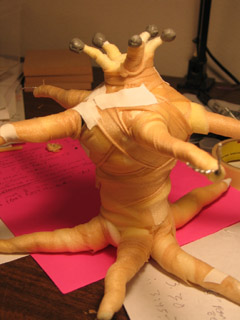
standing up test: click on image to play movie (109 KB) Another thing I've been aching to see is how the elder things stand up.
Looking at the prior "walk test," it seemed to me that the Elder was almost comical -- waving its arms around hysterically. These creatures are millions of years old, frighteningly intelligent and dignified. Maybe they don't move their arms much at all? Maybe they don't writhe -- which has always been the assumption -- maybe every motion is very purposeful.
Important puppet construction note: This puppet sorely needs tie-downs at the ends of each of the legs and at the base of the spine. Animating a two-legged puppet without tie-downs is painful, but can be done in a pinch. Having five legs all subtly shifting as you animate, when you really want them to stay fixed to the ground? ...Intolerable.
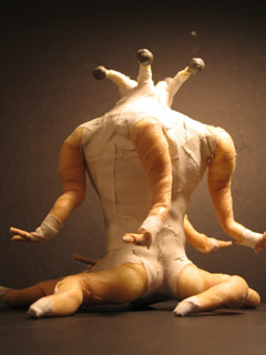
white line test: click on image to play movie (197 KB) It's going to take more playing around, but I'm beginning to have insight into the Elders.
(Huh. Does puppet pushing constitute method acting?)
Their limbs are fast and lithe. But lifting up their torso -- that's heavy, so the rise has to be more deliberate and burdened.
As I'm animating, there's a tendency for me to choose one of their five faces and think of it as the front. When I do so, I see a pair of arms and a pair of legs -- which looks almost human, if I don't focus on the other spare limbs.
I think I can use this impression of humanity to good effect at key moments in the film -- but I must beware. What are the other faces doing and thinking while I'm looking at this particular side? Maybe it's better to conceptualize the Elder as five separate people, all standing back to back. Kind of like certain photos of multi-faced (Indian?) gods that I've seen.
The eyestalks... If they function like human eyes, then they ought to dart around from focal point to focal point. But there's a danger of making the critters too human. In the "standing up" test, I tried having all the eyes swing around in unison -- which produced a sort of sea anemone effect. Plausible, but very appropriately alien.
For this last clip, I tried using AfterEffects to multiply the critter, and tried out using white lines on a black background. This is very close to what I think I'm going to ultimately use. I thought I'd like to use a "lens flare" effect to create green, star-like eyes... But it turns out that I'd probably need to use LightWave to get what I want -- which may not wind up being worth it.
...
Holy cow! All that in one day??
posted by sven | permalink | categories: let sleeping gods lie, movies, stopmo
January 3, 2007
making of "the great escape"
by sven at 10:25 pm
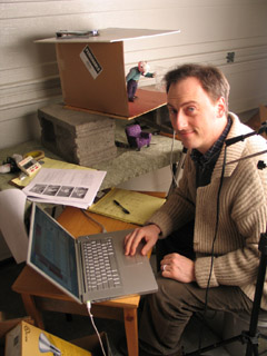
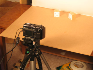
Sven animating I want to fill in some details about the process of making The Great Escape...
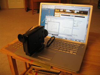
1. the computer
I was using my PowerBook G4 to capture frames... Boy, was I glad to have a laptop in this instance! It was really helpful being able to easily move the computer around, depending upon where the camera and set needed to be.
2. the framegrabber
I used FrameThief as my framegrabber. Just prior to this project I spent a bunch of time play-testing the main framegrabber options for the Mac: FrameThief, AnimAideXT, and iStopMotion. I'd like to write a more in-depth review, but here's the short version...
There are two functions that are absolutely critical for a framegrabber: (1) it has to let you do onion-skinning, and (2) it has to let you check your work against a sound clip. FrameThief is getting a little antiquated, but it's the only one that can do both of these things adequately. AnimAideXT has exciting potential, but was buggy for me when it came to onion-skinning. Boinx's iStopMotion has a great interface and support -- but you have to pay $400 for the pro version if you want to work with sound.
FrameThief did crash on me a few times. However, I remain impressed with this workhorse software: I never lost any data -- all I had to do was re-start the program, and I was back in the game.
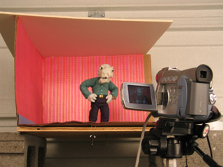
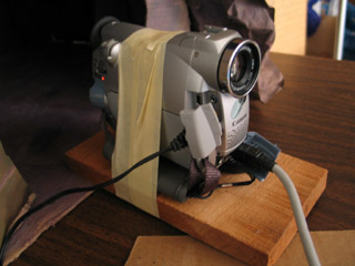
capturing frames with the ZR45 3. the camera
I used a Canon ZR45 DV cam to capture frames. This cam has given me so much grief...
When I was shooting footage for Let Sleeping Gods Lie, it would turn itself off (to conserve power) whenever I kept it on pause for 5 minutes. Since most of the shots took longer than 5min to set up, this was really irritating...
On this project, the horrible realization was that even though I manually set the exposure to 1/60, everytime Jimmy's white shirt came on screen, the picture would darken to compensate -- resulting in awful flicker.
Sin #3: Even though I had a brilliantly colorful set and excellent lighting, the camera sucked a huge amount of color and luminescence out of my shots. In post I did some brute-force color correction by adding saturation and brightness universally -- but I still couldn't get the quality that I had when shooting the photo animatic with my still cam.
Potential solutions: Get a 3CCD DV cam. (Pretty expensive.) Or use the still cam... Which will require an analog-to-digital converter in order to interact with the framegrabber -- and has an expected life-span of 50 to 70 minutes of animation before conking out from over-use.
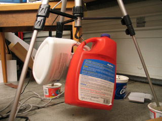
weighing down the tripod with sand 4. the tripod
I've been told by several sources that sand is the professional choice for how to weigh down your tripod... Yet, I wasn't sure how to do it in practice. I tried putting the feet of the tripod into yogurt tubs filled with sand. Useless. Filling plastic bottles (with handles) up with sand, and then making wire loops so they could hang from the tripod's hook -- that worked pretty well.
Technically water in those jugs would have worked just as well. But I'm glad that I went to the hardware store and bought some sandbox sand, nonetheless. The thought of those jugs, if filled with water, dropping and cracking open -- well, let's just say that I think sand would do less overall damage.
Even with the sand, though, the head of the camera could still be moved some with a good bump. There's play in the gear that raises and lowers the camera that I don't know how to fix.
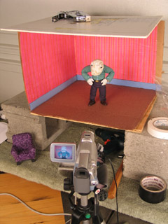
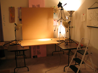
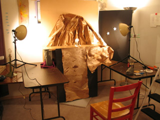
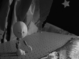
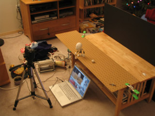
the set seen from above 5. the set
The set was constructed from a cardboard box, which I then staple-gunned to a piece of plywood. The plywood sat atop two cinderblocks so I could get at the tie-down screws. The ceiling was a piece of white foamcore that wasn't actually attached -- just weighted down. The wallpaper was gift-wrapping paper, and the carpet was felt.
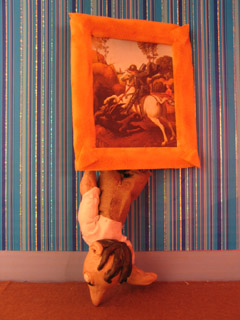
The cardboard walls worked satisfactorily through most of the film. The only problem came at the end when Jimmy pokes out from behind the painting. At that point, he's actually pushing against the walls and they flex. Next time: Rigid walls made out of hardboard or MDF.
The plywood base is adequately rigid, but splinters when I drill holes for the tie-down screws. MDF -- medium density fiberboard -- would be better. It's made out of glue and fine sawdust, which shouldn't be able to splinter at all.
On a couple of occasions I managed to bump the set and shift it on the cinderblocks. Next go around, I plan to build a proper animating table, like the one Justin Rasch has just made, and which Marc Spess shows you how to build in his eBook Secrets of Clay Animation Revealed.
6. props
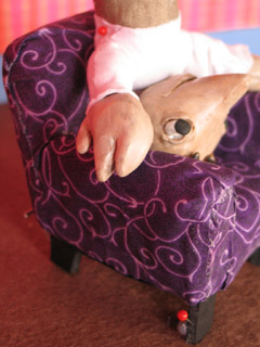
I'm fairly happy with the look of the comfy chair, which is just fabric glued over insulation foam, with foamcore feet. However, I made two fundamental mistakes here.
One: The foamcore legs were too squishy, and led to the chair moving around while I was animating. I tried using hot glue and pinning it to the floor -- but to little avail. Next time, furniture needs to use MDF for its frame, and there need to be threaded holes for tie-down screws.
Two: Scale! The room was one scale, the pups were another, and the furniture was a third. This was particularly a problem with the comfy chair, which was supposed to be huge -- but was barely big enough to seat Jimmy. Next time, pick a scale and stick to it!
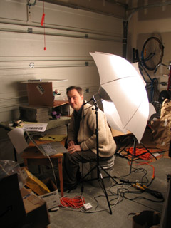
light umbrellas 7. lights
I used two 500 watt lamps that I got at a photography supply store, along with umbrellas to diffuse the light. I ran into terrible problems with the lights burning out. I suspect that this had to do with the lights being so hot and the garage being so cold.
The lights get freakishly hot! When one of them burned out, the broken filiment actually burned a pin-sized hole through the glass. With another, the glass of the bulb melted into a bulge!
For the living room set I wanted lots and lots of light -- a bright, saturated, jubilant environent. So the lamps were really necessary. On future projects, though, I'm thinking I'll probably use more colored lights and gobos -- which may mean I need to get some more fresnells and stands.
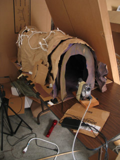
In the cave set, I'd intended to use xmas lights hidden behind the arches. It proved to be too much trouble. I just went with shining a single light down the tunnel. Less magical -- but oh well.
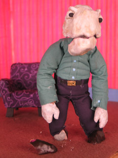
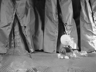
Dad's shattered foot 8. puppets
I used Super Sculpey for the heads, hands, and shoes of the puppet. I ran into problems with it cracking. Jimmy's head had a big crack in it from the get-go, and it wasn't firmly attached to the epoxy putty skull. At the very end of the film, Dad's shoe shattered. Little bits of Super Sculpey would flake off around the wrists. Next time, I think I'll be using Magic Sculpt (a fine-grained epoxy putty for artists) for hands and feet; possibly resin for heads.
The most glaring flaw in the puppets' design was in the necks and wrists. Or rather, the lack thereof. One solution would be to wrap these bits in string and then paint them with liquid latex. I've also heard of latex rubber tubing being used for necks -- partly because you can make a hole in the base of the skull that conceals the join.
(Btw: I'd like to tip my hat to Grant Goans -- the idea for Dad's flapping jaw comes directly from his Vitruvius project.)
9. armatures
The sculptor's armature wire (annealed aluminum) didn't break. Huzzah!
Dad was pretty fun to animate; Jimmy was much harder, due to the smaller armature. Note to self: larger wire armatures are easier to articulate.
I keep on making my pups' necks too short. Dad was pretty much neckless; Jimmy was better, but still couldn't lean his head back far enough at one point.
Dad really didn't want to twist in the middle. More wires in his spine would have helped; but given the amount of foam that had to be moved, I'm not really sure how much more a build-up puppet could be improved.
10. costumes
Instead of sewing the costumes, I used Fabri-Tac glue to attach cloth directly to the foam body mass. This seems to have worked out OK on the pants -- but the arms of the shirts tore out of the shoulders.
I'd really like to know a better solution for the shoulders of shirts. I'll probably try hand-sewing the costumes next time. But even then, I know there's a problem with the sleeves and shirt bottom riding up when a pup lifts their arms. Anyone have any ideas here?
I also didn't bother to fold the fabric over when I attached it. It looked fine at first -- but I was getting some fairly serious fraying toward the end of the film, and had to keep cuticle scizzors on set.
11. lipsync
I used Papagayo to do lipsync. Magpie's the industry standard and costs a pretty penny -- whereas Papagayo is free... So I was a bit dubious when I started out. However, while there are some niceties missing, I found Papagayo was very easy to use, and quite satisfactory for my purposes. I strongly recommend giving it try.
A big discovery: It was much easier for me to animate puppets when I was matching movement to dialogue. It made the entire animation process much more managable when knew exactly how many frames I needed for any one shot. But beyond that, I found that my characters' movements were much more motivated when there was speaking. For each word, I thought about what gesture ought to accompany it. I avoided having the words and gestures match up perfectly -- but just working through how the pups' thoughts should be pantomimed really made them more alive.
the tunnel set 12. trick shots
There were a few useful tricks I utilized to get the shots I wanted.
In order to get a point-of-view shot for Jimmy running through the cave tunnel, I made a little wooden sled for the camera... Well, actually, I just picked up a piece of scrap wood and wrapped masking tape around it and the cam. When it got far enough into the cave set, I used a stick to keep pushing it farther in, an inch at a time.
a wooden sled for the camera I put screws into Jimmy's feet for tie-downs... But as it turns out, he never stands up in the story! In order to have him not jitter around too much while he was sitting, I stuck pins right through him and into the chair.
(Thanks to Shelley Noble for the pins that I was using!)
holding things down with pins When Jimmy had to get out of the chair, I didn't have any easy way to secure him... So I wound up just holding him in my hand. The same was true for when he pokes out from behind the painting at the end: no way to secure him, so I was holding him in my right hand from behind the set, and setting off the shutter release with my left.
Consequently, when I concluded the shot, the poor boy fell out. Right on his nose.
that's a wrap 13. post-production
I started working on this film back in October. But when December rolled around, xmas preparations kept me from getting down to business until the 26th -- at which point I pushed everything else aside in order to get this done. On the 30th/31st I worked for 30 contiguous hours without stop... Possibly the longest single stretch of my life (so far).
Post-production took a surprising 18 hours to complete. What really saved me was that at the outset I made up a master list of fixes, and then worked that list. Keeping copious notes on my thought process as I went, problem-solving one thing at a time. Here's the outline:
- assemble the clips so they sync to the audio track
- fix problem clips
- add/cut shots
- add titles/credits
- edit timing - must be absolutely finalized
- record additional sound, edit the mix
- color correction (if there's time)
- compress
Since I'd assembled the photo animatic in iMovie, I thought it would be easy enough to just replace the still images with my new animation clips. Not so! Because I filmed at 15fps -- but the animatic was 30fps -- iMovie simply wouldn't let me edit my clips to single-frame accuracy. That threw the whole audio sync off, which would have ruined the film. [Yes, even though the dialogue is in mumblephonics.] I tried out a whole bunch of potential work-arounds, but nothing did the job. So I switched to AfterEffects for final assembly -- which treated me much better.
I discovered that I had the heads of pins showing in several shots. I went through and fixed each frame by hand in PhotoShop. ...Actually, this wasn't a bad experience at all. I think I may use this process more in future projects -- particularly for flying and jumping effects.
At 320x240 pixels, the final render of the film was 752.9MB. It took a lot of fooling around, but I finally got it compressed down to a more manageable 6.8MB. The magic was to use the Sorenson3 codec at medium quality, with all options set on auto...
And then for sound, it turned out that the QDesign Music 2 codec was working out better than QualComm PureVoice. My settings were: best / 44.1 / best / 48 kbit. Bad sound just kills me... The sound quality I wound up with is not everything I could wish for, but it's at least tolerable.
Jason Gottlieb's tutorial, How to compress a movie for the web using QuickTime Pro, was once again very helpful. If you haven't seen it already, I strongly recommend it.
[Reminder to self: Rendering the image and the sound out from AfterEffects in two separate passes has consistently worked best. Make it standard practice.]
...
And there you have it! More than you ever wanted to know about the making of my little 2 minute film!
posted by sven | permalink | categories: movies, stopmo
January 1, 2007
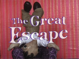
the great escape
by sven at 11:59 pm
click on image to see my film at StopMoShorts.com Happy New Year!
I'm happy... I managed to complete my film on time for the quarterly "stopmo haiku" challenge at StopMoShorts.com! Click on the image above to see it in the context it was intended for...
Or (in case that link stops working at some point in the future) you can watch the film by clicking here. (6.8MB)
My joke du jour: Can we call this an eleventh hour victory if it was only 10:30pm when I got the film done and submitted?
Very proud.
Here's what I wrote about the film for StopMoShorts:
Armature building's been taking all my attention... So I wanted take a step back and do something more holistic. The idea was to embrace "quick and dirty": go all the way through the film-making process and not get hung up on things being perfect.
When brainstorming story ideas, I latched onto "cave" as a tunnel -- maybe a magical tunnel between places. In terms of animation style, I was inspired by Robot Chicken -- intentionally going for "pop" over "smooth."
The pups are standard aluminum wire armatures, wrapped in thin strips of cushion foam, with heads and hands made from Super Sculpey. The eyes are Van Aken plastilina... One of my weirding-outest moments was when an eye fell off and rolled right down into Dad's mouth.
I shot frames with a Canon ZR45 DV cam... Which (curse its metallic soul) insists on auto-adjusting exposure even when I tell it not to. I used FrameThief for my grabber, 15fps. Sound done in GarageBand, final assembly in AfterEffects.
I actually wrote a script, and then translated it into mumblephonics... Perhaps when I get around to releasing the "director's cut" DVD I'll put together a subtitled version.posted by sven | permalink | categories: exhibits & events, movies, stopmo
November 5, 2006
four types of storyboard
by sven at 11:59 pm
In all the books I've perused about filmmaking, I think I've only ever seen one kind of storyboard described: the Professional Hollywood Storyboard.
Well, here in indy micro stopmo land, we have different needs. And so, I'd like to suggest that there are at least four types of storyboard that might be of use.
1. the thumbnail storyboard
Draw your storyboard all on one or two pieces of paper. For each shot in your proposed film, draw a little sketch, about the size of a postage stamp. It's OK if the sketches are barely legible -- the point is to be able to get your cinematography ideas down on paper as quickly as possible. If you're working alone, you could even start shooting based on this. Most likely, however, you'll want to do a second, more legible draft.
benefit: very fast
2. the floating storyboard
When you see photos of storyboards, the sketches of scenes are always drawn inside rectangles that match the aspect-ratio that the film is being shot in. But it doesn't have to be that way. You can draw sketches of your scenes in a sketchbook without rectangles around them -- just floating on the page. When you're in the early stages of developing your images, this is a nicely free-form way to work.
benefit: allows drawings to expand, unrestricted
3. the framed storyboard
A framed storyboard is one where you draw your images inside of fixed-aspect-ratio rectangles. The point here is to force yourself to think carefully about how you want to compose things within the shape of the screen that your film will be displayed on.
There are number of ways to do framed storyboards:
- You can just draw a rough rectangle on the page (for each shot). That's often good enough.
- You can cut index cards to the correct size and draw your shots on them. Advantage: this allows you to shuffle and reorder the shots as needed.
- You can use computer software to make multiple perfect rectangles on a page, and then print them out on a printer. In my experience, it can be nice to have a tidy storyboard that lives in a binder when you're in production -- but it's not the easiest way to work when you're still developing ideas.
benefit: forces you to compose images within fixed aspect-ratio
4. the photo storyboard
If you have your puppets and sets done, you can make your storyboard images using a digital camera. With the camera, you don't have to worry about aspect ratio -- the device imposes a frame around the image. Working with the camera also helps you generate camera angles that you might not have thought of when relying only on your imagination. If your puppets and sets aren't done, you can still work with this technique somewhat if you can make stand-ins and mock-ups of some sort.
benefit: fixed aspect-ratio; reveals new camera angles
storyboards and words
With stopmo puppets, we're often making pantomime films without dialogue. Even so, I've found that it can be extremely useful to put words with the storyboard.
Particularly with a floating storyboard, it's easy to write a sentence or two describing what's happening in the image -- sort of like in a storybook. Being forced to switch modes from visual to verbal can help reveal aspects of the story that aren't clear, or suggest new meanings that you want to work into the story.
I haven't gone very far yet with pairing words and pictures in my storyboards. My sense is that there'd be benefits even if you just wrote one or two words beside each image... And if you wrote a whole paragraph for each shot, the discoveries would be even greater.
the purpose of storyboards?
The way that I've typically seen storyboards written about goes something like this:
Write a script.
Stop.
Draw your storyboard.
Stop.
Shoot your film.I want to explore and promote the notion that storyboards are a way of developing your story.
Storyboards can be part of how you generate your script. When your story concept is still rudimentary, drawing images helps it become clearer in your mind.
Then, later on, when you're writing paragraphs that describe what's in each storyboard panel, the images will help prompt you to think about emotional beats, blocking, and performance. Storyboards can help you figure out how you want your puppet to act.
A storyboard could be compared to having a blueprint when you build a house: it's the plan you keep referring back to as you assemble your film. But maybe this metaphor is all wrong...
Maybe films aren't actually (or don't have to be) built from a perfect preconceived plan. Maybe the filmmaking process is more like watching a blurry and indistinct image come into focus... And each time you draw a new storyboard, it's like seeing that red blur in your mind further resolve into a crisp-edged rose.
posted by sven | permalink | categories: movies, stopmo
August 16, 2006
30fps - flicker textures
by sven at 9:39 pm
Here's the follow up to 30fps: basic principles. This one runs 2 min 17 sec.
click on image to play clip (5.88 MB) The final "symphony" reminds me a bit of those old electronic "Simon Says" games from the 80s... Or of video game music. Still, it was interesting to identify some more "flicker textures" through playing around: syncopation and strobing.
Music was useful for emphasizing changes -- but it also distracts attention from the flicker more than I'd like.
click on image to play clip (10.42 MB) After putting together the basic "symphony," I tried a bunch of different variations. This one uses photos rather than flat colors. It's only 57 sec -- but all that quick flipping between images makes for a very large file size, even when compressed with Sorenson3.
An observation. The eye can read a high-contrast image (like a number) with only one frame. A photo is more difficult to interpret, and seems to require two or more frames for readability.
I could see doing a third "30fps" piece: one that explores using motion clips, rather than just stills... However, it's more likely that I'll just end the series here, and move on to other things now.
posted by sven | permalink | categories: movies
August 13, 2006
30fps - basic principles
by sven at 7:46 am
We're only just back from Canada... And immediately I get one of my signature bouts of inspired insomnia.
click on image to play clip (2.74 MB) Last night I started typing out a list titled "exploring the formal qualities of stopmo animation." Why? Form precedes content, I think I've decided. I'm just not gushing forth ideas for stories that I want to tell -- but if I spend a while dissecting the empty cinematic container that's meant to transmit stories, I suspect some part of me will start stepping forward to fill the void.
After I went to bed, one of the items on my list developed itself into a full-fledged short film concept -- so I was compelled to get up and execute the idea. Click on the image above to see the film; it runs 1 min 16 sec.
For your additional amusement, here's the passage I wrote that inspired the film:
5. As animation is actually a series of still images displayed rapidly, one might have more than one series of images interspersed with each other, perhaps at varying rates. At a one-to-one ratio, the two story streams would appear superimposed. At a ten-to-one ratio, the minor story stream would become subliminal. There could be not just two, but three or four or more story streams being interspersed at the frame-level of time, each at varying rates. The rate at which a story thread is visible could be constant, or it could change during the course of a film -- e.g. increasing in frequency until it’s visible at a conscious level -- and then receding back to a subliminal rate.
5A. Do the interspersing of frames using nothing but still frames of color. (This isn’t stopmo proper, and there are no evolving story threads -- but it would be a much simplified version of the basic idea, useful for testing how it works in practice.) Each of these colors might be paired with a musical tone, which would both help alert the viewer to new themes, and create an organic soundtrack. ...Backtracking, this raises the question of how a soundtrack would be handled if one were working with actual story threads.
5B. The principle of intermixing different story threads at the single-frame level could be explored even more simply using black and white screens. At its most basic, there are four concepts to demonstrate: unbroken, superimposed, subliminal, and transition. Have the name for each concept in white letters at the top of a black screen, and in black letters at the bottom of a white screen. After demonstrating the four basic concepts, one could move on to demonstrate ratios, e.g. 1:14, 2:13, 3:12, 4:11, 5:10, 6:9, 7:8. (Working in 15fps would probably be most practical.) Having the words for the black screen and the white screen spaced so that they wouldn’t overlap would make it easier to see the principles; for the ratios, it might be more interesting to have the black and white text fall on the same spot on the screen. For sound, perhaps just white screens would have sound (a simple sawtooth tone?) -- black would have silence. If there were a title at the beginning and credits at the end, perhaps it would be appropriate to the medium that they each only be one frame long; using a QuickTime viewer, they would stay visible until the film was set into motion. It might also be appropriate to have the title cards written on gray screens. Possible titles: ratios, intercut, 15fps, stacking frames, impersistent vision... This experiment would do a very good job of laying the groundwork for the color, multi-thread experiment. The title card might also be an explanation, rather than a title -- the title and credit could come at the end. Looking at this project from a practical point of view, it could probably be assembled in AfterEffects by dropping single-frame compositions into a master composition (nesting them), and then using the keyframe assistant command to sequence them.(Oh so witty... Now may I please go to sleep, please?)
posted by sven | permalink | categories: movies, stopmo
April 23, 2006
a film by the unconscious collective: "catch"
by sven at 12:00 pm
The "Unconscious Collective" was an informal filmmaking group that I initiated following a double-feature movie party at my place (Delicatessen and The Cook, The Thief, The Wife, and Her Lover). The group -- which eventually included Leopoldo Marino, Carl Caputo, Andrew Stout, Laura Grant, Gretchin and myself -- was active from November 2003 to June 2004. Our mission: "Get together, make a movie. Do it in one night. Use what you've got. Work with whoever shows up."
This is the final film that the Unconscious Collective made.
click on image to play clip (582 KB) Nearly all of the films we made are available online at my Unconscious Collective website. The clips are encoded as mp4's. ...When I tried to encode "Catch", the sound didn't sync up right... Which is why it has taken until now to get it online. --Three cheers for the Sorenson3 codec!
The night we made "Catch" I came to the meeting with a vague notion that we might try making an animation. Each of us made a bunch of drawings with sharpie markers on typing paper. Using these pictures as inspiration, we brainstormed a simple story. I took digital photographs of the drawings and cleaned them up in PhotoShop. I did the animation in AfterEffects while everyone hung out and chatted. The voice of the pup was provided by Gretchin.
All told, I don't think the clip took more than 4 hours to complete.
posted by sven | permalink | categories: movies
April 22, 2006
first time online: the "let sleeping gods lie" trailer!
by sven at 12:00 pm
For those of you just joining us...
Let Sleeping Gods Lie is my "serious" film project that I've been working on since 2003, and hope to complete in 2007. The one-minute teaser-trailer premiered at the H.P. Lovecraft Film Festival last October. This is the first time I've put the completed teaser online... I was kinda burnt out after last summer's big push. ;-)
click on image to play clip (4.45 MB) Previous "making of" posts can be found in the blog's let sleeping gods lie category.
posted by sven | permalink | categories: let sleeping gods lie, movies
April 19, 2006
against keeping your film production secret
by sven at 8:39 pm
[I just wrote a long post over at StopMotionAnimation.com that's worth repeating here. Leevi Lehtinen is working on an excellent stopmo film, and my blog brother Ale suggested that Leevi shouldn't show us any more clips from the work until it's complete. I've been roughing out an essay about why I'm against keeping film projects secret -- Ale's comment just opened the floodgates.]
Quote
Keep it up and please don't show so much about the film! I love it, but prefer to see it completed!Oh! I must respectfully disagree with Ale! PLEASE, don't hesitate to post work-in-progress shots! If a viewer does not want to see the film until it is completed, then it is their own responsibility to not click on those files.
I am of the opinion that getting to see the film as it's being made only enhances the experience. Rather than spending five minutes of attention on your well-crafted work of art, I get to spend months or years enjoying it bit-by-bit. I'm cheering you on -- and when it is completed, I feel that in some small way I was able to help make it possible -- by being a supportive ear / eye.
Telling artists not to show their work until it's done -- this doesn't help them at all! Isolation is a terrible motivator. Look at SMA itself: when we get to share our energy, we are reinvigorated and inspired to do more! Sharing encourages sharing -- and that's where we get our spark.
"Keeping it secret" is NOT a step towards professionalism. Look at Peter Jackson's online "making-of" video diary for King Kong. Look at how Joss Whedon showed rough cuts of Serenity to eager audiences... Sharing the process of creation -- as you're creating -- is an excellent way to build your audience prior to release.
...And after your film is released, showing the "making-of" doesn't somehow spoil the magic. Pick up almost any DVD, and you'll see "making of" documentaries. The viewing public knows movies aren't magic -- we're curious to see how they're made, and only gain respect by learning how well-crafted the film is. The "making-of" is part of the product, just as marketable as the film itself.
The film-viewing public is literate and should get to make their own choices where "spoilers" are concerned. For example, when the new Star Wars movies came out, myself and lots of my friends knew that there would be spoilers -- and we conscientiously avoided them. In the world of blogging, there's an etiquette whereby you warn people that there may be "spoilers" in your post so they can decide for themselves if they want to read on.
The movie itself is only half the story. I want to know about about the people who made it. There are movies that I go to not because I know anything about the film -- but because the film is a Peter Jackson- or George Lucas- or James Cameron- or Steven Spielberg- or Jim Henson- or Joss Whedon- or Martin Scorsese- or Whoever- film. As filmmakers, we shouldn't try make ourselves invisible. Ultimately what we want is for people to be invested in US. Hopefully I'm not going to make just one film. I'm going to make several or many films -- and I want my audience to follow ME as I grow and create.
I don't know what Nick Hilligoss' next film is going to be about -- but it doesn't matter! I already know that I want to see it! Same goes for the the next film by Mike Brent or Alejo Accini or Jeffrey Roche or Shelley Noble or Dave Hettmer or Lio Ivan Orozco or Marc Spess or (forgive me, folks I'm failing to name)... I want to see WHATEVER these people do next, because I've come care about them and what they're doing.
And I want to know about their work as it's in progress, too. So, please -- everyone -- keep sharing your works-in-progress!
Svenposted by sven | permalink | categories: movies, stopmo, writing
April 7, 2006
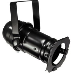
lighting: par cans
by sven at 12:00 pm
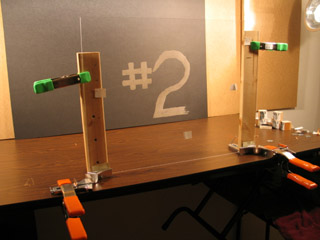
I just got my par cans in the mail.
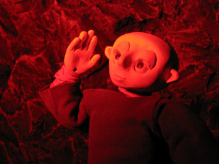
dramatic blue lighting As I had hoped, these lights allow me to create more dramatic lighting.
American DJ PAR 46 Can with Lamp The PAR 46 is what's lighting all the test photos here.
Odyssey PAR 16 Pro Pin Spot The PAR 16 didn't come with a bulb -- and I'm a little confused about what I need to get for it -- so it hasn't been tested yet. Just to give you a sense of scale: this one's small enough that a 60watt bulb wouldn't fit inside of its housing.
blue gel The blue gel produces the happiest results. As Gretchin pointed out, I could use it to suggest a moonlit night.
red gel The red gel created surprisingly saturated results. If I hadn't taken this shot myself, I would have sworn it was photoshopped... But no -- the pic is unaltered.
green gel The green gel didn't really do much for me one way or the other.
Prior to the arrival of the par cans, I'd been using lights that are made for photographers doing portrait shoots. They are amazingly bright -- the par can can't compete at all. I suspect I'll order another par can or two in the not too distant future... Maybe some PAR 64's? I'd like to be able to do a traditional three-point lighting arrangement.
I'd also really like to get dimmers for the lights -- but I haven't been able to find anything appropriate yet. If I could dim my white lights, then maybe I could use them together with the par cans... which would be nice.
posted by sven | permalink | categories: movies, stopmo
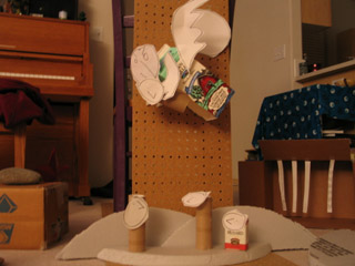
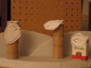
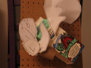
March 9, 2006
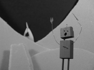
percy wakes up
by sven at 1:14 am
Tonight I got set up and did some motion tests with the new puppet, Percy.
click on image to play clip (150 KB) In my opinion, the first clip was the best. The eyes more than anything else make Percy live.
Problems:
- using just sticky wax, one of the eyelids fell off a few times (a plug-in system might have been wiser)
- the eyeballs catch and don't want to turn smoothly
- it looks like the facial paint smudged an eyeball; do I need varnish?
click on image to play clip (137 KB) In the second clip, I wanted Percy to smack himself on the head -- as if to say, "What was I thinking?!"
Problems:
- jerky, jerky, jerky...
- I only tied down one foot -- and it shows
- the pants hang so low, they almost entirely cover the shoes
- when the head leans back, there's a big gap between the neck and the body
- is there a camera flicker? --or did my shadow effect the lighting?
- the eye movement is unmotivated
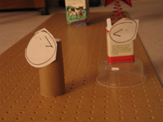
click on image to play clip (246 KB) ...And, of course, I had to try a walk cycle. Trying to make things a little more interesting, I dressed up the set a bit with stuff I got from Loose Ends back in January, and had the camera shoot from above.
Problems:
- dang it's hard to keep the head moving in a straight line; guess I need a surface gauge
- when the arm moves forward, the shirt sleeve pulls up and shows a lot of wrist
- the shirt also wanted to ride up and uncover the small of his back
- I tried to make sure I was bending the limbs, but he still looks pretty stiff
After all the effort that went into making this puppet, it's hard not to be a little disappointed as I discover design flaws. Still, the point is to learn -- and I can't complain on that account. I learned a helluva lot making this guy.
posted by sven | permalink | categories: movies, stopmo
January 29, 2006
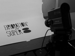
now showing: "Experiments in Super8" and "Two Men, One Pair of Glasses"
by sven at 12:30 am
You can finally see the work I did for my Super 8mm Filmmaking class!
click on image to play movie (10.9 MB) Here's my final project, "Explorations in Super8". It's 3min 14sec in length, so expect a long wait while downloading. Sadly, more image quality was lost when I went from Super8 to DV. Sigh... I knew going into this project that I was working in a lossy medium.
I've previously written in-depth descriptions about how each effect was achieved. You may want to refer back:
Amusing / irritating note: When the film was finally developed, I discovered that in several shots the camera is zooming out. I didn't do that. What happened? There was a knob on the lens that you would rotate to adjust the zoom. While I was shooting, its own weight would cause it to slowly and imperceptibly descend from its initial position -- thus causing the zoom effect!
click on image to play movie (11.5 MB) As a bonus, here's the "Two Men, One Pair of Glasses" film that Andy Weinstein and I made as a quick in-class exercise. No one else wanted it, so I figured I'd use the reel for practice doing video transfer -- before potentially chewing up or melting my own precious celluloid. This is also 3min 14sec in length.
It's out of focus a lot of the time... Let's you and me say that was intentional: the camera man needed glasses too. ;-)
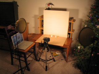
How did I get the Super8 footage digitized? Here's a shot of me setting up the video transfer. Inside that black box is a mirror, so the light from the Super8 projector can shoot directly into the DV cam. Very fussy work, trying to get everything lined up correctly and in focus. ...And then you turn off the lights.
posted by sven | permalink | categories: classes & workshops, movies, stopmo
January 22, 2006
comic homage to moon baby
by sven at 10:11 pm
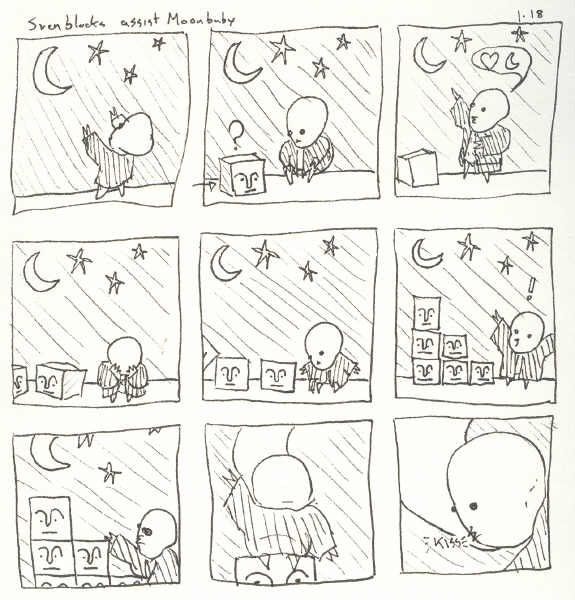
My brother drew a comic using Moon Baby and the Sven blocks!
[click on image to enlarge] Here's what he had to say about it on his art blog:
"This will probably make my brother do a double take. I used two of his characters and two of his themes in this comic. Moon baby and the Sven blocks both come from his recent explorations into stopmo. If you look through Scarlet Star, you'll see Love and The Moon constantly show up in his work (well, at least I think they do). Pardon any off character sheet drawings, I didn't look up what they looked like before I started drawing."...Wow. I wish I'd thought of that story line. (Thanks, Bro!)
posted by sven | permalink | categories: movies, stopmo
January 16, 2006
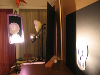
scenes from "Explorations in Super8"
by sven at 12:00 pm
I turned in my final project for the "Super 8mm Filmmaking" class at on Sunday (Jan 15). I tried to turn it in twice on Friday (the deadline), but no one was at Radius Studios (grrrrr).
I feel like this class is jinxed. I just wouldn't be surprised at all if my film cartridge somehow got lost in the mail. So, I will now spoil all surprise and describe exactly what I did for this project. I'm hoping that when I get the developed film back, I'll be able to do a transfer to digital and put it online. But, like I said, I'm not holding my breath.
I shot one complete film cartridge. A cartridge contains 50 feet of film, which works out to be around 3 minutes 30 seconds of screen time. To keep track of where I was in the roll of film, I used graph paper to make worksheets -- marking off one square for each frame shot.
I took quite a few "making of" shots with the digital camera... Not everything's covered, but you'll get the idea.
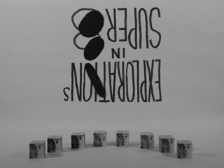
title card Opening shot: The words "Explorations in Super8" write themselves on a white backdrop. The camera angle changes, showing that the words were actually written on a surface that was at an angle. The closed spaces of the the letters P, O, R, and A -- and of the number 8 -- sequentially turn black, as I put pieces of black paper over them. These cut-out shapes then all slowly tilt sideways. All the cut-outs on the left slide over to the right and are consumed by the black shapes there (the "O" of exploration and the "8"). The remaining "Explorations in Super8" logo appears again later in the film.
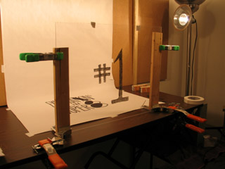
exploration #1 The number "1" seems to write itself on top of the logo...
grease pencil on a sheet of acrylic "glass" ...This effect was achieved by writing the number "1" in grease pencil on a sheet of acrylic "glass". I was very pleased with the strategy I came up with for making the glass stand up. As you can see in the photo, each side of the glass is clamped to a piece of wood. These two pieces of wood are held in corner clamps. The corner clamps are then clamped to the table using two more clamps (a total of six clamps).
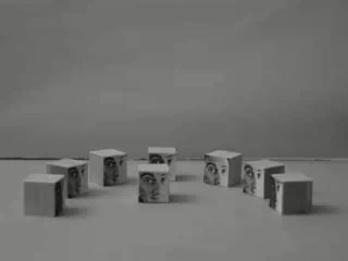
the "blockheads" present themselves Eight blocks that I made previously, ones with photocopies of my face on them, present themselves in a half-circle. The middle two swap places. The next two out knock heads and return to their places. As do the next two out. The last blockhead on the left runs over to the one on the far right and tips him over.
blockheads cavorting on the wall and the ground The blockheads start running around the set willy-nilly. Some slide across the floor; others slide up, down, and across the wall. One comes down the wall and gets on top of a block that's on the floor.
everyone's about to be just two blocks tall A little comedy: a totem pole of two blocks, a totem pole of three blocks, and a single block all stand next to each other. The middle one looks at the others and seems pleased that it's the tallest. The one on the left rams it while it's not looking, and then everyone is equally two-blocks-tall.
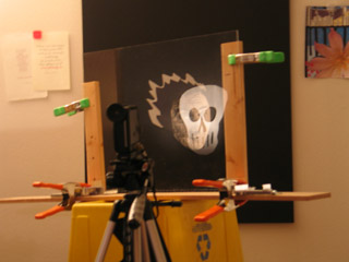
exploration #2 The first exploration used a predominantly white set, where butcher paper was the backdrop. The second exploration dealt with sets that were predominantly black. Using the same trick that I used for "#1", I animate "#2" appearing by writing with a white grease pencil on the glass sheet. In both cases I also animated the numbers erasing themselves.
ghostly skull My face, floating in blackness, is replaced with a ghostly skull. See my post on "compositing, retro-style" for details.
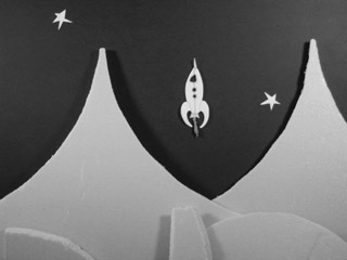
spaceship A spaceship rockets between the stars. As it zooms past, the stars spin in its wake. The spaceship is a drawing cut out of paper; its exhaust is made out of green tissue paper.
landing The spaceship fires its retro-rockets and gently lands on an alien world. The mountains and hills are made from scraps of blue insulation foam.
panicking robot A panicking robot runs by in the foreground. The focus changes, and we see the landed rocket in the background.
exploration #3 Having done "light" and "dark", I decided to do "wet" and "dry". Exploration #3 is animation done using sand (dry concrete mix, actually). After I draw the "3", I animate it disappearing -- by vacuuming up a little bit of it at a time.
(For how-to details, read "animating: sand, paint, shadow.")
flag made of sand Three O's appear. They turn into two eyes and a mouth. The mouth smiles -- and then frowns, and tears fall. The lines that make up the eyes connect themselves to the mouth, and the resulting snake wriggles its way off screen.
New scene: I cover the entire screen with sand. I wipe some away, so that white shows through, and an American flag appears. I make the stripes seem to flap in the wind. The flag dissolves, and the mushroom cloud from an atomic bomb appears. (Clearly I was free-associating here!) The cloud disappears, and random zig-zag lines mark the sand for a while.
exploration #4 On to "wet" animation! A number four paints itself on the glass, and then erases itself.
paint "weaving" I splatter paint onto the whiteness a little at a time until there's a black puddle. The puddle turns into a checkerboard. The checkerboard becomes a more ornate "weaving" pattern.
paint "whorl" Circles radiate out from the center. A spiral takes its place. The spiral pattern becomes a wild whorl. The whorl resolves into a painting of a human eye, which blinks once. The paint is gradually wiped away, until it looks like a bagel. Bites disappear from the bagel until it's gone. (I must have been hungry!)
exploration #5 I thought it would be interesting to use this retro medium, Super8, to film digital images. I think there's an impulse, if you're using super8, to try to make everything look "old-timey." Why ignore the existence of digital? Maybe hi-resolution digital captured on low-resolution Super8 will create an interesting visual effect... ?
For the transition to this section, I quickly made a three dimensional "5" in LightWave and set up a scene where it would rotate. Rather than rendering out this footage, I simply advanced the frames manually in preview mode, and snapped a shot each time with the super8 cam.
"star" I experimented with reusing animations that I've made previously. The first one, "star", shows a person looking at the sky... They see something and point at it; they reach out a hand, and catch a falling star. This animation exists as a QuickTime movie. I advanced it one frame at a time on an Apple Cinema Display, taking two shots of each frame with the super8 cam.
"Dot" The second animation I recycled is called "dot". It was an improvization where a dot morphs into all kinds of random shapes. Both "star" and "dot" can be seen in their original forms at my old "Sven's Animation" site.
filming a QuickTime movie on the laptop For "dot", I tried filming the movie off of the laptop rather than from the workhorse computer. I shot this using the macro setting -- and have a suspicion it'll probably be all blurry. I tried filming "dot" three times in succession: once at 3 frames for each drawing, once at 2 frames per drawing, and once at 1 frame per drawing.
exploration #6 For the sixth and final exploration, I decided to work with shadow puppets. The shadow of the number six appears, and then disappears.
(For how-to details, read "animating: sand, paint, shadow.")
robot walking away A shadow robot waves, shakes its head, and walks off screen.
Random geometric shapes -- squares, rectangles, triangles, circles -- appear and disappear in interesting patterns. A circle and triangle form themselves into a timer, which goes through two revolutions.
"the end" - part 1 At this point, my best guess was that I had 10 - 20 seconds of film left. I brought Gretchin over to the studio and had her help me with the final shot. I wanted to have this last bit be live-action, and I needed her help to actually run the camera.
Gretchin -- fine calligrapher that she is -- wrote "by sven" for me on my the back of my hand...
"the end" - part 2 I show the camera the back of my hand: it says "by sven". I turn my hand over and "2006" is there, written on my palm. Just as I finished showing my palm to the camera, we think we heard the camera run out of film...
THE END!
posted by sven | permalink | categories: movies, stopmo
January 15, 2006
animating: sand, paint, shadow
by sven at 6:00 pm
For the Super8 final project I tried out several animation techniques that I've read about, but never had enough interest in to actually pursue: sand, paint, and shadow.
camera + tripod mounted on microphone stand Animating sand and animating paint both had a similar setup. You work on a horizontal piece of glass, lit from below. You put your sand or paint on top of this glass, and film with the camera above.
The super8 camera has a minimum focal distance of 4 feet (unless you use macro). My sheet of acrylic "glass" was raised up about 18" off the ground by two recycling bins. This meant I needed to get the camera pretty high up in the air -- and it had to point directly down, which the tripod wasn't built to do.
So, I took the camera and tripod as one piece and put them in a microphone stand! ...A little wobbly, but a very workable solution.
animating sand With sand, I put a piece of white butcher paper on top of the glass -- to prevent scratching, and to diffuse light. I didn't have any proper sandbox sand around, so I used some of Gretchin's dry concrete mix instead. Concrete has lye in it, so I was careful to wear latex gloves while working with the grit.
Sand was kinda fun to work with. ...Dropping pinches of it onto the glass wasn't very precise -- and trying to pick it back up to move it somewhere else was fairly irritating... But pushing around little lines was pleasant. And spreading sand across the whole sheet and then making lines with negative space was also pretty good -- so long as the image didn't need to be very fussy.
animating paint For animating paint, I took the sheet of paper off the top of the glass and instead clamped it onto the underside. I started off by dripping black tempera paint onto the slick surface -- Jackson Pollock style -- and then proceeded to move it around with brushes (occasionally re-wetting the surface).
This I liked a lot. It was very much like finger-painting: the process being more about moving paint around than capturing a single static image. And the light shining up through the glass really illuminated the texture of the brush strokes nicely. Just beautiful.
camera pointed at mirror below glass For filming shadows, I needed to change the camera setup. I put the white butcher paper back on top of the glass, and pointed the lights downward at it. The shadow puppets sit on top, held in place by gravity. The image I wanted to capture was going to be underneath the glass.
If the camera were directly underneath the glass, then the glass would have to be at least four feet up in the air (due to focal distance). That would have been really awkward to work with. So instead, I put a mirror on the floor, and pointed the camera at that. The focal distance was measured not from the camera to the mirror -- but rather from the camera to the mirror and then up to the glass.
shadow puppet hinged with nails Shadow puppets are typically hinged with thread, I believe. But I was feeling lazy. I wanted to use brads (the metal fasteners you find on large manilla envelopes) -- but we didn't have any on hand. So, in a pinch, I used small wire nails for my joints. Pointy -- but effective!
The robot pictured above was cute, but not a very practical puppet. The shoulders would bump into the neck if I moved them too far. If I make shadow puppets again, I must remember to make sure that none of the joints interfere with each other.
animating with shadows Animating the shadow puppet was a real pleasure when I was only moving one limb at a time. The arms moved wonderfully smoothly. But when I had to move the whole body -- that was trouble. All the joints would flail wildly, dragging behind the main torso.
Another problem I ran into was bad lighting. Because it was easiest to just lean the lights inward, I had beams coming from two sides. The puppet didn't always lie totally flat upon the glass, which meant that side-lighting could wash out some of the shadows I was trying to create. If I had had light coming from directly above, it probably wouldn't have mattered so much if the puppet wasn't lying entirely flat; all the shadows would be perpendicular to the glass.
Conclusion: Having known about these animation techniques for years, I'm glad to have actually tried them now. I doubt that I'll return to them any time soon... But if I do, I expect it'll be paint that I pick up again. It has a really lovely improvisational quality about it -- and it would be interesting to see what I could do with it if I were working in color. Any serious work, though, would probably require oil points -- which is an investment I'm not quite ready to spring for yet.
posted by sven | permalink | categories: movies, stopmo
January 14, 2006
compositing, retro-style
by sven at 11:59 pm
I finally finished the Super8 final project Thursday night; it took 19 hours to complete actual shooting. I squeezed in a lot of interesting experiments, so I'm going to break this story up into more than one post.
The trick I'm most proud of was making a ghostly skull appear in place of my face -- without any use of digital compositing!
Note: Super8 is, of course, actual celluloid. What you see here are photos that I took with a digital camera from the same angle as the Super8 cam, so I could document my process.
The "ghost" trick begins with this image of my face. The image is just a photocopy, blown up from a photograph that I had lying around. The photocopier lopped off the edges of my head -- so I cut out some paper to make that fiery "manga" hairstyle.
As you watch, the face is slowly replaced...
...by this skull, which is a paper cut-out.
How did I achieve the effect? Well, it's a little tricky to explain.
The key to the effect is putting a plate of clear acrylic "glass" between the camera and the image of the face. The glass is at a 45 degree angle, so it will reflect whatever is on the wall to the camera's left.
On the wall to the left of the camera, I taped the skull onto a piece of black foamcore. If there's no light on the skull, then there's no reflection on the glass that the camera is looking through. But, throw some light on that skull, and then a reflection appears. If I subsequently turn down the light on the image of the face, then I can almost get it to disappear, so we're left seeing only the skull.
My problem here was in trying to isolate the lighting... If there's any light at all on the skull, then we're going to see some reflection of it in on the glass. The ideal solution would have been to have a spotlight focussed on the skull that was controlled by a dimmer switch. That way I could keep the skull in darkness, and then gradually illuminate it. ...But I didn't have a dimmer switch.
So, what I did instead was have a light pointing away from the skull, but aimed at a mirror. For my purposes, I clamped the mirror to a microphone stand. When the time comes to illuminate the skull, I swivel the mirror on the microphone stand, and the light is bounced onto the skull. Overly complicated -- but pretty effective.
Here's a picture of the whole setup. As you can (hopefully) see, I've got two light sources: one on the left pointed at a mirror, which will illuminate the skull -- and one on the right that's pointed directly at the photo of my face. When it comes time to film the trick, what I do is animate the lights turning. ...For each frame of film, I incrementally turn the one light away from the face -- and the other light so that it's illuminating the skull. Run the film at 18 fps, and the metamorphosis appears!
My understanding is that this is an old theatrical trick... I think it was used around the end of the 1800s to make "ghosts" appear on stage, next to live actors. The trick there, too, was putting a big inclined sheet of glass between the audience and the stage.
More recently, I've seen the trick put to use in science museums, using a two way mirror. At the traveling "Star Trek: Federation Science" exhibit, for instance, I recall there being a station where you could sit in front of this pane of glass, and as you raised the lights on the other side, you could see a Klingon face superimposed over your own. Neat gimick.
Since compositing is so easily done in digital, I don't know when I'll ever need the "ghost" trick again. It's labor intensive, and relies on a complete control of lighting sources, which is difficult to achieve...
Note to self, in case I ever do attempt it again, though: An even more effective means to isolate the light on the skull would be to put a board between the light and the skull, with a "keyhole" in it... Cut out a skull shape in the board, so all extraneous light is truly masked and only a thin beam can shine through.
posted by sven | permalink | categories: movies, stopmo
January 11, 2006
explorations in super8
by sven at 12:05 am
So, Monday I finally began shooting my reel of Super8 film.
Ultimately, I decided that I'd have to be crazy to shoot animation I care about on Super8. As I stood in the kitchen Sunday night, thinking about this project -- which might turn out blurry, will be very difficult to get online, and could take up to 20 hours to shoot -- the exact words that went through my head were: "Do I hate myself?"
...So instead of wasting my "Mud & Metal" script on this project, I decided to film a series of improvised experiments in animation. It'll still take me a hella lot of time -- but at least this way there's no risk of heartbreak.
Title: "Explorations in Super8." ...I'd meant to title it "Experiments in Super8", and when I got to the end of animating the first word, found myself wondering why the letters didn't fit as planned!
posted by sven | permalink | categories: classes & workshops, movies, stopmo
January 8, 2006
script: mud & metal
by sven at 9:55 pm
Yesterday I wrote a new script. I'm very excited about it... When it was done, I read the whole thing through... and cried! (Of course, I have the benefit of perfectly heartbreaking mental visuals to go along with it.) I used the new story generating strategy a third time, brainstorming ideas as a numbered series. Read them as a text file.
This is the story of a young robot losing the human that takes care of him, told in three acts. ...I say "acts" -- but it's really a short piece, probably four minutes long -- reading more like haiku than theatre. Still, there are three distinct movements: the first is a "gotcha" gag; the second is straight comedy; the third: tragedy. ...I like how the the third act hits just that much harder because you were laughing only a moment ago.
Anyway, without further ado, here's the script:
MUD & METAL
January 7, 2006ACT I.
They're a little unnerving
And we're so dependent on them.
What if they rose up against us?
Still...
Some of my best friends are human.ACT II.
Human: After we're gone, you'll still be here
I tried to make you everything I'm not.Robot: Why? Are you ashamed?
Human: We are... hungry, unhappy, smelly, confused.
People are made of clay.
But you -- metal is immortal.Robot: I wish I could fart.
ACT III.
I can't always tell
if you're sleeping.
I wait
and I worry
If you die
who will take care of me?posted by sven | permalink | categories: movies, stopmo, writing
January 7, 2006
Attention Surplus Disorder (ASD)
by sven at 4:17 am
Thursday I had crazy laser focus and wound up creating a complete stopmo short: all the way from getting the idea to having a compressed movie ready to put online. Biggest one yet by far: 1 minute 20 seconds -- that's one thousand nine hundred thirty eight frames that I shot!
click on image to play movie (4.04 MB) I didn't start the day with any particular project in mind. I just wanted to keep experimenting. So, using my new story generating strategy, I brainstormed 18 ideas for films that could use blocks as main characters. Read them as a text file.
After 2 hrs 15 min, this is the idea I decided I wanted to run with:
#013 FIRST PICK
Back to writing words on the backdrop. Maybe as the characters speak, words are added to the backdrop without erasing the previous ones. The dialogue is added increasingly quickly and angrily, until the air is blackened with accusations. If I were easily able to do it with Super8, I'd then have everything go still, and let it all fade away, being replaced by a clear white backdrop again. If I were going for crude, one of the characters would then say: "So, wanna f*ck?" Or, the punch line, after all the furor could be "I love you." Or I could try to steal that beautiful scene between Tara and Willow on "Buffy the Vampire Slayer" where Tara says "I know we have so much to repair... but could we be kissing now?" (paraphrase). ...In this set up, the cubes hardly move, except maybe to twist and turn a bit while talking. All the action is in what's being written up above them. This is probably not more than a minute-long gag: as the air gets increasingly cluttered with words, you either have to focus on the words or the cubes -- you can only really show the whole conversation written above the cubes and have it remain legible early in the game....It's not all hashed out -- but you can see the germ there.
I was working in the livingroom again -- but this time I bothered to set up better lights -- and I put my 2'x2' hardboard "stage" up on the piano bench, so I'd be able to place the camera more easily. I was sloppy with the backdrop, though -- it's a piece of of big newsprint folded over another piece of hardboard, not even taped on. It shifted a little during the shoot -- but I got lucky, and it didn't give me too much trouble.
The real pain this time was when I'd bump the camera. With such small characters, I had to have the camera right at the edge of the set -- forcing me to contort around it to do the animating. Important lesson: I think I'm going to make a point of using larger puppets in the future, so the camera can be farther back, giving me more elbow room. Glad I learned this while working in digital... A Super8 cam is much trickier to focus; bigger puppets will save me a lot of grief.
For folks who are wondering about tech details, here's the scoop. I'm shooting photos with a Canon Powershot G5 digital camera. I'm using the laptop computer to activate the shutter release, using a software application that came with the camera: RemoteCapture. The computer is a Macintosh PowerBook G4. I've been doing research on framegrabber software, but none was used on this project.
...Overall, I'm thrilled with the piece. There are some glaring problems: I bumped the camera several times, there are pauses that last too long, the spinning sequence is too slow, and the blocks' "body language" doesn't always make sense. Even so, it's a complete story -- which counts for a lot. And there are several bits that came out really well -- like when the zig-zags shoot around and you see the action carry over from one shot into another, and when the word "really?" seems to wrap itself around the cube.
It took seven hours, non-stop, to shoot. That's about 11 seconds of footage per hour. My previous experiment with animating blocks averaged out to 10 seconds of footage per hour -- so it looks like I'm pretty consistent (at least with these puppets). I finished the thing at 2:45 in the morning. Exhausted...
But euphoric. :-)
posted by sven | permalink | categories: movies, stopmo, writing
January 6, 2006
while moon baby's in the hospital...
by sven at 11:59 pm
Tuesday and Wednesday I did a few more simple stopmo experiments. Can't let Moon Baby being in the hospital bring everything to a halt!
click on image to play movie (139 KB) Tuesday night I went over to the studio; threw together a bit of 2"x2" pine scrap, masonite, and bronze (?) wire; painted it all white, and taped on a paper face. ...Voila! New puppet.
It only took about an hour to make; I consider it a throw-away. The masonite base is so I don't have to worry about tie-downs and walking for a while; it just slides around. The arms are too stiff to do much with... However, I did try something new: drilling holes in the torso, and weaving the strands of wire through -- a good idea that I'm borrowing from Nick Hilligoss. I also gave this puppet some fingers using very thin aluminum wire, just to get a feeling for what that would be like.
Earlier Tuesday afternoon I was brainstorming story ideas. When I was making this clip, I had this story germ in mind:
"a solitary artist [...] nightly looks at the stars, paints them and paints them, and ultimately releases a star into the sky from his own chest"I liked the look of the puppet interacting with the paintbrush -- but it also turned out to be pretty difficult making it grip the prop. Puppet hands aren't people hands; that's something I'll have to remember. Maybe they'd grip better if I exaggerated the length of the fingers?
click on image to play movie (427 KB) When the painter in the first clip is making his spiral line, that was drawn in with a black crayola marker. ...I wanted something without fumes! The look was so appealing, I decided to try something else with the markers.
The light in this second clip is pretty awful -- I've been doing my work on the livingroom floor again. Gretchin was typing on the couch, so I wanted to hang out with her. ...This experiment was a nice surprise for her when she finally looked up, too. :-)
click on image to play movie (776 KB) I did this third clip the following night, after being out doing Artist's Way postering all day. Again, terrible lighting in the livingroom -- and I forgot to turn off the camera's auto-focus for the first bit. Still, this was my longest stopmo clip to date -- 363 frames @ 24 fps for 15 sec.
Like I said in my last post, I'm thinking now that the final project ought to be done animating objects rather than puppets -- hence the blocks. The blocks were cut off the same 2"x2" piece of pine that the artist puppet came from -- using a miter saw to get straight lines. I taped on photocopies of my face just to make them a bit more interesting. I chose to go with black and white because the Super8 final project will ultimately be shot on b/w filmstock.
My lesson while working on this clip: it's easy to make things zip around on screen way too fast! Move the objects in even tinier increments, and have them pause longer -- 24 frames per second is a lot of space to fill.
posted by sven | permalink | categories: movies, stopmo
January 5, 2006
story writing experiment
by sven at 2:17 pm
For a couple of months I've been going to "Church of Art" meetings. This is a small group of artists (mostly painters) that meets once a month at World Cup Coffee for a show-and-tell session about what they've been working on. One of the members recently wrote:
"One of my favorite artists, Corita Kent would push her students to come up 50 or 100 ideas for a project. She said that when you scrambled through the first easy ones, then worked harder for the next ones and really had to scrape for the last ones, you found out what you were made of."I like this idea very much! It's very much in line with my "quality through quantity" ethic.
...Also on my mind, this post from Pjotr Sapegin that I found on the StopMotionAnimation.com "story" forum. (Pjotr's from Norway -- be nice about his spelling.)
When you write a film-script, the dialog comes last in the prosess. You should write a short Sinopsis first, to have your story strate. Then you write a Treatement, where you brake your story in to the sceens, and there might come a little-bit of the dialog. When you are satisfied with it, you write the actuall script, basycaly, felling up your treatement with the dialog.Storytelling, admittedly, is one of my weak points. I'm a very visual thinker -- more comfortable quickly sketching a storyboard than trying to work out a film idea using just words. This has led to problems with "Let Sleeping Gods Lie": I find myself now trying to rewrite both the beginning and the ending, because what looked good in pictures stopped making sense when I had to actually explain what was going on. I swore that for the Super8 class' final project, I'd try to do better.
So, with the two quotes above in mind, I set out to develop the "moon baby helps a star" story. I set for myself a goal of writing 50 to 100 different concepts, each with a serial number, and only a paragraph long. ...I spent two hours writing and made it only to 25 -- but it was a good experiment, and served its purpose.
I figured out that I could do a pretty good story about a dragon stealing a star, scared away when Moon Baby -- aided by fireflies -- creates a terrible shadow on the wall of the monster's lair. However, this story would take more puppets and more shots than I have time for right now, in the context of the Super8 class. My second-choice story deals with a solitary artist who nightly looks at the stars, paints them and paints them, and ultimately releases a star into the sky from his own chest. This is much more doable...
But at the end of it all, I've been convinced that I should go for something simpler still. I'm holding onto the Moon Baby concept -- possibly for submission to the quarterly StopMoShorts.com competition? In the meantime, I'm looking into what I can do with animating objects, like blocks. "Something is better than nothing" -- being too ambitious could easily prevent me from finishing anything for Super8.
...Want to see those 25 story synopses I wrote? Read the complete text file.
posted by sven | permalink | categories: movies, stopmo, writing
December 29, 2005
little black tears
by sven at 1:05 am
My poor puppet "moon baby" has broken!
I worked all day on finishing my new puppet... And then his left arm snapped off. This setback would be devastating -- but I'm trying not to let the hurt in too deeply; I need to believe that I can still save my baby.
And everything was going so well...
body made of unbaked Sculpey The first thing I did today was paint Moon Baby's eyes black. I'd been intending green, but time's at a premium, and this was simpler. It reminds me of the eyes of your stereotypical "Close Encounters of the Third Kind" alien -- and of a great white shark -- and of the tree spirits from "Princess Mononoke". I like it.
I thought maybe I could cut corners by encasing the armature in unbaked Sculpey. When I did so, it turned out that the puppet became too heavy -- the ankles couldn't support the extra weight. Still, it was a good exercise: it helped me get a better sense of the physical dimensions I was after.
body made of poly foam So, I went back to my original plan: to cover baby's body with poly foam. It's probably for the best; it's better to put in extra time making a good puppet up front, rather than be cursing the puppet later while you try to animate it.
A week or so ago when I went out shopping for foam, I found something wonderful: "Poly Foam Weatherseal Self Stick Tape" from Frost King. I want to strongly recommend this material to stopmo puppetmakers who are using the build-up method. This tape is 3/4" wide, 1/4" thick, and came in a 17' long roll. It's intended for insulating windows, and I found it in the hardware section of Fred Meyers (our local department store). It cost maybe $3.00.
...It's the kind of foam that you would normally use for bulking out a puppet -- but because it comes in tape form, you don't have to deal with messy, toxic sprayment! It's also good for creating a symmetrical body mass; you layer small, precisely measured pieces of foam -- rather than having to whittle down a huge block. Really, it was a joy to work with.
working on the costume For Moon Baby's costume I wanted a sort of black burlap muumuu. I had some tan burlap on hand, so I dyed it black with india ink. It did the job -- but also rubs off on the hands over time, which leads to smudging baby's head. I thought it would be a good idea to paint the back of the fabric with liquid latex. It had a loose weave that I wanted to seal, and I figured a stiffer fabric would move less randomly when I was animating. This was probably a mistake; the stiffness impairs the armature's ability to hold its shape, somewhat.
I created a pattern for the costume by trial and error using pieces of paper and tape. When I thought I had it right, I tried out the pattern using burlap -- but not the burlap I'd treated with latex yet. Looking at the burlap, I made some further changes to the pattern, which I now drew onto graph paper. I cut these templates out, and using a yellow watercolor pencil (because it was at hand), marked out my cut lines on the black stuff, and cut.
At this point I realized that I should deal with the wrists, ankles, and neck before going farther. These bits (I gather) are always difficult to construct. I decided that with the look I'm going for, it would be adequate to just wrap them with string. I thought about painting the string with latex, but then decided it wasn't really necessary. The string for the ankles was dyed black using india ink again. The ends of the string were fixed in place with a dab from the hot glue gun.
Now I started attaching the muumuu. A while back I read that professional costumers in the theater have a trick for quick clothing construction: they use a hot glue gun to make their seams, instead of a sewing machine. Perfect! I hot glued the arms of the costume directly to the body...
...At which point I realized that the arms weren't bending as easily as they should anymore. The poly foam "muscle" combined with the costume was just too springy, and baby couldn't hold a pose without it slowly sliding out of place. So I tore open the sleeves, and tried cutting through the foam -- incising rings down to the "bones", so the joints could move more easily.
amputated! That's when it happened. The arm just snapped off.
At first I thought I must have nicked the wire -- which is death for an armature. But now as I look at it, I see that the wire broke right where it goes into the epoxy putty. Maybe the arm was working as a lever, and all the strain was put on that one point. I've read about people reinforcing the entry point with silk thread... Maybe that's what I should have done.
...I'm hopeful that I can still salvage this puppet. I've already put at least twelve hours into him, and have grown fond of the character. I think maybe I can drill new holes into the epoxy and replace the wire. But it will be difficult.
I'm left with questions about how other puppet makers deal with musculature. Replacing the wire will fix the problem, but what should I have been doing with the foam in the first place? Was incising the foam at the joints the right way to create mobility? What if I tried wrapping string in these areas, too?
My next step is going to have to be writing a sad post to the www.stopmotionanimation.com forum...
posted by sven | permalink | categories: movies, stopmo
December 28, 2005
sets for "moon baby helps a star"
by sven at 11:10 pm
Yesterday I started work in earnest on making a stop-motion animated short -- spurred on by the approaching deadline for the Super8 class' final project. Tentative title: "moon baby helps a star".
basic animating set up I commandeered Scarlet Star Studio's meeting space and began assembling sets. My basic set up involves two tables with pegboard bridging the gap between them. Since pegboard is pretty flexible, I reinforced each of my two big scraps with wooden rails. I've got three spot lamps that I borrowed from Radius Studio; super8 requires a lot of light. I put a little step ladder next to the table so I could easily get up there and take shots looking down at the set.
experimental set I like to brainstorm with my hands, seeing what I can make with what's around me. I like the sense of improvization... And in this case, it helps me avoid fantasizing about things that I don't have time to construct. At this point in the game, I'm still working out what my story is going to be; the impromptu sets I've been trying out are suggesting story ideas as much as anything else.
One interesting thing I discovered while doing this physical brainstorming: it's helpful to have the set about a foot higher than table-level. When I'm sitting in a chair, this puts the floor of the set close to eye level -- so I don't have to crawl under the table to screw in the tie-downs. In the photo above, you can see that I've put one of my pegboard scraps up on bricks, and have a test set thrown together.
cave set I've found it very useful to have a digital camera handy while I'm playing around like this... It allows me to try out different camera angles, and later on I can string the photos together into a sort of storyboard. Since the Super8 film stock I'm working with is black and white (and silent), I took all my test shots in b/w.
the cave entrance The cave walls are made out of butcher paper that was packing material in a box of art supplies that Gretchin ordered. It had such an interesting texture, I knew it would come in handy when I got around to animating! In that same box, there was also this interesting paper mesh... Turns out it's excellent for creating a floor texture that still allows tie-downs to pass through.
nighttime outside Here's an exterior shot. The dark sky is two huge pieces of black foamcore. The mountains and hills are leftover insulation foam from a sculpture project several years ago. The stars were decorations I made for our tent when we went to Burning Man in 2004.
So, the story as I've imagined it so far: Black shadow creatures steal a star from the sky and whisk it down into the depths of a cave. "Moon Baby" -- a name that Gretchin suggested for my new puppet, which I'd been referring to as just "baby" -- also lives in this cave, and discovers the kidnapping. He steals it back from the amorphous nether creatures, and after consulting either a map or some sort of guardian being, journeys to the entrance of the cave. Stepping into the outside world, he throws the star back into the heavens, and all the stars above dance in joy.
posted by sven | permalink | categories: movies, stopmo
December 27, 2005
Nice model... But can you animate it?
by sven at 12:15 am
I've been very focused on learning how to build puppets to animate... Yesterday I suddenly realized that I've neglected learning how to actually put them in motion!
When I think about it, I really haven't done much animating at all. The last time I worked with animating objects was nearly two years ago. You can still see those experiments at my old Sven's Animation site. Since then, I've been working mostly with LightWave 3D for the "Let Sleeping Gods Lie" project -- but that too has been mostly about modeling so far.
So I set to the task of learning and re-learning the basics of stop-motion animation. ...And thanks to Jason Gottlieb's definitive tutorial on compressing stopmo for the web, you get to see all eight tests that I've done so far! Some of these are pretty bad -- but I include them here because the learning process (beginning from zero) may be interesting.
click on image to play movie I'm using a Canon PowerShot G5 camera attached to a Macintosh PowerBook G4. Using the software RemoteCapture (which came with the camera, I think) I can activate the shutter release without touching the camera, and the images go directly to the computer, rather than into the camera's memory card.
In RemoteCapture, these are the steps to get ready for shooting:
- in "preferences", select the folder you want shots to go to
- now in the "shooting remote" window, set size to "small/fine"
- in the same window, hit the button to turn the view finder on and then adjust zoom
- put the puppet in shot and take a test shot
- if it's in focus, then set the autofocus (AF) to "locked"
- delete the test shot
- ...and go!
After all the shots have been captured, I use the software QuickTime Pro to open the shots as an "image sequence". The newly created movie is then saved. It's from this master that I create the compressed versions you see here.
In my first test (above), the camera is just sitting on the floor, and I'm scooting a bottle of embossing powder (a Christmas stocking stuffer) across the floor. The picture vibrates, going in and out of focus... This is because I didn't have the auto-focus locked yet.
click on image to play movie In this next clip, I'm moving the embossing powder again (this time upsidedown) -- but with the auto-focus locked. There's still some variation in light, but this is because I'm using daylight (which changes as clouds pass) and my shadow occasionally falls in the frame.
click on image to play movie Moving a solid object in a straight line? Not very interesting. So I grabbed another stocking stuffer -- a fuzzy sock -- and made it worm its way across the floor. Cute! But now I realized that the foreground is really blurry. That's because the camera's just sitting on the ground; it can't focus both on the foreground and the midground at the same time.
click on image to play movie In the fourth test, I put the camera on top of three DVD cases -- that was enough to get rid of the blurry foreground problem. This time I wanted not just to imply character, but to show a relationship between two beings. The star globe reacting to the orange is fairly compelling, I think.
...This was the last test I did before going to bed on Christmas night.
click on image to play movie This afternoon I dove into some more elaborate tests. I commandeered the livingroom cofffeetable, leaned a big piece of black foamcore against it for a background, and taped down a piece of butcher paper. I pulled out some Sculpey, and after conditioning it by running it through a pasta maker, created some very rough characters.
In my imagination, what's happening here is two tree beings get blown around by the wind; the little one cries out a complaint, and the old one blinks its eyebrows dispassionately; the little guy sneezes, and with a few more blinks, everything goes back to normal. ...But it all goes so fast, I don't think the "story" gets communicated.
At this point I realized that I hadn't really paid any attention to timing. Every frame, I just pushed my puppets forward a little more -- so they were in constant motion. What about pauses? What about figuring out how long you want specific actions to last? For that matter, what about really planning out the story in advance?
click on image to play movie For this sixth test I drew a very quick storyboard. The dinosaur-head creature is supposed to notice the fruits, reach down and gobble up one, then another, and then stretch himself out on the ground in order to reach the third. It occurred to me that as an animator, one needs to develop a good sense of how long a second, half-second, and quarter-second are. So in the storyboard, I made a note for how long I thought each motion should last. I was pretty happy with this approach.
But before I could even get the dino's mouth down to the first fruit, it tipped over! D'oh! Here we have an object lesson in the importance of attaching your puppets securely to the set.
click on image to play movie Seeing that it was time to begin playing with my actual puppet-in-progress ("Baby"), I got out a scrap of pegboard and clamped it to the coffee table, hanging over the edge (see the photo at the top of this post).
The little animation of Baby interacting with this Sculpey ball works pretty well. I guesstimated how long I wanted each action to last, and helped myself keep track by counting each section of shots out loud : "1... 2... 3... 4... 5... 6!"
The foot that's tied down swivels in place when Baby turns. That doesn't look right; the foot should always be firmly planted in one place. There's also a moment when an arm swings wildly, where I either didn't give it enough time, or wasn't thinking about what was motivating the action.
click on image to play movie Finally, my eighth test: a walk cycle. I've been shooting 24 frames for each second -- using the frame rate associated with film cameras rather than DV, in order to get the classic learning experience. Sending baby from one side of the screen to the other required 178 photos, which took me just a hair over an hour to shoot.
Beginner animators obsess over walk cycles. You have to realize, though, that a good deal of action happens when characters are basically standing still. Getting walks right is a technical skill -- but what we ultimately need to focus on is acting. ...I say this in part because I could see myself being one of those people who gets stuck on striving for technical perfection, rather than using the puppets to tell a story. No, Sven!
If you just look at the feet, the walk worked out pretty well. The arms, though, are swinging way too much. With hands that drag on the ground, Baby would probably carry them in front of himself, rather than swinging them at all. The head is also painfully jerky. This is probably exactly the sort of situation where a gauge would be helpful -- perhaps one that tracks the position of the nose. [Oh yeah -- and in one frame you can see my hand in the shot!]
Problems that I knew were inherent in the Baby puppet became much more obvious. He's too small: only 5 inches tall. It was hard to manipulate his legs; and I could tell that the lack of upper arm bones (which I couldn't fit in) made a big difference while animating. He's also top-heavy. He'd jiggle a little when I posed him -- but the ankles did OK holding their shape. Note to self: ALWAYS test whether or not an armature can stand on one foot while leaning forward, before you get too invested in the puppet!
...And there you have it: eight quick tests to help me learn animation. I really recommend this process; if I had dreamed up a fancy story first, I'd have been bogged down with trying to overreach my skill level. But by grabbing whatever what was at hand, I made fast progress learning. Tomorrow I have to turn my attention to the Super8 final project -- but I can tell that if I just allowed myself to continue doing experiments without expectations, it wouldn't be long at all until my growing level of competency would start producing keep-worthy clips -- which might then be woven into an interesting whole.
posted by sven | permalink | categories: movies, stopmo
December 23, 2005
new stopmo puppet - in progress
by sven at 9:29 pm
For several weeks I've been obsessed with learning how to make puppets for stop-motion animation. I studied and studied -- and now I'm making one of my own...
How I came up with the design is interesting... I was experimenting with different ways to generate stories for my Super8 final project. I tried:
- photographing improvised dioramas
- quickly brainstorming story elements, drawing each one on a separate piece paper
- writing ten one-paragraph-long story ideas as quickly as I could
- beginning from the characters: sketching pictures of possible puppets
[So far, working with dioramas has worked the best. I found that when I drew story elements, I tended to only draw solitary characters -- working with "dolls", on the other hand, immediately implied relationships. Writing story ideas, I tended to come up with poetry -- neat, but it felt too abstract.]
...When I tried doing character designs, I managed to spit out 35 sketches in about an hour and a half. I used fat crayola markers on the backs of junk typing paper -- it was nice not to be inhaling toxic fumes! The sketches were rough, but conveyed emotion... From this, I just had to leap into constructing them in 3D!
I'm surprised myself that I chose this picture to start with. But for some reason, the little "baby" on the far left really spoke to me. In my imagination, I see this shy family of what's-its cowering in a cave somewhere, eyes almost blind from disuse, whispering unintelligible things to the moon when they occasionally creep up to the outside world at night.
I started puppet construction by drawing a quick outline of the character on another piece of paper, marking out where I thought the bones should be. I took some sculptor's aluminum armature wire (1/16", I think), folded it in half, and used a hand-held drill to twist the two strands together. Interesting: the wire becomes a straight and stiff rod in the process... It's easily bent -- but this first transformation fascinates me.
I created three lengths of twisted wire: one for the legs, one for the arms, and one for the spine and head. The lengths for the legs and head I folded and twisted a second time, so they'd be four-strands-strong. These bits turned out smaller than I expected -- when you twist the wire, it shortens noticably.
Next I created some "bones" out of plumber's epoxy putty. The armature here is about 5" tall -- which is overly small -- so I couldn't make all the bones I'd imagined. Nothing in the legs, and bones only in the forearms.
This is my first time working with epoxy putty... Overall I liked it. It starts setting up in about 5 minutes, and is steel-hard in 20. Since I wasn't creating any details, that was plenty of time. (Glad I wore latex gloves, though.)
Notice that I epoxied some bolts onto the feet loops. The armature is able to stand up because there's a bolt coming up through a hole in that piece of wood, screwing into the foot.
For my first puppet I figured I'd just have a single-expression face -- expressiveness would have to come from body language. I got out some Super Sculpey and "conditioned" it by putting it through a pasta maker several times. ...I got the stuff to begin working with Sculpey quite a while back (last year?), and I tried a few tests then -- but this is really my first time doing a serious project with the material.
I used Super Sculpey to put on a head, hands, and feet. I smoothed the head by using a loop tool and then brushing with isopropyl alcohol. The rubbing alcohol is supposed to act as a solvent, softening the sculpey; it did somewhat, but I was disappointed. Turpenoid is stronger; I'll be trying that next time. ...Even so, I got a pretty darned smooth head. I wasn't as concerned with the hands and feet this time around, and didn't work them too hard.
You're suppossed to bake Sculpey at 275 degrees for every quarter inch of thickness. I guessed that there were places on the head a full inch thick, so I chose to bake it for an hour. That was a mistake. I got severe cracks in the head, a pinky fell off the hand, and one of the feet broke. Meh.
According to Smellybug's insanely cool tutorial on maquettes, the way to fix cracks is by putting superglue in, smearing on Super Sculpey, smoothing it with turpenoid, and then hitting the spot with a heat gun. I tried this and only wound up adding some scorch marks to the puppet. However, I found that I could just smear Sculpey into the cracks like you'd use wood putty on a nicked chair; it was fine even without baking.
After making repairs, I sanded the head even smoother, and then painted all the Sculpey bits with four coats of white acrylic. I used a bit of kitchen sponge to do the application, which gives the whole piece a really neat stone-like texture. I think I like it better than brush-work -- but in the future I might try using an airbrush to get an even finer surface.
That's where things stand at present!
Notes on what could be improved:
- 5" is too small a scale -- puppets should probably be between 8" and 14" tall
- bake Super Sculpey at a lower temperature for a longer time (200 degrees?)
- a basecoat of black paint, with white sponged on top of that, and then color stains, would probably give me a better look
- try using an airbrush next time?
- I shouldn't have used tin foil to bulk up the head; it's a little loose on the wire
- there should be a more distinct neck; the head almost rests on the shoulders
- the shoulders could have been wider
- truly flat feet would work better; bolts on top of wire loops = uneven footing
- I think Nick Hilligoss' T-style tie-downs would be easier to work with on set
(Still, I'm very enthusiastic about what I've accomplished so far.)
posted by sven | permalink | categories: movies, sculpture, stopmo
December 8, 2005
research: stop-motion puppet construction
by sven at 9:24 pm
I stayed up way later than I should have last night -- researching how to make stop-motion puppets. And I'm very excited about what I've learned. I'm going to break this into sections...
I. RESOURCES
By far, the best general resource I found was at StopMotionAnimation.com: their Stop-Motion Newbie Guide rocked my world.
Really -- I've been fascinated with stop-motion animation for years, and this site taught me things that I'd never seen addressed before. ...It was valuable to the extent that I feel compelled to list what's included in their index:
- Chapter 1: A Basic Overview of Puppetmaking Techniques
- Chapter 2: Building a Wire Armature for Your Puppet
- Chapter 3: Building up a Classic Stop-motion Monster
- Chapter 4: Properties of Different Clays
- Chapter 5: Claymation or Stop-Motion - What's the difference?
- Chapter 6: Choosing a Camera for Stop-motion
- Chapter 7: The Importance of Using Gages
- Chapter 8: Stop Motion Software
Three other sites had outstanding tutorial sections: Stop Motion Works, AnimateClay.com, and www.StopMoShorts.com. Whatever educational gaps StopmotionAnimation.com left, they filled in pretty nicely.
Stop-motion animation is a rarified art -- and I'm pleased to discover what seems to be an enclave of amateurs and professionals dedicated to keeping it alive. StopMotionAnimation.com seems to be the heart of their community -- and StopMoShorts.com seems to be where they're showing finished works amongst each other. Not for prizes -- just for the love of it.
...It's very exciting for me to discover StopMoShorts.com -- they have filmmaking challenges every two or three months and seem easygoing about posting submissions. I'm seriously considering grooming future animation projects for display there...
I'm beginning to recognize the names of individuals who -- by their actions -- lead in the "StopMo" community. Four who have personal sites that have helped me greatly:
One more name I want to squeeze in: Kathi Zung. She has a homemade DVD titled "Do It Yourself! Foam Latex Puppetmaking 101" available on her website. I saw it mentioned on Kevin Kelly's Cool Tools site a while back (via Gretchin), and promptly ordered the thing. It's not where I'm going with puppet construction at the moment -- but it was truly an excellent introduction to the topic.
II. PUPPET CONSTRUCTION OPTIONS
I'm going to condense a bunch of what I learned...
Constructing a puppet for animation can be divided into two phases: (A) the armature, (B) the armature's covering.
Phase A. There are basically two sorts of armatures: (1) ones made out of bent wire, (2) ones with machined joints.
Phase B. There are basically three ways to cover the armature: (1) clay, (2) couch cushion foam, (3) foam latex.
Wire vs. Machined Armatures. When you bend wire, it has a bit of rebound; machined joints can be positioned more precisely. Wire suffers metal fatigue over time; machined joints are more generally more durable. However, it's difficult and expensive to machine your own armature.
Differences in coverings. As Mike Brent says, "clay puppets are the easiest to make and the hardest to animate". When you push clay, it smooshes -- so you have to keep resculpting it as you work. ...Foam latex probably gives you the best ability to sculpt your puppet; however, it is very tricky getting the latex to gel correctly, and it can be a fairly expensive route.
...Which leaves couch foam. With this technique, you build musculature with the couch foam (urethane), and then cover it with liquid latex rubber. According to Richard Svensson, this is what you use for "creating the King Kong-Harryhausen-type monster, dragon, dinosaur, etc". The downside: latex rubber disintegrates after about 5 years -- but then, clay and foam latex aren't particularly permanent media, either.
Considering the options, I think it's clear that any 3D puppets I create will probably have a wire armature, and be covered with urethane and liquid latex rubber.
III. CONSTRUCTION DETAILS
Now that I've decided what kind of puppets I want to make, let's take a closer look at the four main steps in their construction...
Step 1: Armature
From what I've read, it sounds like the best wire to use for armatures is aluminum -- it doesn't fatigue too quickly. Several armatures I've seen show more than one strand of wire wrapped together. My guess is that braided wire is more reliable: if one strand breaks, the others are still functional.You don't want the entire "skeleton" to be bendy -- you want to create some "bones". This can be done by putting segments of the wire through metal tubing, or wrapping them in epoxy putty, or simply by wrapping them thickly with tape. Mike Brent said this about epoxy putty: "It's used to create solid 'grab points' that allow you to feel and easily move the puppet under the padding, and also it helps to lock the twisted wire together permanently".
The following two photos were very helpful to me:
This is a wire armature with epoxy putty "bones". (by Joshua Mosley)
This armature has taped arms, an epoxied torso, and a sculpey head. (by Mike Brent) Step 2: Tie-downs
How do you make sure your puppet doesn't fall over? Bolt it to the table! You have a choice: bolt from above, or bolt from below. If you bolt from above, you can just have a slot in the puppet's foot where the screw goes. If you bolt from below, you might build a nut into the foot, and then have the bolt come up through a hole in the table. Either way, it's probably best to drill the holes before you start animating, so you won't get sawdust all over and accidentally tip over the puppet.These photos were particularly useful to me:
Notice the bolt coming up through the table. (by Joshua Mosley)
Notice the nut that's built into the shoe. (by Mike Brent)
This is a reverse-engineered "California Raisin". (from AnimateClay.com) How do you hide the holes in the table? Filling them with plugs that you can pop out when you need to is probably the best option. At www.StopMoShorts.com the tutorial section contains an excellent animated movie on tie-downs by Nick Hilligoss -- followed up by a great article by Mike Brent about how to hide the holes.
Step 3: Covering with urethane foam
Apply couch foam to the armature using spray glue. Trim it into the shape you want using little scizzors. Nick Hilligoss' site does the best job of explaining this process. Richard Svensson, however, does a somewhat better job of showing how one can shape musculature.Padded grandma. (by Nick Hilligoss)
Coach foam on demon. (by Richard Svensson) Step 4: Latex rubber skin
In his article on "Building up a Classic Stop-Motion Monster", Richard Svensson does a good job of describing how you sculpt a model, create a mold from it, and then cast a thin latex skin -- which one attaches to the bulked out puppet, much as a taxidermist would. When you're closing up seams in the skin, use liquid latex; rather than brush it on, use a sponge to get a smoother surface.Another great trick for liquid latex: fingers can be built up by applying successive layers of latex directly to naked bits of wire.
Applying latex with a sponge. (by Richard Svensson)
The fully-skinned but unpainted demon. (by Richard Svensson)
Hands made with liquid latex painted over wire. (by Nick Hilligoss) Closing Remarks
Phew! A lot of details... I'd just like to restate that I am so grateful to Mike Brent, Nick Hilligoss, Joshua Mosely, and Richard Svensson for the tutorials they've put up online -- it's so much easier to understand this art form when you can look at the pictures. If you're interested in StopMo, then please, go visit their sites!
posted by sven | permalink | categories: links, movies, stopmo
test: stop-motion puppet armature
by sven at 5:50 pm
Last night after I got back from Super8 class, Gretchin unpackaged her new computer, "Celeste". An important event! An addition to our computing family! Gretchin set the machine to upload all the files from her old laptop, "Eliot"... And suddenly we had an hour and a half to kill, waiting.
I thought to myself: "I wonder if I could build a stop-motion monster puppet in 90 minutes?" --And in a flash, off I ran to the studio.
Above, you see the results. I didn't have time to make arms or flesh the thing out -- but with some scrap wood, wire, and nails, I got a decent head, torso, legs, and feet.
How to attach the wire for joints to the wood? At first I tried wrapping the wire around and between little nails. That was a miserable failure, and actually wound up breaking the wood. So I tried drilling holes and threading the wire through. That worked pretty well -- except in the ankle joints, where the wire remained too loose.
The whole thing stands up pretty nicely if you leave it alone... But if you push it, it'll start to lean. Lesson learned: you need to have thicker joints in the legs, and your thickest joints in the ankles. The whole body is a lever, applying force at the point where the feet meet the floor...
There are holes in the feet so I could use screws to quickly fix them to the set's floor as the puppet walks forward. However, I don't think I'll be doing anything more with this armature. It's not bad -- but not good enough for extended use in animation. That's OK; the point was just to try, and to see what would happen.
This test convinced me that I need to do further research on armature construction. More on that to come...
posted by sven | permalink | categories: movies, stopmo
Super8 class takes a long break
by sven at 5:01 pm
Last night the Super 8mm Filmmaking class met for just an hour. We watched the two one-reel films that the class made two weeks ago. [We were supposed to have seen them last week, but the film didn't get sent out for developing on time.] ...The film I helped make looked pretty good: good continuity of action, decent lighting -- a few out-of-focus shots, though; and pixelation with three-shots-per-pose was jerkier than I'd hoped.
Film equipment was distributed. Now folks go off to do their final projects. Having second thoughts, I took a couple of lamps to help with lighting whatever animation I settle on doing.
We decided when we'll meet next. It turns out that we're not going to meet again until January 11, when we'll learn how to do editing. January 18 is tentatively the day when we'll all meet to view our final projects. So, the latest we can turn in our film for developing is December 29.
... I'm kinda appalled that we're going to be meeting in January. When I signed up for this class, I understood it to be a five week class. Originally, we were supposed to be done by Dec. 7! I don't think I have any conflicts, and I consented to the new dates -- but I'm shocked that the class schedule was not actually set in advance.
I suppose I shouldn't be surprised. When I showed up for what was supposed to be the first night of class I discovered that the class had been pushed back a week, and by some snafu I hadn't been notified. I only signed up for the class because I wanted to get a general sense of what it's like to work with real celluloid -- and I've gotten that. But -- and I'm sorry to say it -- I think this is probably the most poorly organized class I've every participated in.
posted by sven | permalink | categories: classes & workshops, movies, stopmo
December 3, 2005
test clip: dancing
by sven at 1:49 am
Yesterday afternoon I did a really neat film experiment in preparation for my final project in the Super8 class.
I set up a digital camera on a tripod and used the remote to take some photos of myself: full -body shots and head shots. I printed them out on an inkjet printer, enlarged them on the photocopier, pasted them to black cardstock, and cut out the bits I wanted to keep. On my desk, using my desklamp for lighting, I set up two pieces of black foamcore -- one for the backdrop, one for the ground. I have a scrap piece of wood with drill holes in it, which I put a dowel in. Then I taped the heads and bodies to the dowel and took more photos. I imported 54 stills into QuickTime as an image sequence at 6 frames-per-second...
And thus made an 8 second movie clip!
If you want, you can download the clip.
[Wow -- I think this is the first actual movie clip I've put on the Scarlet Letters blog!]
- Length: 8 seconds
- Format: QuickTime (.mov)
- Size: 2MB
Notes:
- The shadows are excellent... I could create this same clip (including shadows) entirely in digital space -- but it just wouldn't be as rich.
- There's some fluctuation in the lighting. It seems to be a matter of where the camera is pointing when it takes its light meter reading. The figure changes; the background doesn't. If I make sure the reading's being taken off the background, things seem to be OK. [I could also probably put the light meter on manual.]
- 6fps seems about right. Since Super8 shoots at 18fps (as opposed to normal film's 24fps, and DV's 30fps), I probably want to click three shots of each pose.
- The facial transitions are a bit abrupt. For my brain, my guess is that it takes a minimum of half a second to read an expression. Since the eye really focuses on the face, this is important.
- I could have done with more tweens for the leg movements.
- Cardstock cut-outs bend. This can be an advantage. It allows me to get the foot below the edge of the foamcore that I'm using as the ground. It doesn't look right if the foot is standing right on top of the line.
- The "ground" was at an angle. I like it. It might be useful for some "forced perspective" effects.
posted by sven | permalink | categories: movies, stopmo
December 2, 2005
3D storyboard: "Stole My Heart"
by sven at 11:54 pm
I'm a visual thinker. When I've tried to brainstorm movie scripts with friends, I can't do it. They're imagining a story through words -- I have to draw pictures to show them what I'm thinking.
Last night I wanted to begin creating a story to film for the Super8 class' final project. Where to begin? With collage! I went to my DVD shelves and started blindly picking out titles. I'd try to think of the most memorable scene from the film, and then I'd draw a little illustration of it. After doing this about eight times, my brain was percolating with ideas for my own scenes.
I didn't just want to do a 2D storyboard this time, though. I went to the garage and brought out leftover masonite from the pegboard project. I went to the recycling bins and pulled out printer paper. I started making people by taping sharpie-drawn faces onto toilet paper tubes, and throwing together hills by stacking scraps of polystyrene foam.
Work fast. Instead of drawing ideas for scenes, I cobbled together little dioramas and took snapshots of them with the digital camera. I didn't create them in order -- I pieced them together into a story this afternoon. I'm really excited about the process: it was energizing, and so much richer than working just in 2D. Work from the hands, not the brain.
...Too bad the story's too long to actually use for my Super8 project. D'oh!
Nonetheless, here's the quick'n'dirty story I came up with: "Stole My Heart"
1. Inside of the moon... 2. there lives... 3. a monster... 4. an angry monster. 5. Below, a village dances. 6. But too loudly for the monster. 7. It descends upon the village... 8. and seizes Little Brother! 9. The monster rises up... 10. and the villagers watch, stunned... 11. as it flies away with him. 12. Big Brother to Middle Brother: "We must save him!" 13. They set off through the woods, running... 14. and climb into their boat, at the edge of the sea. 15. Meanwhile, the monster has Little Brother in a cage. 16. Little Brother is scared. 17. The monster eyes him hungrily... 18. lifts him up into the air... 19. and swallows him down! 20. Poor Little Brother, in the monster's belly! 21. His brothers sail in their boat for a long time... 22. until they come to the island... 23. where the ladder to the sky is. 24. They start climbing... 25. and climb, and climb... 26. until they can reach the moon. 27. They confront the monster on his throne... ...Will they be able to save Little Brother? posted by sven | permalink | categories: movies, stopmo
super8 class @ radius studio
by sven at 6:02 pm
So, I'm taking a "Super 8mm Filmmaking" class taught by Mark Brandau at radius studio.
I'm a digital boy; digital is what finally made filmmaking accessable to me. But there's a sense of lacking street cred -- I wanted to take this class so I'd have a more tangible sense of what it means to shoot on real film and to edit celluloid by actually cutting and taping it together.
Plus, the price was right. Only $130 for five 2-hour classes, and the cost of film and developing is covered. That last bit's the knock-out. I've always dreaded not knowing how much the cost of real film would add up to... With Super8, I now know that we're talking about $12 for a roll of film, and about $16 to develop it. That's for just three and a half minutes -- fifty feet of celluloid, yo. Maybe not as bad as I imagined -- but still, it's comforting to have it covered on my first, experimental outing.
I've been to three classes so far. It's very informal. Mark has a collection of maybe ten cameras that he's gotten off of eBay and from thrift stores. The first night, we leapt in, and each got to shoot thirty seconds. It was supposed to be developed by our next meeting, but someone simply forgot to mail out the rolls (they have to go to Seattle). Still, not a bad start to the class. My one complaint is that the seven students weren't given a period for introducing ourselves. Anonymity is an odd dynamic to start off on, even if there's just ten hours of class time.
For the second class we broke up into two groups, each got a roll of film, and we shot a story that night. A few folks didn't show up, so there were just two of us in my group. We came up with a story about two men who share one pair of glasses. Man A wakes up, drives to the meeting point, hands his glasses to Man B, and then Man B drives home and goes to bed. The driving sequences were done with pixelation (my idea, of course) -- and I managed to break a chair while scooting around. Oops.
The third night, I'm sorry to say, was just awful. Mark showed us how to hand-process film. It's like developing photographic film... You put it in a light-fast container, and sequentially add and drain chemicals. It's a neat thing to know how to do -- but 45 minutes of just watching Mark shake a plastic container nearly killed me.
Next Wednesday we meet briefly to view the films we shot during the second class, and most students will pick the camera they want to use for their final project. Me, I knew what I wanted and checked out a camera at the end of this week's class...
I gotta to do something with animation. It's a childhood dream. King Kong, Ray Harryhausen -- if I'm only ever going to do Super8 once, then I have to try walking in the footsteps of the masters.
The cameras are all different models. Me, I'm holding a Canon 310XL. I'll be shooting on Kodak Tri-X Reversal Film. I also borrowed a remote shutter release cord, so I don't have to touch the camera itself and inadvertantly muck up the shot -- which matters, if you're doing animation.
Ee! I'm excited to finally try something I've always wanted to do. Also a little dismayed at the imprecision of it... I'm really worried about getting the shots in focus and adequately lit. It's difficult, but I'm trying to find a good emotional balance between going hog-wild -- and not getting too invested in a product that might come out really crappy.
posted by sven | permalink | categories: classes & workshops, movies, stopmo
October 15, 2005
LSGL teaser kicks off 2005 H.P. Lovecraft Filmfest
by sven at 6:08 pm
Last weekend (Oct 7-9) we attended the H.P. Lovecraft Film Festival at the Hollywood Theater. My one-minute teaser for "Let Sleeping Gods Lie" was the very first item in Shorts Block One... Thus, kicking off the festival! (Or so I'd like to think. There were three screens, after all.)
Thank you Laura G., Leopoldo, Michael B., Philip F., Alex R. for coming to the show! --And a special shout out of apologetic gratitude to Jacque & Mari who came, but got turned away at the door because Saturday night sold out. I appreciate your support!
The teaser showed three times: twice on the upper left screen, and once on the main screen (Saturday). Getting to have something on the big screen -- even if it was just a minute long -- was a dream come true for me. During the third screening, the sound system was wonky; but I didn't care. It was great just to be shown -- and every night, the theater was packed. Here's a photo of the the blizzard sequence actually playing on the upstairs screen:
Going into the fest, I was most worried about how the colors would turn out. Happily, they worked out just fine. The super-saturated red can be problematic on a regular television screen -- but projection dulled it down just enough. ...Color-wise, I think I had one of the prettiest clips in the show.
I talked to five or six of the other filmmakers and gave away freebie copies of the teaser DVD as good will gifts. They're excited to see the final product when it's done, and commiserated with/lauded me regarding the insane time commitment that producing this animation requires.
A few reviews of the shorts block have gone up online. Here's the feedback I'm getting... Folks are confused about what kind of animation they're seeing. [It's a variety of rotoscoping.] They're wondering how long the final piece will be. [Between 7 and 15 minutes.] One commented that the lavamen effect could get pretty old pretty quick... Which makes me think that I really need to make the "body heat fading away" sequence at the end sing, as a payoff for my strange visual premise. Folks said that the teaser was really too short to be able say much about it.
My big worry now: My notion that I could merge experimental art film with gothic horror might not make sense to a lot of people. This idea that the creatures are eternal, thus more real, thus photo-realistic -- whereas the ephemeral humans are blurry -- also may not communicate. There's not a lot I can do about it now; I'll just have to make my peace with the potential for blank looks. But me -- I still think it's a really cool concept. And in the end, since this isn't particularly a money-making venture, that's what counts -- right?
Oh, I almost forgot to mention: I spent the two days before the fest doing promo materials. I made two t-shirts (see photo above), a new sticker-label for the DVDs, and seventy snazzy little business cards / flyers. All of the flyers were gone by the end of the fest. And I think I gave away about 20 DVDs. ...Now that I've figured out how to use Disk Utility to burn .img files, it only takes about 15 minutes to produce each disk. I had a frenzied little DVD factory going on in the studio... [Thanks, mph, for the last minute iChat help with the software!]
posted by sven | permalink | categories: exhibits & events, let sleeping gods lie, movies
August 28, 2005
LSGL in H.P. Lovecraft Film Fest!
by sven at 9:15 pm
Well, I haven't received an official acceptance notice -- but the "Let Sleeping Gods Lie" teaser is now listed on the H.P. Lovecraft Film Festival schedule! Go check out the website!
...For historical purposes, though, here's what the text there says:
Shorts
Updates coming late August but will include: Arcane, The Call of Cthulhu, The Gibbering Horror of Howard Ghormley, The Lovecraft Syndrome, Ryleh, The Vessel, Late Bloomer, Experiment 17, The King in Yellow, March the 13th, 1941, The Courtesy Nudge, Let Sleeping Gods Lie, The Night of the Octopus, The Statement of Randolph Carter
posted by sven | permalink | categories: exhibits & events, let sleeping gods lie, movies
August 17, 2005
Open The Box
by sven at 10:25 pm
I've been wanting to get better at writing actual stories for animation. I'm so visual, my "stories" tend to be silent... And all my characters have a zen-like sense of peace.
Well, tonight I experimented with writing a script. I brainstormed elements I might want to use by looking through pictures in library books: evil dictator, lots of zombies, a tree, a box, etc... "Box" sparked my imagination. I wrote a five sentence summary. Then I brainstormed lots of things the characters could say to each other, writing stream-of-consciousness. Ex: "What's it like in there? It's cold." I pulled out my fave bits and put them together.
After three hours I'd got as far as recording the voices for the soundtrack and splicing them together. Not enough time for animating, though -- and unfortunately the sound levels are damnably low. Sound capture is always a terrible headache.
Anyway, here's the script. I've added in a few stage directions here to help you make sense of it.
TITLE: OPEN THE BOX
[In a small cube-shaped room, a boy is looking at a large cube-shaped box.]
BOY: Ooh! A present! It’s not my birthday... Knock knock!
[BOY raps on the lid of the box.]
BOX: Who’s there?
BOY: Uh -- who’s there?
BOX: Schrodinger’s cat.
BOY: You’re not a cat.
BOX: Mew... Mew... Mew...
BOY: What are you?
BOX: I’m a metaphor.
BOY: A metaphor? For what?
BOX: Depends. Open the box.
BOY: No.
BOX: Open the box! Open the box! Open the box! Open the box! Open the Box!
BOY: Stop that! Why should I?
BOX: Aren’t you curious? Take a little peek.
BOY: What’s in there?
BOX: Something wonderful.
[BOY opens box. Leaning in too far, he falls into the dark opening. He falls through the nebulae of outer space, stars whizzing by.]
BOY: My god. It’s full of stars!
posted by sven | permalink | categories: movies
August 15, 2005
Mopey goes digital
by sven at 11:24 pm
The critters in "Let Sleeping Gods Lie" are going to be extremely difficult to animate. I've been thinking that I need something simpler to practice on...
Ah -- Mopey, you'll do nicely!
posted by sven | permalink | categories: let sleeping gods lie, movies
LSGL depresses Mopey
by sven at 12:00 pm
My bro, Shield, does comics.
A recurrent character in his art: "Mopey".
Bro takes great pleasure in abusing this poor armless alien. Much to everyone's delight.
Friday bro did a pic inspired by "Let Sleeping Gods Lie"... His caption read "Was thinking of HPL after looking at my brother's HPL project stills."
Cool!! That's what Gretchin would call an "artistic response"!
P.S. Want more of Shield's work? Check out his artblog. "Art daily, updates whenever."
posted by sven | permalink | categories: let sleeping gods lie, movies
August 1, 2005
the most expensive minute of my life
by sven at 4:17 am
(except for being handed my diploma)
I started working in earnest on the teaser-trailer on June 29. The grand total of hours put into getting the trailer done: 142. Minus the 3 seconds of black on either side, it's exactly one minute long. That works out to 2 hours 22 minutes (!) of effort for every second of screen time. Which is to say...
I'm DONE!!!
After dinner I called Andrew Migliore and arranged to drop the DVD off at his house tomorrow. The disc is burned, the submission form is filled out, I've just now emailed Andrew my "press kit" materials... As soon as I deliver the deliverables, I'm coming straight home and starting "Harry Potter and the Half-Blood Prince". I get a day off!
Oh, but a few more war stories before I sign off for the night...
Just as I was saving the final sound file -- the software crashed! Fortunately I'd saved recently, and all the tweaks were fresh in my mind. Things were put back in order without much pain.
But better yet: Today -- today of all days -- I filled up my 200 Gig movie-making hard drive! No more room! Very lucky, then, that just a few weeks ago Gretchin juggled some data around and made more space on the Workhorse's hard drive. When I ran out of space, I just started saving new data on the other drive. (Thanks, gl.!)
Today's final tweak: I decided that the teaser would say "coming in 2007" instead of "coming in 2006". It's probably more realistic, and it takes some psychological pressure off me. In terms of the audience, I think it conveys that they should be anticipating this project -- but not get too antsy. If I get it done by 2006, I'm ahead of schedule. If it's not done til 2008 (dear god, no...), people will either have forgotten about it, or understand that it's that big of a project. Gretchin advocated for not naming a completion date at all... There's something to that -- but for my own sanity, I have to believe that this thing will be completed within two years.
I got the first DVD burned by 9:45pm. Finally able to let the excitement creep in, Gretchin and I watched it over and over, alternately squealing and nit-picking. I did something fancy for the DVD menu -- I'm really happy with that (check out the photo above). The lavamen don't look as good as I'd hoped -- the TV screen makes them glow way more than I expected, they lose a lot of subtlety. The brightness level of the TV set makes a huge difference for this film; there are white-whites and black-blacks, and you lose detail on either side of the spectrum if the set's not adjusted right. In the shot where the explorers come into the cave from the blizzard I lose most of the cave entrance -- I failed to respect the "TV safe" boundary. But it's still acceptable.
Overall, I'm both very happy with the results -- and rather disappointed. I'm ecstatic with excitement -- and utterly bored with the teaser. I'm alternately proud, thinking this will wow folks -- and nervous, thinking that they may be non-plussed. With so much sweat and blood in this thing, you gotta expect some complicated emotions.
Wow. I'm done.
posted by sven | permalink | categories: let sleeping gods lie, movies
July 31, 2005
the last shot
by sven at 12:50 am
Nine hours today. A lot of compromises, but I finally got something I can live with. After I finish this post, I'll render out the very last shot I'm doing for the teaser.
I'm going to splurge and use "radiosity".
Light doesn't just hit a thing and stop. It bounces off and illuminates the surrounding area, too. In the animation world, this effect is called "radiosity". It can be subtle -- but everyone raves about how much added realism it can give a scene.
It's also very time-expensive. A frame of this last sequence takes 10sec to render without radiosity. It takes 194sec per frame with radiosity turned on. [Interpolated, 1x3, shading noise reduction.]
Here's a test frame without radiosity. Look particularly at the eyeball.
Here's the same test frame with radiosity. ...Like I said: subtle. But hey -- I can set it rendering and go to bed, so no real problem.
My morale has been better today -- though it was tough getting moving in the morning. The regimen of walks every two hours has been good, too. No more little chest pains.
Tomorrow I pull it all together and call it done.
...And there's a present from Gretchin waiting for me, for after I finally deliver the teaser to Andrew Migliore. It's in a blue box with red rafia -- to echo the lavamen colors! And there's a little star-shaped hole for the tag, with red around it -- because we're Scarlet Star Studios! It reads: "for sven, when he finishes the movie trailer".
Ah, I am loved.
posted by sven | permalink | categories: let sleeping gods lie, movies
July 29, 2005
*snap*
by sven at 9:30 pm
It didn't work.
Today's lesson: When you turn on subpatch, your geometry smooths out. If there are corners, they become rounded. You can't keep that corner from getting rounded by adding a bone. Bones will keep geometry from being deformed by other bones -- but the rounding is created by subpatching, not bones.
Translation: If I cut my critters into pieces, there will be seams. If my seams are good, I can prevent gaping... But I don't get to have an absence of seams. Not unless I want to deal with a 350 bone armature.
I give up.
I'm quitting for the night. I can't take it anymore. Tomorrow I'll work on this shot some more, but just to get the most egregious problems out of the way.
I'm not one to swear in print, but: fuck it. This weekend -- Saturday tomorrow, and Sunday the day after -- are all I have left to finish this teaser. And I've hit the point where I don't care anymore. No more fudging with details.
It's good; I'll live with the imperfections that only I'm going to see -- but will always see, when I look at the trailer.
After the "evil eye" shot is done, I'll re-edit the sound (which will be easy), and burn a DVD. If all goes well, I'll drop the disc off on Sunday. A day before the real and final deadline, Monday Aug 1.
Because it amused me, here's another error shot. ..."Where'd my torso go?"
posted by sven | permalink | categories: let sleeping gods lie, movies
What Would Ray Harryhausen Do?
by sven at 3:55 pm
Actual totals this week: Tues 8hrs, Weds 11hrs, Thurs 8hrs. This morning I started having little chest pains. ...Didn't I say walking is mandatory?
New regimen: 10min walk to the top of the big hill and back every two hours. Mustn't get hurt by throwing myself pendulum-style in the opposite direction, doing a huge 5 mile walk when I've let myself get this out of shape. Incentive: there are blackberries on the final descent. ...And I've got a second kitchen-timer running now to remind me to go.
exterior extablishing shot Did a smart thing yesterday: had a LightWave scene ready to go, and set it rendering while I ate breakfast. I'd only had 2 seconds of the exterior establishing shot, which I looped. Now I've got a 5sec clip to work with.
hive - with distortion hive - without distortion The 4hr render of the hive that I ran Thursday night came out great! It was the right decision to not wrestle with the distortion around the lavamen just then, too. Friday morning I got the solution: What I needed wasn't transparency around the explorers, but rather a "clip map".
A clip map actually deletes bits of the image where you specify. Transparency (apparently) works differently. The way I figure it, transparency's algorithms are built to blend a semi-opaque foreground image with its background. So, even if the image is 100% transparent, the machine is still trying to do blending. That's where my distortion came from!
Now I've got better arms on the critters, the lavamen's feet don't slide on the floor, and there's not a lick of distortion. Excellent...
first draft "evil eye" In the evening I moved on to working on the "evil eye" shot. Notice in my first draft that there's gaping to the right of the foremost eyestalk.
second draft "evil eye" In this second draft I had some initial success, followed by a bunch of frustration.
I got the gaping to stop. What I did was to take all the points along the seams of the one-fifth critter and transform them into tiny little bones in a second layer. When I import those bones into Layout, they act like little pins, keeping the sides in place. ...Ah, but if you look below the eyestalk, now it's not bending as smoothly. Too much is being held in place, so there's creasing.
[In the second draft I also explored having the eyes rotate in their sockets. Too crazy, too much motion. I'm thinking that the eyes should be able to rotate in their sockets, but have very limited motion. It makes sense to me that if you have movable eyestalks, your actual eyeballs wouldn't have a lot of range on their own -- I mean, where would the musculature go? It's like a slug's eyes... But there are eyelids, so not exactly.]
What to do about the creasing? My first idea was to try to take the skeleton and put it inside another skin -- a full creature, rather than just a fifth. Problem: you can replace a skeleton's skin with another skin, but you can't just delete the skin altogether and do what you want with the bones. As Layout so eloquently states in its error message: "bones must remain under object they belong to". Sigh.
That failure led to me exploring what would happen if I created a full armature for the complete creature. I get a nightmare of 350 bones to keep track of -- that's what happens. Let me tell ya: it's difficult managing just a leg, arm and eyestalk at the same time. Trying to keep track of 15 wiggly bits is really impossible. You keep accidentally selecting the wrong bone and screwing up the whole scene when you move it. Layout (grrr grrr grrr) doesn't seem to have an "undo" button.
I went online and hunted for how other animators have dealt with tentacles. Three hours later my discovery: everyone who has attempted tentacles is flailing and begging for help. Lightwave 7.5 may not even be built for the task! ...There are a few plug-ins that may or may not help. There's a new book on character animation that claims to have a discussion on different types of tentacle motion (must find that!), there's a strategy for animating snakes that involves using "wind" to make them billow.
No silver bullet, though. What I'm left with is my previous conclusion: tentacles shouldn't just wiggle wildly -- they should be articulate, and they should roll in waves. That means articulating each of the ~25 bones in the arm or leg individually. Which, y'know, is what the old masters had to do.
But then it hits me: In working with the octopus from "It Came From Beneath The Sea", Ray Harryhausen cut off two tentacles, just to simplify things. Ray balked at eight.
...Oh. My critters have not six, but 15 wiggly bits. And everyone seems to agree that tentacles are the just about the toughest thing imaginable to animate. And this is my first ever attempt at 3D animation. WHAT AM I THINKING??
Called it quits and went to bed. ...At which point inspiration strikes.
Really, I've got three issues that I'm trying to work out simultaneously:
- I don't want there to be gaps between segments of the critter
- I want the motion of limbs to be reusable
- I need an easy way to choose bits of the limbs and grab them for posing
Well, I had a partial solution with my "pins" strategy. What if I took it farther? What if I chopped the one-fifth critter in three: leg, arm, eyestalk? Each critter would be made out of 15 pieces, each saved with its motion in a lws file. I could mix and match motions, assembling a a whole creature out of 15 bits, all parented together.
The torso wouldn't be able to bend. But -- and this is the second half of the inspiration -- I should be able to manage creasing issues with weight maps! Except for the seams, I should be able to make everything flexible.
Furthermore, I've been bothered by how the one-fifth critters seams look too sharply... Maybe I can create a full critter, and then chop it into bits to pose? If I stagger my cuts, they don't have to fall in the creases between fifths. Hopefully the pins will keep subpatch from making the edges of my critter pieces too wacky.
Wow... I might even be able to create a special waist-down rig with IK legs that would allow me to lift the body off the ground. Seeing the Elder Things stand up: that's what I want for Christmas!
Moral of the story: When people advocate "thinking outside of the box", they seldom talk about how you have to thoroughly explore every corner first, and then knock your head against the cardboard's weak spot repeatedly until you break through.
Now, on to today's work...
posted by sven | permalink | categories: let sleeping gods lie, movies
July 27, 2005
arm wrestling 2
by sven at 11:59 pm
Right now I'm in today's 11th hour of work. Before I go to bed I'll start a sequence rendering that will take more than 4 hours to output.
I wanted better arms on the critters before showing the teaser to the world. These ones are an improvement. The arms are posed to slant down naturally, and merge into the shoulders more organically. The dorsal side of the arm is peaked, the ventral side is flattened. In this version the arms lay flat against the body when the critter's at rest.
...And here's what it looks like when the critter's awake and writhing! I threw on some eyes, just to see what it would look like. They're supposed to be green, but got hue-shifted along with the cave.
This is the second draft of today's sculpt. I thought the arms should be just a hair beefier and longer, and the hands should have longer fingers. The shoulder isn't perfect; and the arms look almost too tight against the sides this time.
...So I tried posing the arms in a slightly more relaxed pose. Not bad! Good enough, in fact, that I'm ready to call this model done for the teaser. Will I do more tweaking before releasing the full, final film? Maybe. But let's not think about that just now, eh?
[Oh, another thing to notice: I finally figured out how to get the legs to lie flat on the floor!]
Here's the hive. Actually, it's a good thing that I have this sculpt of the critter in two poses. The first version of this shot had everyone's arms in the same position -- and it was really obvious. The arms are the most ideosyncratic part of the individual critters; we should see variation, I think.
Finally, here's the shot that I'm working towards. Those lavamen are actually in LightWave -- quite an achievement for me (see yesterday's post). But alas! I've just discovered that viewing the backdrop through the alpha channel portions of the lavamen clip causes distortion! These pics may be too small for you to be able to tell -- but the critters' skin doesn't shine correctly where the invisible rectangle is in the way. No idea what that's about yet.
Worry about it tomorrow.
posted by sven | permalink | categories: let sleeping gods lie, movies
July 26, 2005
rough day animating
by sven at 11:59 pm
An amusing error:
Looks like it's going to be more than 9 hours today. Work has felt haphazard. I've been jumping around between tasks, not entirely satisfied with my results most of the time. The image above sort of distills what it's been like.
I started with the title card, thinking it would be simple. The original version, I now realize, looks too much like a fish tail when it wiggles. I took the serif off -- much to my sadness. I liked the serif. I used the bone structure from the previous animation for the new rendering... But it looks too stiff to me. Time permitting, I want to play with the logo in Illustrator some more -- and then see if I can't reanimate it, a bit more smoothly this time.
The last shot of the trailer "coming 2005" was in too-jaggy a font before. Taking a suggestion from Gretchin, I tried re-doing it in the wavy "font" I established with the title. I don't know if I like it. On the one hand, the "2006" looks pretty cool. On the other hand, I kinda think the last thing we see should be simple.
One pertinent observation: the "coming 2006" bit has to be a good deal smaller than the title logo; otherwise it feels like we're seeing another title.
Probably the most successful accomplishment today was putting the blizzard in the entryway of the cave. To create it, I rendered a blizzard over a still shot in LightWave; then in AfterEffects I put the original cave in a layer over that, and masked out the cave entrance so just the snowy exterior could show through. Feathering the mask nicely simulated the glare of the snow and some flurries crossing the threshold.
My one sadness with this shot: Having all that motion outside makes the interior seem far too still -- we want to see moving shadows on the cave wall, some kind of interaction with the light. It would be nice if I could come up with a way to do that. Unfortunately, it's probably more than my timeline will permit right now.
My project for the last few hours has been trying to figure out how to fix the shot where the camera pulls back, revealing the critters for the first time. Feet that "skate" across the ground are a hallmark of a novice animator -- so I really want to get this right.
The trouble is that rather than having the camera itself move backwards, I used a zoom. I don't know exactly what the math is (I suspect logarithms are involved), but this means I can't simply use scale on the lavamen layer in AfterEffects. Nor is it a matter of scaling them at the same time that I move them. Physics at work: Visually, a point attached to the ground does not recede at an even pace if you're walking backwards and your focal point is directly ahead of you.
So I've been exploring putting the lavamen actually into the LightWave set. This involves creating a flat panel in Modeler which uses a QuickTime movie as its surface texture. However, because you don't want to see the whole rectangle, just the lavamen, you have to work with the alpha layer. When rendering the lavamen from AfterEffects, make sure that you are saving RGBA. You'll need two copies: one that will be fed through the color setting in the Surface Editor, one that will be fed through the transparency setting. Before you can use the alpha channel as a transparency map, however, you have to use the Image Editor to make the clip "alpha only".
Sound confusing? It is.
However, it's really cool that I'm finally figuring out how to do this -- it gives me a lot more power for future projects where I'll want to composit 3D animation objects into live-action settings.
Notes for further work on this shot: The flat screen object only needs to be composed of one polygon. The QuickTime clip I'm working with should be applied to the screen's surface in Modeler -- that way I can put the actors' feet on the X-axis, which will save lots of pain in LightWave. In LW, the screen object will have to be burried in the floor exactly where the actors are supposed to be standing; if you try to use a trick of perspective, when you pull back the lavamen will seem to be floating in midair. Due to the tricks I've pulled with color correction, I'll have to (1) get the lavamen set up in the space they're meant to exist in, (2) render the scene without them and color correct it, and then finally (3) use the new clip as a background, and render just the lavamen over it.
Ack! So much to do!
posted by sven | permalink | categories: let sleeping gods lie, movies
teaser-trailer: one week left
by sven at 10:50 am
One week left to get the trailer done. I'm going to be cutting out several of the activities I would normally have done this week, to give myself adequate time / breathing room. I'm feeling pretty good about being able to get it done. Sunday night I spent two hours wrestling with the blizzard sequence at the beginning, and finally decided that cutting my "showing off" shot would best serve the film. With that out of the way, most of the work feels pretty doable. It's just the bits with modeling the critters that could expand to take up too much time -- if I let them.
posted by sven | permalink | categories: let sleeping gods lie, movies
July 20, 2005
Carl's boots...
by sven at 3:53 pm
...just arrived!
posted by sven | permalink | categories: let sleeping gods lie, movies
big decisions
by sven at 3:10 pm
G & I went to lunch with Carl... Carl! Ah, how I look forward to the day he moves back to Portland.
Following the up-to-dating about how New York and San Fran have been treating the boy, we all had a big pow-wow about the movie. Conclusion: We're not going to try to film next week after all.
The stress of a visit from my mom & stepdad, G's stepmom the day after they leave, getting Carl's books moved into our garage -- it's too much as is. We've got 10 days left til the submissions deadline, and I only get maybe five of those for actual work on the teaser trailer. Resolving my script problems, drafting new storyboards, and prepping the house for shooting? Stress Vesuvius.
This was the deciding question: Is there a 75% chance that Carl will be back in town again before the end of February? The answer was yes, so the three of us agreed that there will be no filming next week.
I don't need the footage for the teaser, anyway. It's for the film proper. We can't talk specifics about when Carl will be back just yet -- but going on the assumption that he will come back, I can start planning now, really do things right. [Which also means that I have a better shot at getting Andrew here, who suffered most from the heat the last time we shot...]
A shout out to Leopoldo, who was willing to lend me his portable air conditioner for the day of filming.
Oh, and the boots Carl's having mailed to my house? They're supposed to arrive today. Apparently they were at his sister's place, down in California, not on the east coast. Even so -- I remain humbly astonished at Carl's goodness, having them sent up here so abruptly.
On the topic of "I don't know how to be grateful enough for this": At our pow-wow, G said that if it came down to it, in February she'd fly Carl to Portland for me. By the eldritch gods I serve, it won't come to that. But still -- I have no words for that kind of good will and support. It is wholly new to my world; thank you.
I have good friends.
OK, then. Next task: prepare for the visiting family. And then, do the best job on the teaser trailer that I possibly can -- by August 1st.
posted by sven | permalink | categories: let sleeping gods lie, movies
the blizzard effect
by sven at 1:09 am
Well, I still need to tweak the shot where the explorers first enter the cave so that you can see the blizzard outside behind them -- but other than that, I've got blizzards everywhere else I need them.
shot 1: establishing shot shot 2: Carl steps out of the mist shot 3: Carl discovers the cave Now I can start fretting about whether I should start instead with the shot of Carl stepping from the mists. And about whether the levels of blizzarding in each shot match each other. Ugh!
...But before I get into that tizzy -- let me pause and tell you about how I accomplished the blizzard effect.
The blizzard effect involves setting up a partigon emitter, and then having it spew hypervoxel sprites across the screen. Ah, but we don't simply want it to occlude everything -- now do we? The snow in the background should be thicker than the snow in the foreground.
In my trickiest blizzard shot, I want to have the lavaman step out of white-out conditions into the foreground, where he's less occluded by blowing snow. Here's what it took to do that:
Step 1: In AfterEffects, I have a background shot and the lavaman footage in two separate layers. Render out a clip where the lavaman steps forward from the background.
Step 2: Import this first movie into LightWave, and use it as a backdrop. Run the partigon emitter and render out a second movie. Now you have the whole thing partially occluded by blowing snow.
Step 3: Import this second movie back into AfterEffects. Use it as your new back ground, and put the lavaman layer on top of it. As he steps forward, fade the lavaman from 0% to 100% opacity. This will make it look like the lavaman moves from being behind the blizzard to entirely in front of it -- and outside of the blizzard entirely, in fact! Render.
Step 4: Import this third movie into LightWave, use it as the new backdrop. Tweak the emitter and hypervoxel settings to create a less dense, more flakey snow. [That in itself is something of an art!] Render. Now you have the lavaman stepping forward from dense blizzard into the lighter snow of the foreground!
...Nifty trick -- but the devil's in the details. With two layers of snow, it's easy to totally obliterate the original background. You still want it to show through enough that the audience can still interpret what's back there. Also, creating different textures of snow for the foreground and the deep field -- pretty challenging.
Worth noting: As is, the skies in my landscapes are too blue for a blizzard. I applied the blizzard effect in LightWave to create a new still, then merged this with the original in PhotoShop to create a whiter, cloudier sky. My sense is that the modified landscape image now gives an adequate sense of snow hanging in the air when the blizzard's blowing across the foreground. At least, that's what I hope.
Guh... Even if I get the process streamlined, it's probably going to take at least five hours to assemble each blizzard shot I do. And that's presuming I like my results on the first try.
Ouch.
posted by sven | permalink | categories: let sleeping gods lie, movies
July 19, 2005
hurry and wait
by sven at 11:59 pm
The movie-making work has a new rhythm: hurry and wait.
For the past two days I've been working on the opening exterior shots, creating the blizzard. Typically I'll work for maybe an hour at setting up a shot, and then I'll go away for 90 minutes while it renders.
Based on how long it takes to render single frames while I'm doing tests, I make an estimate about exactly how long it'll take to render out the whole sequence. Example: The shot I'm rendering out just now is a hair under 7 seconds, and moves at 15 frames per second. Thus, with 86 frames, each taking about 23 seconds to render, I've got 33 minutes to kill. It was 11:26pm when I started the sequence rendering, so I'll come back at midnight.
(Yes, I'm blogging from the other computer, "Confessor".)
Keeping a pocket calculator next to the workhorse has proved really handy. I've been multi-tasking like mad today, running back and forth between the studio and the house -- sometimes even putting an alarm clock in my pocket to tell me when to switch tasks. Can't complain too much, though. With my parents arriving for a visit on Thursday, "hurry and wait" is really helping me get the house in order.
...And this is only the beginning. I've spend enormous amounts of time thus far in the movie-making process creating the lavaman effect in AfterEffects, or constructing the Elder Things in Modeler. When I get down to the end of the movie, where I have to actually animate the creatures in Lightwave -- then I'll be dealing with this rhythm constantly.
One trick is to try to always set something rendering before going to bed, or before leaving the house, or when you take a break for lunch. Still, I can see that I'm going to have to learn how to do batch processing soon. That should allow me to spend more daytime setting up shots -- let the workhorse do boring stuff while I'm asleep.
posted by sven | permalink | categories: let sleeping gods lie, movies
July 18, 2005
visiting: Carl & his boots
by sven at 2:00 pm
I just talked to Carl Caputo on the phone -- one of the two actors in "Let Sleeping Gods Lie". He's going to be coming back to Portland for about a week and a half, arriving tomorrow.
I've been worrying about the end of the movie... I don't think I have enough footage of the explorers dying. Nothing of them actually dead, in fact -- which somewhat undercuts of the point of the lavaman effect. The red, in part, is symbolic of body heat in a cold environment. I have to show that body heat dissipate at the end, in order to really get the point across. Pay-off, y'know? ...There's also just not enough shots of the explorers struggling. The movie, as it stands, ends too abruptly.
But I haven't wanted to ask my actors for another shooting day. Two summers in a row they've done me the huge favor of wearing heavy black costumes on our hottest days.
I floated the concern past Carl -- and he volunteered. What's more, he's going to ask his mother in (Georgia? Florida?) to overnight him the boots that he's worn for the shoots. That wasn't my suggestion -- that was his initiative.
Wow... Carl is the coolest!!
Uh-oh... Now I have to get the new storyboarding together, pronto!
Eep!
posted by sven | permalink | categories: let sleeping gods lie, movies
July 17, 2005
LSGL: painful errors
by sven at 11:47 pm
After another 5 hrs 15 min, I've finished cleaning the digital spatter off that shot I was working on yesterday.
Soon after sitting down to work today, I discovered that I'd made a terrible mistake yesterday. Instead of cleaning up the clip that was stretched and cut to the right length, I'd been at work on an earlier stage of the material. I wouldn't have thought that would be a problem -- but when I stretched it, my correction layers didn't stretch correctly.
It probably has something to do with stretching 250%... How do you stretch a single frame to 2.5 times its original length? You don't. Frames are the smallest unit of animation -- when you ask AfterEffects to stretch a thing 250%, it mixes and matches duplicating the frames you have by 2's and 3's. And since the source footage runs the whole length of the clip, but the correction layers are often very short, sometimes their stretching doesn't match up.
Give up 7 hours of work and start over? I don't think so.
My work-around was to render out what I'd done yesterday, reimport that, and stretch the new QuickTime movie appropriately. Unfortunately, you can't render out without a background. [At least I don't know how to do it.] So I had to color key the default black background out. This left little traces of black around the blue outline, where the pixel colors had mixed. I had to change the tolerance setting, which meant the blue lines shrank some. Meh. It's an imperfection I can live with, though.
That's one painful error.
The second was the computer's fault. AfterEffects crashed.
Fortunately I hadn't saved that long ago, so I didn't have to re-do too much work.
Guess how many layers it took to clean up the shot... 20? 50? 100? Nope. For Carl, it took a total of 133 layers. For Andrew, it took 146 layers. A total of 279 layers?!? No wonder why this shot took more than 12 hours to clean up. Guh!
Tomorrow's my house-cleaning day. But the next time I get back to the studio: work on the blizzard shots.
posted by sven | permalink | categories: let sleeping gods lie, movies
July 16, 2005
roll 2d10
by sven at 11:15 pm
...to determine San loss.
["Call of Cthulhu" roleplaying game reference.]
Another seven hour day. Spent on one shot. The shot where the lavamen walk into the cave. There's digital "spatter" I have to clean up, where simple contrast controls weren't enough to eliminate shadows.
When you see this movie, you'll probably think that the lavaman effect was out-of-the box, apply a simple command. Not so. It has been extremely -- almost insanely -- laborious to produce. See, the lavaman effect is created in AfterEffects. AE isn't like PhotoShop, where you can just smudge or erase something out of existence. AE is all about moving layers around. So, if I want to selectively remove a bit of spatter, I have to create a solid green layer that covers it it up. Then, nesting that composition in a second, I can color-key out everything green. In this one shot, I've got easily 40 layers. Just for Carl.
Now realize that for most of those layers, I'm moving around my little square of green for each frame, so it will cover up the spatter as it moves.
And there are little patches of red, too, if there's a bit of blue spatter on the lavaman himself.
It's an important shot -- entering into the cave -- and one that will definitely be used both in the teaser and in the final film. Still, a full day of working on this one shot bends even my persistent psyche pretty far.
A friend of mine, Leopoldo, who used to work at Will Vinton studios has often said that there are two types of animators: those who are insane, and those who are willing to go insane.
Let me tell you firsthand: the man is right.
[btw: This is the 100th post on the Scarlet Letters blog. A very happy "pointless-yet-emotionally-significant marker-iversary" to you, SL!]
posted by sven | permalink | categories: let sleeping gods lie, movies
July 15, 2005
LSGL has sound!
by sven at 10:30 pm
Mood: building excitement.
Yesterday I drove around town all afternoon, ransacking 6 branches of the Multnomah County Library system, looking for sound effects CDs. Three and a half hours later, I was back home with a stack of 23 discs. The most important one I found -- it includes "Antarctic white-out". Perfect!
The night before, I had started looking at issues of sound... I had a few sound effects in my iTunes library, leftover from "Madness from the Sea" -- so I played a joke on Gretchin. I brought her over to see the silent rough cut of the teaser... Silent, except for the very last scene where the creature howls: there I pasted in the sound of an angry cat growling. Hee hee! Good surprise!
Today I got to work on sound design for real. It turns out that I need to have iTunes, GarageBand, Deck, and QuickTime all running at the same time in order to juggle my sound files around appropriately. It took awhile to refamiliarize myself with Deck in particular, which has been gathering digital dust since even before GarageBand came out.
And now it's done! Well, at least a rough cut. After four and a half hours, I've got sound all the way from the "scarlet star studios" logo to the "coming in 2006" screen at the end. And, all in all, it's pretty good as-is. I doubt I'll have to change much at all, after I'm done tweaking the visuals.
The screaming Elder Thing: I don't know if I'll use the sound I created tonight in the final cut -- but it's pretty cool. I took a howling African baboon, pitch-shifted it up, and applied guitar distortion. It's pretty indescribable. But appropriately appalling, I think.
Ee! On to tweaking! I may just have this teaser done in time to show my folks when they come a'visiting at the end of next week. Heck, I may even turn in the teaser before the submissions deadline!
posted by sven | permalink | categories: let sleeping gods lie, movies
July 14, 2005
Unfilmable.com announces "Let Sleeping Gods Lie"!
by sven at 12:55 pm
I should have blogged about this a while back. Craig at Unfilmable.com (a site dedicated to H.P. Lovecraft Cinema) discovered my film project -- and asked if he could do a write up!
I sent him a bunch of info, and he put together a really nice description on the June 2005 news page. For your convenience (and in case the original page ever disappears), I include the text here. ...But do go look at Craig's site -- it's amazing!
June 14: Let Sleeping Gods Lie
Animation seems to be perfectly suited to H.P. Lovecraft's indescribable horrors, so I was very excited when I stumbled across news of an animated adaptation of "At the Mountains of Madness*". Director/writer, Sven Bonnichsen filled me in on all the latest news for this ongoing production...
Titled, "Let Sleeping Gods Lie", the film was inspired by "At the Mountains of Madness". The story concerns a pair of explorers (deep in the white wastes of Antarctica) who happen upon an unknown cave system. Inside they discover a sleeping hive of ancient, alien creatures -- and their doom.
The project is a work of digital animation with the "elder things" and locations (sets) being rendered with 3D animation software.
The actors will be added later using a form of rotoscoping. The style is described as "Neon-Gothic", which uses hyper-saturated colors. The Scarlet Star Studios production will have an anticipated running time of about 15 minutes.
The two actors (Carl Caputo and Andrew Stout) completed principle photography in Sven's own home, and he notes that they were good sports about being filmed in heavy black winter coats with stockings over their heads on the hottest day of summer...
Sven's first film, "Madness from the Sea" (inspired by "The Call of Cthulhu"), was shown at the 2002 H.P. Lovecraft Film Festival. He hopes to have 'Sleeping Gods' done in time for the 2006 festival, but may have a teaser-trailer ready for the 2005 HPLFF.
For further information and official progress reports, visit the Scarlet Star Studios blog.
(Thanks to Sven Bonnichsen and Edward Martin III)
[There's also a brief mention of LSGL on the Forthcoming Terrors page...]
Let Sleeping Gods Lie ~ new ~
Producer: Scarlet Star Studios
Directed by: Sven Bonnichsen
Written by: Sven Bonnichsen
Cast: Carl Caputo and Andrew Stout
Plot: Deep in the white wastes of Antarctica, a pair of explorers happen upon an unknown cave system. Inside they discover a sleeping hive of ancient, alien creatures -- and their doom. Inspired by the story "At the Mountains of Madness". Read the story here.
Release date: TBA
Website: http://www.scarletstarstudios.com/blog/archives/movies/letsleepinggods_lie/index.html
IMDb: NA
Source: Personal correspondence with Sven Bonnichsen.
posted by sven | permalink | categories: let sleeping gods lie, movies
I want to be animated, too
by sven at 11:54 am
Exhaustion is setting in. This morning I felt like a zombie digging myself out of my own grave. I had a milkshake for breakfast just to bribe myself to live another day.
Animation is a uniquely insanifying process -- almost not hyperbolically speaking. At the end of the day you stand up from the desk and think: today I traded seven hours of my life for nine seconds of screen time. There are lots of jobs where you feel like you're selling your soul; animation hands you the receipt.
Two things are a must: get exercise, and "fill the well".
Doing reasonably well on the exercise front: took a nice two and a half hour walk up on the butte with Gretchin yesterday to see the crazy daisies. And I've been getting out for solo walks pretty regularly; but often after pushing myself to the brink, where I feel like my lungs are atrophying. Or there are little pains in my head making me paranoid that I'm going to have a stroke because I haven't stretched my brain arteries recently enough. Must keep the blood circulating...
"Fill the well" is a Julia Cameron term, which in this case means (to use Snicket-speech): take in some entertainment. All work, no play makes Jack a Stephen King character. Been taking in movies with a new video rental rountine, and I've finally started into reading "I, Robot". Gotta look at things that inspire me in order to stay inspired --y'know?
A little break. Then back to work on sound design.
posted by sven | permalink | categories: let sleeping gods lie, movies
July 13, 2005
scarlet star logo for LSGL
by sven at 11:16 pm
Another 7 hour day -- that's three in a row. Today's big chunk: a "scarlet star studios" logo for the beginning of the film.
The title swings into place. The star comes spinning down into its spot. And then the stars gently illuminate. That's five seconds. Then the blizzard effect crosses the screen, whiting everything out. That's another four.
3D letters are inherently cheesy. I know. But I wanted to show off, and couldn't think of anything better. The star looks communist. Meh. But I like the little white stars illuminating. The overall layout of the logo is based on an idea Gretchin came up with months and months ago. It was a really good idea... And I enjoy getting to make the communal vision of Scarlet Star Studios a little more real.
It looks like I've got a rough-cut of the teaser now. One minute, two seconds! Unfortunately, it looks like I really need to rework a few bits. I don't like how the first shots of the lavamen in the blizzard look. I'm thinking that maybe Carl will emerge alone at first, then signal to Andrew. ...It's worrisome; I don't know if going that route will mentally commit me. Is it what I want in the full-length film?
Also, I'm thinking that I need to have a shot of the camera moving through a tunnel, to really convey that the explorers are traveling through a cave.
I had an idea yesterday to change the script for the teaser, break it up with text. First break is after the cave is sighted: "Uh-oh." Second is when they stop and read the inscription on the arch: "You were warned." Third is after they see the hive: "Let sleeping gods lie." ...I dunno.
At the end of the night I started looking at sound design. After a few initial experiments, it looks like foley work is going to be far more important than music. Music might not even work out. Footsteps are going to be a terrible problem. I may need to go foraging in the library's sound effect CDs again.
And here's an issue I didn't think of until tonight: room noise. How am I going to convey big empty, echoing silences?
Tomorrow: haven't decided. Either work on the outdoors shots, or on sound effects. Sound effects may be more crucial -- but I'm also more confused about where to start.
posted by sven | permalink | categories: let sleeping gods lie, movies
July 12, 2005
"Let Sleeping Gods Lie" logo
by sven at 10:46 pm
Another seven hour day, it looks like.
Today's big project: creating the "Let Sleeping Gods Lie" logo for the title card.
...What's really nifty is that I found a way to animate it -- the tail of the "S" starts slithering like a tentacle. (Yee-haw!)
Next on the to-do list: do a "scarlet star studios" sequence for the beginning of the trailer; create a shot of the lavamen stepping out of the blizzard's mist. Once those shots are created, I'll have stand-ins for everything in the trailer!
Looking ahead:
- adding blizzard effects to all the outside shots
- cleaning up the lavaman process (when the explorers enter the cave)
- finalizing the critters' arm sculpt
- finalizing the eye, eyelid, & eyestalk design
- music
posted by sven | permalink | categories: let sleeping gods lie, movies
July 11, 2005
strawberry fields of vision
by sven at 10:30 pm
Looks like I'm going to wind up with 7 hours of LSGL work today. Today's big project: eyes.
Lots of frustration -- but at the end of it all, I did manage to render 3 seconds of flailing eyestalks. Here's a still.
The eyestalks can move. The eyes can rotate. The eyelids can open and close. The iris is great; I'm less happy about the white of the eye; and I think I made the eye too glossy. The eyelid should be thicker; the endomorph lets green show through when subpatching is turned on, which isn't OK. The texture transition between the eyelid and the eyestalk is too abrupt.
The eye needs to be parented with the last bone in the eyestalk. The eye and eyelid objects have to have their center at the origin, so they rotate correctly; therefore they have to be saved as a separate file from the torso. The coordinate system has to be "local", or I run into gimbal lock.
It looks like a single eye should be rigged with a single snake; then I can "load object from scene" four times to pull together a full critter. I haven't solved the issue of gaping between snakes yet... It'll probably involve creating several specialized rigs.
My biggest grief: because I'm doing major color correction in AfterEffects, the eye will change color if I process it along with everything else. My best solution so far is to render the background and process it, then use that .mov file as my background in the compositing window -- rendering a second file, with the critter in front of the new backdrop. Ouch.
How'd I make that killer iris? Strawberries! Last summer Gretchin was making strawberry shortcake. As she was cutting up the berries, she suddenly exclaimed that they'd make good eyes for the critter. Brilliant! She cut a bunch up, asked which ones I wanted, and then even photographed them for me. Thank you, gl. :D
A year later, a little PhotoShopping, and... ta-da!
(I said a post or two back that that I'd done a new render of the interior of the hive. Well, here it is.)
posted by sven | permalink | categories: let sleeping gods lie, movies
July 9, 2005
teaser assembly, more blizzard
by sven at 11:14 pm
I put in 5 hrs 15 min on LSGL today. My goal was to put together a quick'n'dirty cut of the teaser-trailer. Mission accomplished! I put together about 45 seconds of footage: from leaving the plane to first sighting the creatures.
I put together three new shots inside the hive; rendering from LightWave, but doing color correction and the addition of lavamen in AfterEffects. I used the latest Elder Thing models -- high-poly versions in the front of the crowd, low-poly versions in the rear -- and it looks pretty darned good! This is the most advanced version of the hive interior that I've rendered to date, and I'm feeling happy about the results. [Pictures tomorrow, probably.]
I also did more with the blizzard outside. It looks great! No -- really!! It creates a great contrast with the cave interiors: noisy and chaotic outside, then creepily still inside.
I feel like the look of the film just took a big step up. ...In fact, I may be reaching an "uncanny valley" issue because of it. Previously, the film had an amateur look to it -- but it was going to be better (allow me the hubris) than anything else at the fest. Now, however, I have some footage that almost looks pro -- in which case, I'm competing with a higher standard, and all my flaws are suddenly less forgivable.
["Uncanny valley" is a robotics term -- between mechanical robots and truly life-like simulacra, there are automotons that are creepy in how they imitate humans. Like the robot Abe Lincoln at DisneyLand, y'know? I use the term here to mean "good enough that the bad bits really show".]
On that note, G has raised an issue with the blizzard: why do the explorers get out of their plane in it? That's a good question. I'm not sure that I can do anything about it, though. I'm just thrilled that I've solved the problem of "why do they suddenly act like they're discovering a cave if they're camped by it?" -- which seems like the more aggregious flaw. Me, I can generate excuses like "their plane was forced down and they're looking for shelter", or "they stay in their plane until the blizzard lightens up". Hopefully the audience will join me in rationalizing.
[G also points out that it would be nice if we could see the explorers shivering and rubbing themselves when they get into the cave. Sigh. More re-shooting than I'll allow myself.]
Using the blizzard concept, I could fade out and then have folks wake up the next day, the weather totally clear... But I think just having the storm merely lessen will be more compelling. That'll require futzing with a few shots I thought were in the can -- including the signature shot where the camera's inside the cave, looking out.
Although I really like the still of the camp I PhotoShopped, I may wind up cutting it. I could probably just go from the parked plane to the cave. But, you have to give up favorites when editing. I'm almost decided to give up the shot of the plane flying overhead -- but I don't think I can give up the plane entirely yet. It establishes that the explorers are a long way from civilization. And... And it looks cool!
Big lesson that keeps thwacking me on the head: work these issues out while you're still writing the script -- not in production. ...It's just hard to think of this project as even having a script -- y'know, when there's no dialogue. You miss stuff like "why are they here?" when all there is is storyboard.
Tomorrow: work on the title card, and on modeling an eyeball for the critters. ...Possibly fiddle with a "Scarlet Star Studios" logo for the beginning.
posted by sven | permalink | categories: let sleeping gods lie, movies
July 8, 2005
Ah-ha! A blizzard!
by sven at 9:16 pm
New idea. Start the film with a blizzard. Use hypervoxels in LightWave, I think.
We start with a white-out... I'd been thinking it would be neat to start with white, rather than fading up from black, anyway. Howling winds. The blizzard parts... Maybe we see a mountain briefly. Or maybe base-camp. And then, the lavamen step out of the mist...
This solves a bunch of problems all at once. Previously I've been going a stock-footage route, but sending the shots through Photoshop so they match the outdoors-painted look. The trouble is, I've been uncomfortable with not having created that footage myself. I want the whole project to be mine, this time around. Also, if the plane is right by the cave, why do the lavamen act as if they're just discovering it? ...Ah-ha! Because they landed during a blizzard!
The white-out also allows me to do the subtle homage to Kurosawa that I've been wanting. That segment in "Dreams" that's about hikers in a blizzard -- that's been at the back of my mind all this time.
Sound effect ideas: In the opening white-out, we hear the scream of one of the Elder Things. That sets up the question "what the hell was that?" in the audience's minds. I mean, of course they have to know what's coming -- but it's foreshadowing, anticipation. It might also make the ending a little less corny. (Something I've been worrying about.) The ending isn't just "boo!" if it's a bookend.
We could also hear the sound of the airplane through the blizzard -- but that might cause more problems than it's worth. I don't want to have to create spluttering plane sound effects.
If I can get the mist/fog effect to work, then I think I can salvage the shot that introduces the lavamen. The airplane in the background in this shot hasn't looked right to me. But if it's occluded by whiteness, it might be good enough. Plus, having the glowing red figures step out of the fog -- that's much more powerful than introducing them with a simple cut.
So, script-wise, I think I've really just hit on something. Special-effects-wise, I've just created more work. I'll spend a little time testing the concept immediately -- but for the teaser-trailer I should probably start after the blizzard has abated.
Unless, y'know, I get really lucky and the blizzard effects just work right off the bat. (Ha!)
Addendum @ 11pm:
Well, I took an hour and took a stab at blizzarding. The results are promising. It looks like I need to set up a particle emitter in LW, then turn those particles into volumetric hypervoxels. It'll take a while -- particularly since it'll involve rendering time -- but I'm hopeful.
posted by sven | permalink | categories: let sleeping gods lie, movies
July 6, 2005
arm wrestling
by sven at 10:40 pm
Oof. Over 7 hours working on LSGL today. I did another sculpt of the Elder Things -- this time meticulously piecing together my favorite bits from past versions, then sewing the geometry together... one. polygon. at. a. time.
Here's what I had done by dinner:
Ugh. The seams between "snakes" have come unfastened by my transformations. The arms, which looked so cool in Modeler, don't look organic at all. And straight lines really show if you forget to make the arms bendy on one axis.
Even though I've figured out how to make splits in the arms look more organic, animating these things is going to be a nightmare. And the shoulders still don't look as organic as I'd like. Back to the single-arm concept.
So I started casting about. Here, I took the leg-tentacles and tried using them as arms. Not bad! They may be a little too beefy, but they do look organic. I see from this trial, too, that the arms primarily want to wave up and down -- not so much side-to-side. Good to know, when I start having to make these things move.
Maybe I could still have a little hand-like split at the end of the arms, I thought. ...Nah -- it makes things too cluttered.
The arms looked good when they were up and waving; but I need to know what they look like at the critter's sides, too. So here I took the straight version of the leg, positioned it where the arm should be, gave it bones, posed it in Lightwave, reimported the transformed object back into Modeler, applied "radial array", and uploaded the thing into the empty scene I'm using as a backdrop for these tests...
The armpits bend badly. But that's something I can probably fix with weight-shading. Beefier arms impact the silhouette -- something I hadn't forseen. But overall, I think I'm pretty OK with how the silhouette turns out.
I'm not quite committed to the beefy arms yet, but I'm guessing now that I'll wind up using some version of them in the final sculpt.
My brain's burnt out on sculpting. I think I'll take a few days off from this part of the project now. I'll turn my attention to figuring out what shots I want in the teaser-trailer and creating a title card. The thing I'll really have to be careful about is sound. It could really bite me in the ass if I don't leave enough time to assemble the music, sound effects, and foley.
Eep. August 1st. That's how long I've got.
posted by sven | permalink | categories: let sleeping gods lie, movies
July 3, 2005
Elder Things evolve again
by sven at 10:30 pm
I'm back at work on "Let Sleeping Gods Lie". I want to get a final sculpt of the Elder Things soon...
The model I finished today is the fourth major revision. I built it from scratch, attempting to learn from the mistakes of the previous versions. Let's review.
June 2003 Part of what I like about Lovecraft's critters is how they seem to be built out of geometrical bits. The trouble is, if you take the author's descriptions too literally, then you wind up with something that looks like this. The measurements are pretty literal -- but it looks all wrong.
June/July 2004 This one is much more organic; it looks plausible. I'm very pleased with the overall shape of the body and eyestalks here. However, at this point I hadn't figured out what to do about the arms. There are also problems with the geometry of the leg-tentacles -- they crinkle instead of bending smoothly.
October 2004 In some ways this one is a step backwards. The organic models are built out of five "snakes"; each "snake" includes a leg-tentacle, a torso lobe, and an eyestalk. The basis of the "snake" in June/July '04 was two cones attached end-to-end. For the model in October, I started with two cones connected by a cylinder. I didn't realize until just the past few days that that decision is what led to the lumpier torso. ...I also sized the texture incorrectly, so the skin here is smoother than intended.
However, I wasn't trying to be perfect with this one. The point here was that I figured out how to attach arms. I also got better at posing the leg-tentacle in LightWave, then saving the transformations back into Modeler.
July 2005 Here's today's new model. The arms turned out too long -- although they're awful creepy this way. There are forked "hands" at the ends of the arms, but you can't see them... I fretted over the arms on these things soooo long. I held onto the hope of having 125 writhing tendrils, as "At the Mountains of Madness" describes, til the bitter end. I tried endomorphs, I tried parenting, I tried writing equations. It was just too crazy of a task.
The leg-tentacles are better here, too. The bottoms are flat, and the tops are slightly peaked -- like a slug. You don't want tentacles that are just plain cones; they look all sausagey.
...It's amazing how every single step in creating this model has been a puzzle to solve. It's like making a series of sketches, over and over again, until you really understand how to draw a thing. I'm hopeful that the next model may be the final draft.
posted by sven | permalink | categories: let sleeping gods lie, movies
May 13, 2005
LSGL setback: harddrive failure
by sven at 10:16 pm
On April 30th, the night after a black out, I discovered that my external hard drive "Hal 9000" -- the drive with three years worth of movie work on it -- was making grinding sounds.
Ouch.
Miraculously, though, everything was saved on the back up drive! So... The experience was merely horrifying, rather than spirit-crushing.
Today I picked up a replacement hard drive: a LaCie 200Gb D2 -- pretty much the exact same machine as before. Whether or not the old machine is ultimately salvagable is still an open question... But how could I ever really trust it again?
It'll still take a little while more to get the new drive up and running. I recently purchased a Uninterruptable Power Supply that I want to install first -- and then there's about 180Gb of data to download from the back up.
I think I have to admit it: the movie isn't going to get done for the Lovecraft Filmfest this year. My fall-back position: I'm going to try to get a teaser-trailer completed.
Sigh... I never thought this short, 15 minute film was going to take four years! I'm telling myself that it's OK -- that this year is really about getting the studio up and running. And that I want the movie to be the product of working at my own pace -- not killing myself to meet other people's deadlines.
I have to remind myself that when I started this project, I had just bought LightWave -- I've had to learn alot, and am still learning. It's unreasonable to expect a linear process and steady forward progress. The natural rhythm for projects like this is sporadic spurts: you run up against some sort of block, and it takes a week of the problem composting in the back of your mind before the solution suddenly comes to you.
Still. Four years...?
posted by sven | permalink | categories: let sleeping gods lie, movies
April 11, 2005
LSGL work session #11
by sven at 10:29 pm
Time in studio: 4 hrs
Accomplished:
- further streamlined process for framing shots of cave
- created three backdrops for the lavamen
Commentary:
First of all, I want to show folks what the new tunnel set looks like viewed from the outside:
the tunnel set I've been trying to get good use out of the new model -- and got three more shots out of it today... But I'm running up against problems with regards to the texture. I think the texture's sized wrong. Continuity of color is also a problem.
turning a corner I'm thinking now that I'll have to go back and re-tweak all of the shots in this tunnel sequence. Recall that the shot of the tunnel I produced last Monday was almost purple, and really, really smooth. Part of the problem there was that I colored my shot using PhotoShop -- where I could saturate colors beyond 100%. All coloring should really be being done in AfterEffects. [With the exception of the first entry shot, where I have to merge the "watercolor" world with the cave world.]
warning: abandon hope ye who enter here! The lettering in the shot above presents another problem. The easiest way to create the carvings is to paint them in PhotoShop using rough brushes. However, if the letters show up in more than one shot, how am I going to re-apply them? And even if I just paint them, rather than modeling them in LightWave, I'm going to need to pay more attention to shadows than I did on this first pass. Letters that sit in shadows are going to be less distinct than ones in the light...
into the dark In this third shot that I produced today, the lavamen are supposed to disappear into the dark, swallowed. I can accomplish the effect by both fading the lavamen out and fading the cave itself to black at the same time, I think. The trouble this time is that the "black light" shot from last Monday also has the lavamen walking into darkness. Perhaps I should have them going into a better lit patch first? I came up with a few really cool lighting designs last week that I might be able to put to the purpose.
At this point I've resigned myself to doing a "draft" version of this chapter, then going back to fiddle. I haven't ascertained yet if I'm going to have to model more tunnel sets. ...At least I've got a grip on how to sculpt them now.
Next Steps:
- revisit the texture of the tunnel set
- finalize a color scheme, at least for the entry passage
- experiment with an alternate lighting scheme for the early part of the set
- work out a stretch of the tunnel for an animated camera pass
- reorganize .psd files that are being used for tests, before a mess builds up
- create a better naming scheme for LightWave scenes
posted by sven | permalink | categories: let sleeping gods lie, movies
April 4, 2005
LSGL work session #10
by sven at 4:54 pm
Time in studio: 2 hrs 30 min
Accomplished:
- modeled new tunnel for vestibule shots
- rendered & tweaked a usable still shot of the vestibule
lavaman enters vestibule Commentary:
I'm feeling better about the movie again. Last work session, I was hitting my head against a wall, trying to create new tunnel shots. Today I got the problem licked.
I was on the right track before -- I just needed to review how to use the Modeler tools correctly. Step 1: using the "disc" tool, create a tube 400' long with r=10'. Step 2: use "magnet" tool to create bends and lumps in the tube -- first using top-view, then side-view.
...The trick I'd forgotten was that if set "magnet" to "fixed", I can adjust the parameters (center, area of effect) by holding down the apple key and using the mouse.
Another cool trick I discovered today: I can drag-and-drop my .psd files directly into AE. Very useful for testing backgrounds! ...I just have to remember -- if the shot's good -- to delete the test file, move a copy to the folder where I really want it to live, and then re-import. Gotta keep all the image files I'm using close to my AE file -- don't want them spread out in a whole bunch of different places!
It's been interesting to discover just how differently various programs interpret colors. Looking at the shot above in Photoshop, Preview, QuickTime, AfterEffects, and Safari, some apps make it look like the cave is being lit with black light. ...Not exactly what I was going for -- but I won't complain.
Oh! One other thing: Today inaugurates my new work schedule -- M-Fr, 10-5, in the studio. At this point I'm planning on trying it for two weeks, then adjusting.
[Note that there are other projects besides LSGL that I'm doing in the studio. More about that later.]
Next Steps:
- keep working on still shots for the vestibule sequence
posted by sven | permalink | categories: let sleeping gods lie, movies
March 30, 2005
it @ nocturnal
by gl. at 12:29 am
sven & i went to it @ nocturnal tonight (the last night it's at nocturnal; next month it moves to acme). starts at 7 -- ha! michaelmas & i were there at 7 and they said to come back in 10 or 15 minutes. (michaelmas was interested in nocturnal because it used to be the home of future dreams.) we waited till they let us in the door, then decided to go home and watch buffy. by the time i watched an episode of buffy, said my goodbyes and drove back to nocturnal, they still hadn't started yet! sven & i then waited in a crowding, smoky bar with a very obnoxious man yelling things every chance he could get. the in-jokes were thick and furious. so the atmosphere was not so much fun.
once they got around to showing the movies finally, though, it got lots better. i like seeing people make and show art. sven seemed inspired. and cinema queso's work is pretty good.
posted by gl. | permalink | categories: exhibits & events, movies
March 21, 2005
LSGL work session #9
by sven at 11:40 pm
Time in studio: 2 hrs 15 min
Accomplished:
- created two still shots of the cave's entry passage
Commentary:
Unfortunately, neither of the shots I created are at all useful. Crud!
I tried putting the camera in all kinds of different places in my set -- even upside down -- but it looks like the entry passage is going to have to be resculpted. I tell myself "creative success requires creative failure" -- but a night like this makes me worry that I can't get the movie done this year. ...And that's just not acceptable.
Last week I was consumed with creating a "supernifty and supersecret project" for Artist's Way. This week I'm going to be consumed with proof-reading Kristian William's new book. ...I haven't accomplished nearly as much as I should have in March.
...I'd been beginning to consider doing some additional filming of the actors in order to doctor the movie's ending. But every bump in the road steals more time...
Feeling grim.
Next Steps:
- model some new tunnels in LightWave to use as set
- draft a time-line for finishing the movie (is it possible?)
posted by sven | permalink | categories: let sleeping gods lie, movies
March 9, 2005
LSGL work session #8
by sven at 11:09 pm
Time in studio: 2 hrs 15 min
Accomplished:
- created .psd still shot for entry into cave from outside
lavamen enter cave Commentary:
Well, without "committing" per se, I've started working on part II: the cave's vestibule, and pausing at the "abandon all hope ye who enter here" sign.
Tonight I put together the important still shot where the lavamen transition from the outside world (Photoshop) into the cave environment (LightWave). After I got source material that I liked from LW, I composited this with a pre-existing .psd image. Lots of painting ensued.
"Smudge" is your friend -- but copying and pasting little circles of color can be better, because it maintains texture.
My workflow is going to need tweaking, I suspect. When I save still shots from Viper, I may want to check how they mesh with the lavamen in Photoshop instead of AfterEffects. ...Photoshop's going to become my test environment, I guess.
Next Steps:
- create more still shots for the vestibule in LW
- create the "abandon hope" archway
- figure out how to gracefully transition from the entry's blue tones to the interior's jade tones
posted by sven | permalink | categories: let sleeping gods lie, movies
March 8, 2005
LSGL work session #7
by sven at 10:54 pm
Time in studio: 3 hrs
Accomplished:
- hand-sketched new storyboard
- drafted new meta-level outline of events
Commentary:
I've been reviewing my rough cuts to date and comparing them to my most recent storyboards. Rather than try to create a new photographic storyboard, as I was doing before, I decided to hand-draw the frames -- for the sake of speed and allowing myself to go in new directions.
Looking at my sketches, it appears that there are going to be about 90 shots in the film. Furthermore, I now see it as being divided into six major sections:
I. Lavamen in painting world
II. Lavamen in LW set - no critters
III. Lavamen and critters, but not overlapping
IV. Lavamen walking within crowd of critters
V. That, plus animating the critters
VI. All that, plus the lavamen and the critters interact
The good news: part II is well within my abilities now -- I could possibly complete it in a week, if I worked hard at it.
The bad news: I've got those dreaded "script problems" with parts V and VI. Basically the end of the movie needs to be reworked, and I'm struggling to figure out what the series of events is going to be.
What I know now: The "boss creature" needs to play a more explicit role in motivating the death of the explorers... The death scene itself needs to be strung out longer -- possibly with more shots of the creatures moving around, possibly with new footage of the actors (trying to use myself as a stand-in for Carl?)... And I've decided that I really want to see the creatures stand up -- not just lean over!
Next Steps:
- commit to actually completing part II in the next few weeks
- figure out how this movie is supposed to end!
posted by sven | permalink | categories: movies
March 7, 2005
LSGL work session #6
by sven at 11:41 pm
Time in studio: 1 hr
Accomplished:
- tested animating the moving light source associated with the lavamen
- typed up documentation for the "set dressing" process
Commentary:
There are two irreprable flaws with my lighting design...
First: The lavamen have no flashlights or lanterns. Walking into a cave, you'd think they'd be carrying something!
Second: There's no way for me to make the glow from the lavamen red -- it has to be white. This the result of how I've accomplished the "neon-gothic" look. Because I'm using all kinds of hue-shift, it'd be ridiculously hard to get the right tint.
Even so, I'm pleased with the look of the moving light source. It's subtle, but the changing shadows give the lavamen a way to actually interact with the environment, making them look less two-dimensional. ...In my own head, I think of it simply as the physics of this strange universe I've created.
Here's the documentation I created tonight:
SET-DRESSING PROCESS
A. BEFORE STARTING
- Open LW and AE
- In AE, open the animatic shot that you want to work on
- Make sure Viper is enabled in LW
B. CAVE SET
- Open “cave template” scene in LW
- Set cam location, height, angle Note: Use the horizon line as a reference, comparing to AE shot
- Apple-F9 to render a still
- Export still from Viper as a .psd
- Import .psd still shot into AE
- Place still shot under lavamen footage.
- Set hue/sat to about 150/90. Set brightness/contrast. ...How does it look?
C. ELDER THINGS
- Add Elder Things to the set (+) Note: control-C is the clone command
- Arrange the Elders using the animatic shot as a reference
- Apple-F9 to render a still
- Export from viper as a .psd
- Import .psd still shot into AE
- Place still shot under lavamen footage. ...How does it look?
D. LIGHT FROM LAVAMEN
- Set fps to 1 or 2
- Set length of LW scene to match length of lavamen footage
- Set first and last keyframes for light #2 (light associated with cam)
- In “render options”, name .mov file and location to be saved
- Apple-F10 to render movie
- Import .mov of moving light into AE
- Place .mov under lavamen footage. ...How does it look?
E. FINAL RENDER
- If the previous render looks good, go back and render a 15 fps, anti-aliased, etc.
posted by sven | permalink | categories: let sleeping gods lie, movies
March 3, 2005
LSGL work session #5
by sven at 6:44 pm
Time in studio: 2 hrs
Accomplished:
- experimented with process for set-dressing
new test shot of lavamen in cave Commentary:
Experimented with the process for doing "set dressing" today. It looks like it breaks into three steps: (1) open a template "camera in cave" scene and adjust the horizon / framing; (2) introduce critters into the scene; (3) animate the light source. Check each step in AfterEffects before progressing.
In Lightwave, i'm finding it useful to have Viper open and save stills as .psd files, which can then be easily imported into AfterEffects.
The most important thing in terms of getting the still shot framed right seems to be looking for where the horizon line is.
Applying "hue / saturation" and "brightness / contrast" to the still shot within AfterEffects seems to still be working very well.
I discovered the joys of the "clone" command when I was putting the Elder Things in place in Lightwave. ...I really need to create some low-res stand-ins!
When the critters have been put into the shot and I have the lavamen walk through, I haven't quite figured out what to look for, in order to make everything look proportionally correct...
In terms of lighting, I think I'm beginning to get a sense of the final design: Have a point light about 100' up, with about an 800' fall-off. That emulates light coming from the surface world, filtering down through the ice. Then there's a smaller light associated with the position of the camera, with about a 50' fall-off.
Still shots look, well, still. But if I animate the light associated with the camera, so that light seems to be coming from the lavamen as they walk -- then I'll have something that looks pretty interactive going on. Just be sure to stick to the 1-2-3 process described above!
Next Steps:
- type documentation for "set dressing" process
- try animating the light source
posted by sven | permalink | categories: let sleeping gods lie, movies
February 14, 2005
LSGL work session #4
by sven at 11:36 pm
Time in studio: 1 hr
Accomplished:
- created half a new storyboard based on most recent rough cut
- found an alternative to storyboarding in Quark: Microsoft Word
- printed wirelessly from the studio up to the printer in the office for first time
Commentary:
One of the big projects during the past few months has been to upgrade from Mac OS 10.1.2 to 10.3.8. Big leap! I've held off a very long time because it's absurdly bad luck to make big changes in your computer while you're in the middle of a project.
But then, I started "Let Sleeping Gods Lie" (originally "The Cave") back in 2003. I didn't think it would be a three year project!
Well, at the Mac Salon in January I finally couldn't stand it anymore. I think the straw that broke my back was that the Delicious Monster website wouldn't even let me look at the info on Delicious Library, since I didn't have the right OS to run it. I said "do it now!", and Gretchin -- my wonderful sys admin -- installed 10.3 then and there.
[Being able to stream iTunes wirelessly from the studio was another killer app that I could no longer live without.]
Ah, but there have bumps along the way.
One casualty of the transition has been my Classic copy of Quark Express. It still runs on Confessor [the laptop] -- but Planet Camino [the workhorse] chokes and barfs when it tries to open up OS 9. I can still do Quark on the laptop if I want, then... But all my previous storyboards have been in Quark, and they're saved on Camino. Juggling the files over to the laptop? Inconvenient. I want to be doing all my movie work on one computer, thanks.
Tonight, after the Artist's Way meeting, I went directly to The Tentacle Room (AKA "the Lab") to put in an hour on LSGL. I'm realizing that it's time to review the storyboard again -- both in light of the footage of actors that I have now, and in light of new ideas about what direction I want to take the story in. So I had to find a new way to do storyboards.
I hadn't realized, but I can just drag and drop JPEGs into OS X Microsoft Word. Sizing the pics and then sticking them into a table should do the trick, at least for now. Exporting stills out of my most recent rough cut (the "pacing" draft), happily, is a breeze in QuickTime Pro.
Got about half of a new, revised storyboard completed. Also printed from the studio for the first time. [The printer has moved to the other house, up to the office.]
One of my next steps is going to have to be editing the storyboard -- drawing new pictures for the new animation shots I want to add.
Next Steps:
- finish making the "pace edit" storyboard
- start editing the storyboard vis-a-vis new story ideas & animation shots
posted by sven | permalink | categories: let sleeping gods lie, movies
Back at work on "Let Sleeping Gods Lie"
by sven at 2:25 pm
I've just gone back to work on "Let Sleeping Gods Lie" this week...
I had just been thinking to myself, "Huh... Wouldn't it be nice if I had a blog dedicated to the creation process?" -- when Gretchin brought up the idea of creating a Scarlet Star Studios blog. What fortuitous timing! So Sven's straining eagerness helped, um, gently nudge this thing into existence.
For the sake of of continuity, I'm going to cut'n'paste some notes in here that I wrote earlier this week:
Thursday, February 10, 2005
Sat down at Camino to look at "Let Sleeping Gods Lie" for the first time since October. I have some new thoughts about process... It looks like very little can be automated on this flick. Every dang special effects shot has to be given unique attention. ...And that includes arranging the 3D set and populating it with critters (set dressing). Not as bad as it sounds: putting the backgrounds in sans critters first actually feels like it would be an achievable step, upon which I could build.
Saturday, February 12, 2005
Lovecraft update...
Last night: 1 hr.
FInally figured out how to attach the arms. Spline draw (16 sided); copy the squre polys from where it will attach; connect the points of the square to the circular base by hand.
Also did a test to see if I could do my saturation / hue shift in After Effects. Yes! This is very important, since for some reason I thought back around October that I was going to have to batch process image sequences in PhotoShop -- which would have taken simply forever.
Today: 2 hrs.
Did a fairly successful test animation of an eye opening. The eyelid was made using spline draw, then the lathe tool. I wind up having something that looks like a round vase. Then I created endomorphs for the shut and open positions. Needs tweaking -- but proof of concept is there.
Also took an old one-fifth version of the Elder Thing, and posed it to see what it would look like standing up. I arranged four more in Lightwave in order to get the full creature. I got it standing up OK, but having to deal with five limbs is making me wonder if I ought to scale down to a three sided creature. That would make me sad -- I've been holding out on the five-sided issue, and only gave in simplifying the arms with great grief.
Tried to see if I could apply the neon-gothic style to the cave in Modeler, in the surface editor. No luck. I can add a layer to the texture's color (gradient, multiply, aqua) and get an approximation of the ice cave's look -- but without the effect of hyper-saturation present in the original process, it all comes out looking flat. Oh well; as long as the color can be tweaked in AfterEffects instead of PhotoShop, I'm a happy camper.
posted by sven | permalink | categories: let sleeping gods lie, movies